Micro-Animations and Micro-Interactions: The Complete UX Guide for 2026
The difference between a website that feels alive and one that feels static is rarely the big design decisions — the layout, the colour palette, the photography. It is the small moments: the button that responds when you hover over it, the form field that gently highlights when you click into it, the menu that eases open rather than snapping, the like button that bounces when you tap it.
These are micro-animations and micro-interactions — small, purposeful animations triggered by user actions that provide feedback, communicate status, guide attention, and make an interface feel responsive and human. They are called “micro” not because they are unimportant, but because they are brief and targeted: typically lasting under 400 milliseconds, covering a single UI element, and serving a single communication purpose.
In 2026, micro-interactions have moved from a design luxury — something only well-funded product teams could invest in — to a design expectation. Users have been conditioned by the best consumer apps (iOS, Android, Stripe, Airbnb, Notion) to expect interfaces that respond thoughtfully to their actions. A website with no micro-interactions feels stiff in comparison — not just less beautiful, but less trustworthy, less professional, and less conversion-friendly.
What Micro-Animations and Micro-Interactions Are — and the Difference Between Them
The terms are often used interchangeably, but they describe related but distinct concepts. Understanding the distinction clarifies how to use each effectively.
Micro-Interactions
A micro-interaction is a contained product moment that accomplishes a single task. It has a defined structure: a trigger (what initiates the interaction), rules (what happens), feedback (how the system communicates what is happening), and loops and modes (what happens over time and under different conditions). Examples: toggling a setting on or off, setting an alarm, liking a post, submitting a form.
The micro-interaction is the entire interactive moment — including the animation, the feedback, and the state change. It is defined by its purpose: a specific user action producing a specific system response.
Micro-Animations
A micro-animation is the visual motion component within a micro-interaction (or used independently). It is the animation that makes the button pulse when clicked, the navigation item slide in on hover, the error message shake when the form fails validation. Micro-animations can exist without being part of a full micro-interaction — a decorative loading animation, a subtle parallax effect — but most meaningful micro-interactions include a micro-animation as their feedback mechanism.
In practical web design terms: design the micro-interaction (the complete trigger-feedback system), then craft the micro-animation (the specific motion that delivers the feedback).
Why Micro-Interactions Matter Commercially
Micro-interactions are not purely aesthetic. The UX research on their commercial impact is consistent and directional — they improve the metrics that matter to businesses.
Animated CTAs convert 25–35% higher
Research from multiple CRO agencies consistently shows that CTA buttons with subtle hover animations — colour deepening, slight scale increase, shadow addition — convert at 25 to 35% higher rates than identical static buttons. The animation signals interactivity, which reduces cognitive hesitation before clicking.
Inline validation reduces abandonment by 22%
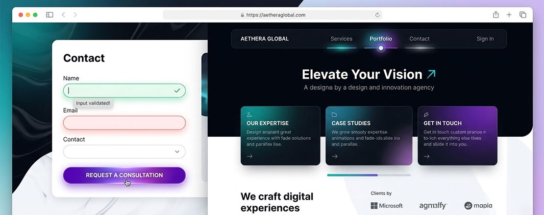
Forms that use real-time micro-interactions to validate input — a green tick appearing when an email format is correct, a subtle red border when it is not — see form abandonment rates approximately 22% lower than forms with only submit-time validation. Immediate feedback reduces the anxiety of “did I fill this in correctly?”
Animated interfaces increase time on site
Nielsen Norman Group research consistently finds that well-animated interfaces — where motion is purposeful and performance is maintained — increase user engagement metrics including pages per session and time on site. Motion draws and maintains attention in ways that static interfaces cannot.
Motion signals quality and attention to detail
Users rate websites with thoughtful micro-interactions as more professional, more trustworthy, and more premium than equivalent static designs — even when they cannot articulate why. The care implied by well-executed micro-animations transfers to brand perception in ways that influence purchasing decisions.
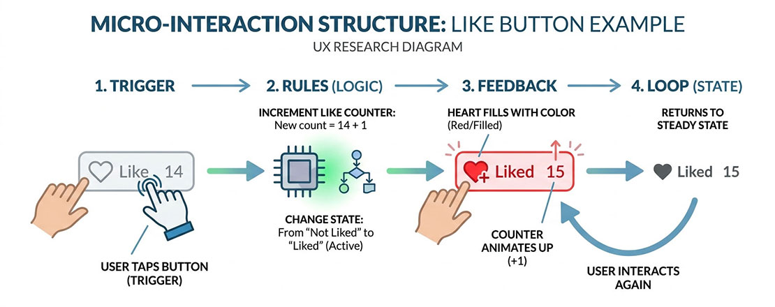
Every micro-interaction follows the same four-part structure: a trigger initiates it, rules define what happens, feedback communicates the result, and loops/modes define what happens over time and in different states.
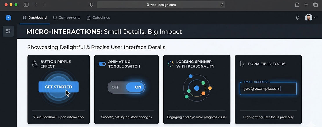
The 6 Types of Micro-Interactions Every Website Should Have
Type 1: Button and CTA Feedback
Every interactive element on a website — buttons, links, CTA elements — should provide clear visual feedback on hover and click. This feedback serves a communication purpose: it confirms to the user that the element is interactive and that their action has been registered.
The most effective button micro-interactions use two-state design: a rest state (how the button looks by default) and an active state (how it responds to hover and click). The animation between states should be fast (150 to 250ms), smooth (CSS ease or ease-out), and visually clear without being distracting.
/* Button micro-interaction — hover + active states */
.btn-primary {
  background: #005182;
  color: #ffffff;
  padding: 14px 28px;
  border-radius: 6px;
  border: none;
  cursor: pointer;
  transform: translateY(0);
  box-shadow: 0 2px 8px rgba(0, 81, 130, 0.25);
  transition:
    background 0.2s ease,
    transform 0.15s ease,
    box-shadow 0.2s ease;
}

.btn-primary:hover {
  background: #004070;
  transform: translateY(-2px);
  box-shadow: 0 6px 20px rgba(0, 81, 130, 0.4);
}

.btn-primary:active {
  transform: translateY(0px);
  box-shadow: 0 2px 8px rgba(0, 81, 130, 0.25);
  transition-duration: 0.05s;
}
Type 2: Form Field Focus and Validation
Form fields should animate through three states: resting (unfocused), active (focused, user typing), and validated (submission confirmed or error shown). Each state transition should be animated to communicate clearly what is happening.
/* Form field focus micro-interaction */
.form-input {
  border: 2px solid #e5e7eb;
  border-radius: 6px;
  padding: 12px 16px;
  outline: none;
  transition:
    border-color 0.2s ease,
    box-shadow 0.2s ease;
}

.form-input:focus {
  border-color: #005182;
  box-shadow: 0 0 0 3px rgba(0, 81, 130, 0.15);
}

/* Success state */
.form-input.is-valid {
  border-color: #22c55e;
}

/* Error state with shake animation */
.form-input.is-error {
  border-color: #ef4444;
  animation: shake 0.4s ease;
}

@keyframes shake {
  0%, 100% { transform: translateX(0); }
  20%       { transform: translateX(-6px); }
  40%       { transform: translateX(6px); }
  60%       { transform: translateX(-4px); }
  80%       { transform: translateX(4px); }
}
Type 3: Navigation and Menu Animations
Navigation hover states, dropdown menu animations, and mobile menu open/close transitions are among the most visible micro-interactions on any website — because every visitor who navigates the site triggers them repeatedly. They have an outsized impact on the overall “feel” of the interface.
Navigation link hover underlines that grow from the centre outward (rather than appearing instantly) are a particularly elegant and widely appreciated micro-interaction. Dropdown menus that fade in with a slight upward movement (appearing to rise into position) feel more premium than those that simply appear.
/* Growing underline nav link animation */
.nav-link {
  text-decoration: none;
  position: relative;
  padding-bottom: 4px;
  color: #1d1729;
}

.nav-link::after {
  content: '';
  position: absolute;
  bottom: 0;
  left: 50%;
  right: 50%;
  height: 2px;
  background: #005182;
  transition: left 0.25s ease, right 0.25s ease;
}

.nav-link:hover::after {
  left: 0;
  right: 0;
}
Type 4: Loading and Progress Feedback
Any action that takes time — a form submission, a search, a payment processing, a file upload — should provide animated feedback that confirms the action is in progress. The absence of feedback during a delay causes users to doubt whether their action was registered, leading to repeat clicks, frustration, and abandonment.
Loading micro-interactions should communicate three things: that the action was received, that processing is happening, and approximately how long it will take (if knowable). The most effective loading animations are simple, fast, and loop smoothly — complex loading animations distract attention rather than reassuring it.
Type 5: Success and Error State Transitions
When a form submits successfully, a payment completes, or an item is added to cart — the transition from action to confirmation state is a micro-interaction moment. A well-animated success state (a button that morphs into a checkmark, a form that fades out and a confirmation message that fades in) communicates completion clearly and memorably, reducing the user anxiety of “did that actually work?”
Error states need equally thoughtful animation — but in a different direction. The shake animation on an invalid form field, a gentle pulsing on a required field that was missed, a smooth error message appearance below the problematic field — all of these communicate what went wrong without jarring the user out of the task flow.
Type 6: Scroll-Triggered Reveals
Elements that animate into view as the user scrolls down the page — cards fading in, statistics counting up, images sliding in from the side — are scroll-triggered micro-animations that serve two purposes: they reward continued scrolling (creating positive reinforcement for the scroll behaviour) and they draw attention to important content at the moment it becomes visible rather than requiring it to compete for attention with content that loaded immediately.
The implementation uses the Intersection Observer API in JavaScript — observing when elements enter the viewport and applying animation classes at that moment. This is significantly more performant than scroll event listeners, which execute continuously during scroll and cause frame drops.
Performance: How to Animate Without Harming Core Web Vitals
CSS animations that are not implemented carefully can significantly harm Core Web Vitals — particularly CLS (Cumulative Layout Shift) and INP (Interaction to Next Paint). The performance rules for micro-animations are non-negotiable in 2026:
-
Only animate transform and opacity
These are the only CSS properties that can be animated on the GPU compositor layer without triggering layout recalculation. Animating width, height, top, left, margin, or padding forces the browser to recalculate the entire page layout on every frame — causing severe jank and CLS. The rule: usetransform: translateX()instead of animatingleft. Usetransform: scale()instead of animatingwidth/height. Useopacityfor fade effects. These properties are hardware-accelerated and produce smooth 60fps animations even on mid-range devices. -
Use will-change sparingly
The CSS propertywill-change: transformhints to the browser to promote an element to its own compositor layer before the animation begins, eliminating the promotion jank that can occur at animation start. Use it on elements that will be animated frequently or where animation start smoothness matters — but not on every element, as excessive compositor layers increase memory usage. -
Keep animation durations under 400ms
Animations longer than 400ms feel slow and interfere with the user’s workflow. The sweet spot for most micro-animations is 150 to 300ms. The exception is large-scale page transitions or deliberate reveal animations where a longer duration is part of the communication — but even these rarely need to exceed 600ms. -
Use CSS transitions rather than JavaScript animation where possible
CSS transitions and CSS animations run on the browser’s compositor thread, separate from the main JavaScript thread. JavaScript-driven animations (even with requestAnimationFrame) can be blocked by main thread JavaScript execution, causing jank during complex page interactions. Prefer CSS for simple state-change animations; use JavaScript (GSAP or requestAnimationFrame) only for complex multi-step animation sequences that CSS cannot express. -
Test on mid-range Android devices
Micro-animations that run perfectly at 60fps on a MacBook and an iPhone may drop frames on a mid-range Android device. Test animation performance on real hardware — or use Chrome DevTools with CPU 4x throttling enabled — to verify that your animations remain smooth for the full range of devices your users are likely to use.
Accessibility: Respecting prefers-reduced-motion
Approximately 35% of users have some form of vestibular disorder, visual sensitivity, or other condition that makes motion-heavy interfaces uncomfortable or actively harmful. macOS, iOS, Android, and Windows all provide a “reduce motion” accessibility setting that users with these conditions regularly enable.
The CSS media query @media (prefers-reduced-motion: reduce) detects this setting and allows you to disable or simplify animations for users who have requested reduced motion. Respecting this preference is both an ethical accessibility requirement and, in increasing jurisdictions, a legal one under WCAG 2.1 criteria.
/* Standard animation for most users */
.btn-primary {
  transition: transform 0.2s ease, box-shadow 0.2s ease;
}

/* Simplified or no animation for reduced-motion users */
@media (prefers-reduced-motion: reduce) {
  .btn-primary {
    transition: background-color 0.2s ease; /* colour change only — no movement */
  }

  /* Disable scroll animations entirely */
  .scroll-reveal {
    animation: none;
    opacity: 1;
    transform: none;
  }

  /* Disable auto-playing animations */
  .loading-spinner {
    animation-duration: 0.01ms;
  }
}
The principle: provide a colour or opacity change as feedback where motion would normally be the primary feedback mechanism. Never remove all feedback — reduced motion users still need to know their actions were registered. Simply provide that feedback through non-motion means.
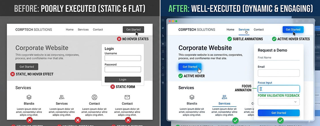
The gap between a website that feels alive and one that feels corporate and flat is almost entirely determined by micro-interaction quality — the same layout, colour, and typography feels dramatically more premium with thoughtful animation than without.
Common Micro-Animation Mistakes That Hurt UX
Animations that are too slow
A button hover that takes 600ms to complete delays the user’s next action. Micro-animations should feel instant — 150 to 300ms. Anything longer than 400ms interrupts rather than enhances the interaction.
Animating layout properties (width, height, top)
Animating CSS layout properties triggers full page reflows on every frame, causing jank and CLS. Always use transform and opacity. This is the single most common performance mistake in micro-animation implementation.
Animations that serve decoration, not communication
Every micro-animation should communicate something — state, status, response, direction. Animations that exist purely for visual interest with no communicative purpose add cognitive load without corresponding UX benefit.
Ignoring prefers-reduced-motion
Motion that is delightful for most users can be genuinely distressing for users with vestibular disorders. Respecting the reduced-motion preference is not optional — it is an accessibility requirement with legal implications in many markets.
Too many simultaneous animations
Multiple elements animating at the same time create visual chaos that distracts from the user’s task. Animations should be staggered and only triggered by relevant user actions — not cascading across the page simultaneously.
Inconsistent animation language
Using different easing curves, durations, and motion patterns for similar interaction types creates an incoherent feel. Define a motion design system — standard durations for fast/medium/slow, standard easing curves, standard animation patterns for each interaction type — and apply it consistently.
When to Use Micro-Animations — and When Less Is More
| Context | Micro-Animation Use | Recommendation |
|---|---|---|
| SaaS dashboards and web apps | Essential — status, loading, state changes all require animation | Use extensively — it is expected |
| Creative agency portfolios | Showcases design capability — micro-animations are part of the pitch | Use generously — carefully |
| eCommerce product pages | Add-to-cart confirmation, quantity changes, wishlist toggle | Use for key conversion interactions |
| Lead generation landing pages | CTA hover states, form validation — conversion-focused only | Use sparingly — don’t distract from conversion |
| Healthcare and medical websites | Minimal — serious context; animation can feel inappropriate | Limit to functional feedback only |
| Government and public services | Minimal — accessibility requirements are highest; many users on older devices | Reduce to minimum functional feedback |
| Long-form content / blogs | Scroll reveals, reading progress indicator, share button hover | Subtle use enhances reading experience |
| B2B professional services | Hover states, form feedback — professional restraint | Use subtly — premium but not playful |
Frequently Asked Questions About Micro-Animations and Micro-Interactions
| What is the difference between micro-animations and micro-interactions? | A micro-interaction is a complete contained moment in an interface that accomplishes a single task — the full system of trigger, response, feedback, and state change. A micro-animation is the visual motion component within a micro-interaction — the specific animation that delivers the feedback. In practical terms: a form field validating an email address in real time is a micro-interaction; the green tick icon that smoothly fades in when the email format is correct is the micro-animation within that interaction. Micro-animations can exist independently of a full micro-interaction (a decorative loading animation, a subtle hover effect with no state change), but most meaningful micro-interactions include a micro-animation as their primary feedback mechanism. When web designers say “micro-interactions,” they often mean both the interactive system and its animation — the terms are frequently used interchangeably in design conversations even though they technically describe different levels of the same concept. |
| Do micro-animations affect website performance? | Micro-animations can significantly affect website performance if implemented incorrectly — or have virtually no performance impact when implemented correctly. The critical rule is to animate only CSS transform and opacity properties, which are processed on the GPU compositor thread without triggering layout recalculations. Animating layout properties (width, height, top, left, margin, padding) forces the browser to recalculate the entire page layout on every animation frame, causing severe jank and Cumulative Layout Shift (CLS) that directly harms Core Web Vitals scores. CSS transitions and animations implemented on transform and opacity properties are hardware-accelerated, run at 60fps, and have negligible impact on page performance even on mid-range mobile devices. The practical rule: use transform (translateX, translateY, scale, rotate) and opacity for all micro-animations, and test on a throttled CPU in Chrome DevTools to verify smooth performance before deployment. |
| How long should micro-animations last? | Most micro-animations should last between 150 and 300 milliseconds. This duration range is fast enough to feel responsive rather than delayed, and long enough for the motion to be perceptible and communicate its message clearly. Hover state transitions work best at 150 to 200ms — fast enough to feel immediate. Form feedback animations (validation, error states) work best at 200 to 300ms — long enough to communicate a clear state change. Scroll-triggered reveal animations can extend to 400 to 600ms because they are announcing new content rather than responding to a specific user action. Animations longer than 600ms feel slow in most contexts and interrupt the user’s interaction flow. The guiding principle is that micro-animations should feel like an enhancement of the interaction rather than a delay to it — if the user notices waiting for an animation to complete, it is too long. |
| What CSS properties should I use for micro-animations? | The two CSS properties you should use for all micro-animations are transform and opacity. These are the only properties that can be animated on the GPU compositor layer without triggering layout recalculations, making them smooth, performant, and non-disruptive to Core Web Vitals. Transform enables: translateX and translateY for movement in any direction, scale for size changes, rotate for rotation, and skew for perspective effects. Opacity enables: fade in and fade out effects, as well as combined fade-and-move animations when used alongside transform. CSS transition syntax for these properties: `transition: transform 0.2s ease, opacity 0.2s ease;`. The easing functions that work best for micro-animations are ease (default — fast in, slow out), ease-out (quick response, gradual settle — best for elements entering), and ease-in-out (smooth both ways — best for toggle/state changes). Avoid animating: width, height, top, left, right, bottom, margin, padding, border-width — all of these trigger layout recalculations. |
| How do I implement micro-animations in WordPress? | Micro-animations in WordPress are implemented through CSS additions to your theme’s stylesheet. The three primary methods are: adding custom CSS through WordPress Admin → Appearance → Customize → Additional CSS (best for simple hover states and transitions that do not require JavaScript); adding CSS and JavaScript through a plugin like Simple Custom CSS and JS (best for animations requiring JavaScript, such as scroll-triggered reveals using Intersection Observer); and adding CSS directly to your theme’s style.css file (best for comprehensive animation systems that should be version-controlled with the theme). For scroll-triggered reveal animations, the Intersection Observer API implemented in custom JavaScript is the most performant approach — add it through the Simple Custom CSS and JS plugin or through your theme’s functions.php file using wp_enqueue_script. Page builders like Elementor and Beaver Builder also include built-in animation options for scroll reveals and hover effects that can be configured without code, though the control over timing and easing is more limited than custom CSS. |
| What is prefers-reduced-motion and why does it matter for animations? | prefers-reduced-motion is a CSS media query that detects whether a user has enabled the “reduce motion” accessibility setting in their operating system (available in iOS, macOS, Android, and Windows). Users enable this setting primarily because motion-heavy interfaces cause discomfort, dizziness, or nausea — symptoms associated with vestibular disorders, migraines, and certain visual processing conditions. Approximately 35% of people experience some degree of motion sensitivity, and a meaningful proportion of those have enabled the reduce-motion system setting. Respecting prefers-reduced-motion with `@media (prefers-reduced-motion: reduce) { … }` is both an ethical design responsibility and an increasing legal requirement under WCAG 2.1 accessibility guidelines, which are referenced in accessibility legislation in the UK, EU, USA, and Australia. The correct implementation is not to remove all feedback for reduced-motion users — they still need to know their actions were registered — but to provide that feedback through opacity or colour changes rather than movement. |
| Which websites should use micro-animations most and least? | Micro-animations are most valuable on: SaaS web applications and dashboards where status feedback and state changes are frequent and critical; creative agency and portfolio websites where animation quality is part of the brand demonstration; eCommerce product pages where animated add-to-cart, wishlist, and quantity interactions confirm user actions and reduce abandonment; and consumer-facing websites where the target audience is accustomed to polished app-level interactions. Micro-animations should be used minimally on: healthcare, medical, and legal websites where the serious context makes playful animation inappropriate and where accessibility requirements are typically stringent; government and public service websites where device diversity is greatest and where WCAG compliance requirements typically limit animation; and any website where the primary audience includes a high proportion of older users or users in markets with predominantly older device hardware. For any website, the universal minimum standard is hover state feedback on all interactive elements — buttons, links, form fields — which communicates interactivity and reduces the cognitive hesitation that lowers conversion rates. |
A website where every interaction is considered — every hover state communicates, every state change confirms, every transition guides — feels alive in a way that static interfaces cannot match. This quality of interaction is increasingly the difference between a website that converts and one that merely exists.
Want micro-interactions designed and implemented correctly on your website?
Neel Networks designs and builds websites where every interaction — every hover state, every form response, every loading moment — is crafted to improve the user experience and reinforce conversion. Talk to our design team about your next web project.