How to Design a High-Converting Landing Page (With Real 2026 Examples)
The average website conversion rate is 2.35%. The top 25% of websites convert at 5.31% or higher. The top 10% achieve 11.45% or more. That gap — between average and exceptional — is almost entirely explained by design decisions, not by traffic quality or offer strength.
A landing page is the single highest-leverage design decision in digital marketing. Unlike a homepage, which serves multiple audiences and multiple purposes, a landing page exists for one reason: to convert a specific visitor into a specific action. Every element on the page either serves that conversion or dilutes it. There is no neutral — every design choice either helps or hurts.
This guide covers exactly what separates high-converting landing pages from average ones in 2026 — with the specific design decisions, psychological principles, technical requirements, and real examples that back up every recommendation.
What Makes a Landing Page Different From a Regular Website Page
The distinction is intentionality. Every element of a landing page is selected, positioned, and written for a single defined outcome — a form completion, a purchase, a phone call, a download, a booking. A homepage serves multiple audiences and multiple goals simultaneously. A landing page serves one audience segment, arriving through one traffic source, to complete one action.
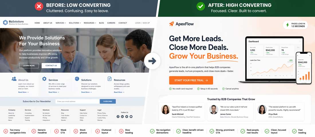
This singular focus has direct design implications. Navigation menus — which invite visitors to explore other parts of the site and leave the conversion path — are typically removed from landing pages. Multiple CTAs pointing to different destinations are replaced by one CTA pointing to one destination. Content that does not directly support the conversion decision is eliminated. The landing page is a funnel, not a brochure.
The most important landing page statistic in 2026: Research from Unbounce consistently finds that landing pages with navigation menus convert at 10 to 15% lower rates than equivalent pages without navigation. Removing the navigation menu is the single highest-impact, lowest-effort conversion improvement available on most landing pages — and most businesses never do it.
The Anatomy of a High-Converting Landing Page
Every high-converting landing page contains the same core components, arranged in a sequence that matches how a motivated visitor naturally processes information and makes decisions. Understanding this sequence is the foundation of effective landing page design.
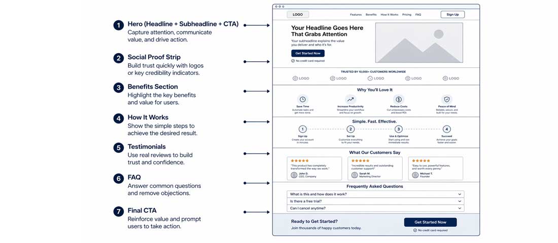
Every high-converting landing page follows the same structural logic — a sequence of elements that maps to how motivated visitors process information and make decisions, from first impression to conversion action.
Component 1: The Hero Section
The headline, subheadline, hero image, and primary CTA that appear above the fold — the portion of the page visible without scrolling. This section has approximately 5 seconds to communicate enough value and relevance to keep the visitor on the page. If it fails, nothing else on the page matters.
Component 2: Social Proof Strip
Client logos, review stars, media mentions, or key statistics placed immediately below the hero — before the visitor has scrolled into the detail. This “credibility moment” catches the visitor who scrolled past the hero looking for a reason to trust before reading further.
Component 3: Benefits and Value Proposition
What the visitor gets, expressed in their language and from their perspective — not product features, but outcomes. The distinction: “24/7 support” is a feature. “Get help the moment something breaks, any hour of the day or night” is a benefit. Visitors buy benefits, not features.
Component 4: How It Works / The Process
A simple 3 to 5 step illustration of what happens after the visitor takes the conversion action. Reduces anxiety by making the process visible. Converts the abstract (“what actually happens when I fill in this form?”) into concrete and manageable.
Component 5: Testimonials and Case Studies
Specific, credible, attributed social proof from people who match the target visitor’s profile. Not generic praise — specific results from identifiable people. “This agency redesigned our website and we saw a 40% increase in enquiries within 3 months — Sarah, Managing Director, Brighton” outperforms “Great work, highly recommend” by every conversion metric.
Component 6: FAQ Section
Addresses the specific objections and hesitations that prevent motivated visitors from converting. These are not generic questions — they are the actual questions sales teams hear from prospects who were almost ready to convert but needed one more thing resolved. Great FAQ content is collected from sales conversations, customer support tickets, and live chat logs.
Component 7: Final CTA
A repeat of the primary conversion action at the bottom of the page, for visitors who have read through all the content and are now ready to act. The language can be slightly different from the hero CTA — reflecting the additional information consumed: “Start My Free Trial” in the hero becomes “I’m Ready — Start My Trial” at the bottom.
Hero Section Design — The 5 Seconds That Decide Everything
The hero section is the most important piece of real estate on any landing page. Research from Nielsen Norman Group consistently finds that users decide within 10 to 20 seconds whether a page is relevant enough to stay on — and most of that judgment forms from the hero section alone. In 2026, with faster browsing habits and shorter attention spans, the effective window is closer to 5 seconds.
The Headline: One Job, Done in 10 Words or Fewer
The headline answers the visitor’s immediate question: “Is this for me, and does it solve my problem?” It should communicate what the page offers, who it is for, and the primary benefit — in the shortest possible form. Not a slogan. Not a mission statement. A clear, specific value proposition in plain language.
Weak headline (what most businesses write):
“Welcome to Our Professional Web Design Solutions”
Strong headline (what converts):
“Get a Website That Brings You Clients — Delivered in 6 Weeks”
The strong headline answers: what you get (a website), what it does for you (brings clients), and when (6 weeks). The weak headline says nothing a visitor needs to know.
The Subheadline: Expand and Qualify
The subheadline — one to two sentences below the main headline — expands on the primary claim and qualifies the audience. It is the second thing visitors read after the headline, and it either confirms relevance (“yes, this is for me”) or reveals it is not.
Example subheadline that works:
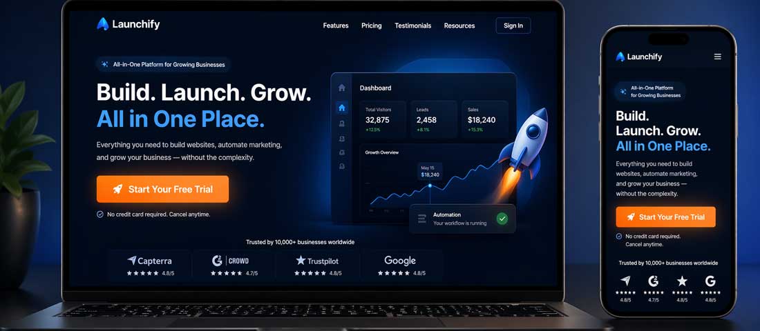
“Neel Networks designs and builds custom WordPress and Shopify websites for small and medium businesses across the USA, UK, and Australia. 450+ websites delivered. 4.9-star client rating.”
This subheadline qualifies the audience (SMBs in specific markets), establishes credibility (450+ delivered, 4.9 stars), and sets expectations (custom WordPress and Shopify).
Hero Visual: Purpose Over Beauty
The hero image or video should serve the conversion, not decorate the page. The highest-performing hero visuals in 2026 fall into four categories:
- The outcome image — showing what the visitor’s life or business looks like after using the product or service
- The product or service in use — a website shown on a device, a dashboard showing data, a service being performed
- The person behind the service — a genuine photograph of the founder, team, or practitioner builds trust faster than any stock image
- The social proof visual — reviews, ratings, client logos, or user counts displayed as the hero visual makes the credibility claim impossible to miss
What does not work: generic stock photography of smiling people shaking hands, abstract geometric backgrounds with no relevance to the offer, and dark atmospheric photography that looks beautiful but communicates nothing about the value proposition.
CTA Design — The Science Behind Buttons That Get Clicked
The Call to Action button is the single element that directly produces conversions — it is where the visitor’s decision becomes an action. CTA design is more nuanced than it appears, and the differences between a high-performing CTA and a low-performing one are often surprisingly small.
CTA Copy: Specificity Over Generality
| Generic CTA (low converting) | Specific CTA (high converting) | Why it works better |
|---|---|---|
| Submit | Get My Free Quote | Communicates what the visitor receives, not what they do |
| Click Here | Start My Free Trial | First-person language increases psychological ownership |
| Learn More | See How It Works | Specific about what happens next — reduces uncertainty |
| Contact Us | Talk to Our Team Today | Humanises the action; “today” creates mild urgency |
| Get Started | Build My Website — Get a Quote | Combines the desired outcome with the immediate action |
| Buy Now | Get Instant Access — £49 | Transparency about price reduces post-click abandonment |
CTA Colour: Contrast Over Brand Compliance
The highest-converting CTA colour is the one that contrasts most strongly with the surrounding page — not necessarily the brand colour. A navy blue website with a navy blue CTA button is invisible. The same website with an orange or bright green CTA button has a conversion point that the eye is drawn to naturally.
The most consistently high-performing CTA colours in independent tests are orange and bright green — both because they are rarely used as background colours in professional website design, meaning they create strong contrast almost universally. The specific hex value matters less than the contrast ratio against the surrounding elements.
CTA Sizing and Spacing
CTA buttons should be large enough that they are the dominant interactive element on the page — a visitor should never have to look for the CTA. On desktop, a minimum height of 48px and padding of at least 16px horizontal. On mobile, a minimum touch target of 48px × 48px (Apple and Google’s accessibility guidelines). Generous white space around the button — it should breathe, not be crowded by surrounding elements.
Micro-Copy Below the CTA
A single line of risk-reducing text directly below the CTA button addresses the specific anxiety that prevents visitors from clicking. Examples that consistently improve conversion:
- “No credit card required”
- “Free quote — no obligation”
- “Cancel any time”
- “Response within 24 hours”
- “Rated 4.9/5 from 43 reviews”
This micro-copy costs nothing and frequently produces 5 to 15% conversion improvements in A/B tests. It is one of the most under-used CTA optimisation techniques in landing page design.
Social Proof — The Types That Work and the Types That Backfire
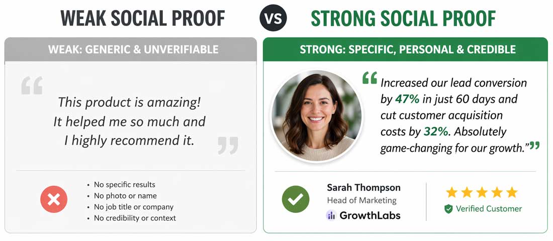
The difference between social proof that converts and social proof that is ignored is specificity — real names, real photos, real results, and real company attribution transform a generic quote into a credible conversion driver.
Social Proof That Works
- Specific attributed testimonials — full name, job title, company name, and a real photograph. If the person is real and identifiable, the testimonial is trusted. If it is anonymous, it might as well not exist.
- Result-specific testimonials — quotes that mention a specific measurable outcome (“40% more enquiries,” “ranked page 1 in 3 months,” “saved 6 hours per week”) are dramatically more credible than praise-only quotes.
- Review platform widgets — a live Google Reviews widget or Trustpilot badge that shows a real star rating from a real platform is more credible than any self-published testimonial, because it is independently verified.
- Client logos — recognisable company logos are powerful credibility signals, particularly when the visitor recognises brands they respect among your clients.
- Usage statistics — “2,500+ websites delivered,” “450+ clients in 20 countries,” “12 years in business” are credibility signals that are specific, verifiable, and immediately meaningful.
Social Proof That Backfires
- Stock photography testimonials — when visitors recognise the photo as a stock image (and they frequently do), the testimonial actively reduces trust rather than building it
- Anonymous quotes — “Amazing service!” — Name withheld. This is worse than no testimonial.
- Testimonials that are too positive — “The absolute best, most professional, most amazing company I have ever worked with in my entire life” reads as written by the company, not a real client
- Logos of companies the visitor has never heard of — unrecognisable logos provide no credibility signal and can actually suggest the business lacks notable clients
Form Design — How Fewer Fields Dramatically Increase Completions
Every field added to a lead generation form reduces completion rate. Research from HubSpot found that reducing a form from 4 fields to 3 fields increases conversion rate by 50%. Reducing from 11 fields to 4 increases it by 120%.
The principle is simple: the more a form asks for, the more effort and commitment it requires, and the more visitors abandon before completing. The counter-intuitive truth is that asking for less information at the conversion stage typically produces better leads — because visitors who commit to a shorter form are more motivated than those who abandon a longer one.
The Minimum Viable Form for Different Conversion Goals
| Conversion Goal | Minimum Fields Needed | Never Ask For (at this stage) |
|---|---|---|
| Free quote / consultation request | Name + Email + (Phone optional) | Budget, company size, full address, project details |
| Newsletter / lead magnet download | Email only | Name, phone, company — anything beyond email |
| Free trial signup | Email + Password | Payment details (add after trial), company name |
| Event / webinar registration | Name + Email | Job title, company, phone, how they heard about it |
| Contact us / project enquiry | Name + Email + Brief message | Phone (unless response is by phone), detailed spec |
Page Speed — The Conversion Killer Hiding in Plain Sight
Page speed is the most consistently underestimated landing page conversion factor. Research from Portent found that a page loading in 1 second converts at 3x the rate of a page loading in 5 seconds. Google’s own data shows that as page load time increases from 1 to 3 seconds, bounce rate increases by 32%. From 1 to 6 seconds, bounce rate increases by 106%.
This means a landing page that takes 5 seconds to load is losing more than half its potential conversions before a single visitor has read the headline. No amount of CTA optimisation, testimonial quality, or headline testing can compensate for a fundamentally slow loading page.
The 5 Speed Fixes With the Biggest Conversion Impact
-
Convert all images to WebP format
WebP images are 25–35% smaller than equivalent JPEG or PNG files with no visible quality difference. On a landing page with 5 images, converting to WebP can reduce total image payload by 500KB to 1MB — directly reducing load time. Every image on every landing page should be WebP in 2026. -
Set explicit width and height on all images
When images do not have defined dimensions, the browser cannot reserve space for them before they load — causing layout shift (CLS) as images pop in. Setting width and height attributes eliminates layout shift, improving Core Web Vitals CLS score and making the page feel more stable on load. -
Defer non-critical JavaScript
JavaScript that is not needed to render the above-fold content should be deferred — loaded after the visible content rather than before. A landing page with 8 non-deferred JavaScript files delays its visible content by the time needed to download and execute all 8 files. Deferring non-critical JS makes the page feel instant. -
Use a CDN for hosting
Serving landing page assets (images, CSS, JS) from a Content Delivery Network (CDN) means they are served from a server geographically close to each visitor — reducing latency. Cloudflare’s free plan provides CDN for any domain in minutes and consistently produces 20–40% page load time improvements. -
Eliminate render-blocking resources above the fold
CSS and fonts loaded in the <head> block page rendering until they download. Critical CSS — the styles needed for above-fold content — should be inlined directly in the HTML. Non-critical CSS should be deferred. Google Fonts should be preconnected with <link rel=”preconnect”> to reduce font loading latency.
Mobile Landing Page Design — Where Most Conversions Happen
Mobile devices account for over 60% of web traffic globally — and for advertising-driven landing pages, the proportion is typically even higher. A landing page optimised only for desktop is optimised for the minority of its traffic.
Mobile landing page design is not desktop landing page design made smaller — it requires specific decisions that are unique to the mobile context:
- Single column layout — two-column desktop layouts that use sidebars or split-screen sections must collapse to a logical single column on mobile, with the most important content at the top
- Sticky CTA button — a fixed CTA button that stays visible at the bottom of the screen as the visitor scrolls is one of the highest-impact mobile conversion improvements available. The visitor never has to scroll back to find the conversion action.
- Tap target sizing — all interactive elements (buttons, links, form fields) must meet the 48×48px minimum touch target size. Elements smaller than this produce mis-taps and frustration.
- Form field optimisation — mobile form fields should use appropriate keyboard types:
type="email"triggers the email keyboard,type="tel"triggers the number pad. This small detail reduces form completion friction significantly. - Above-fold content audit — test your landing page on a real mobile device and identify exactly what is visible without scrolling. If your headline, value proposition, and CTA are not all visible above the fold on mobile, you need to restructure.
A/B Testing — How to Systematically Improve Conversion Rate
A/B testing is the process of showing two versions of a landing page (or landing page element) to randomly split portions of traffic, measuring which version produces more conversions, and implementing the winner. It is the most reliable way to improve landing page conversion rate — because it replaces opinion with data.
The A/B testing priority sequence for most landing pages:
- Test the headline first — it has the highest impact and the results are fastest to reach statistical significance
- Then test the CTA copy and colour — high impact, quick to reach significance
- Then test social proof placement and format — testimonials above vs below the fold; logos vs review stars
- Then test hero image — person vs product vs outcome visual
- Then test form length — 3 fields vs 2 fields; phone required vs optional
The most important A/B testing rule: test one element at a time. Testing headline and CTA simultaneously means you cannot know which change drove the result. One variable per test, measured to statistical significance (typically 95% confidence with a tool like Google Optimize or VWO) before implementing the winner and moving to the next test.
Frequently Asked Questions About Landing Page Design
| What is a landing page and how is it different from a website homepage? | A landing page is a single web page designed for one specific conversion goal — getting visitors to complete one defined action such as filling in a contact form, starting a free trial, making a purchase, or downloading a resource. It differs from a homepage in intentionality and structure: a homepage serves multiple audiences, multiple purposes, and provides navigation to the entire website. A landing page serves one audience segment arriving through one traffic source, removes navigation to prevent distraction, and focuses every element on driving one conversion action. Landing pages are typically used as the destination for paid advertising campaigns, email marketing links, and specific organic search queries — where the visitor’s intent is already known and the page can be designed specifically for that intent. |
| What is a good conversion rate for a landing page? | Landing page conversion rates vary significantly by industry, traffic source, offer type, and conversion action. As a general benchmark: the average landing page conversion rate across all industries is approximately 2.35%; the top 25% of landing pages convert at 5.31% or higher; the top 10% achieve 11.45% or more. Lead generation landing pages (form completions) typically convert higher than eCommerce landing pages (purchases), because the commitment required is lower. Pages driven by branded search traffic convert higher than those driven by cold display advertising. Rather than comparing to an industry average, the most useful conversion rate benchmark is your own page’s historical performance — a 20% improvement on your current rate is more meaningful than hitting an industry average. |
| Should a landing page have navigation menus? | No — removing navigation menus from landing pages consistently improves conversion rates, typically by 10 to 15% based on multiple independent studies. The logic is straightforward: navigation menus invite visitors to leave the conversion path by exploring other parts of the website. On a landing page where the entire design is oriented toward one conversion action, every exit route — including navigation links — reduces the probability that the visitor completes that action. The only links on a landing page should be the primary CTA, possibly a secondary CTA for visitors not ready to convert immediately (such as “Learn More” scrolling to more information rather than leaving the page), and legally required links (Privacy Policy, Terms) typically placed in a minimal footer. |
| How long should a landing page be? | Landing page length should match the complexity of the conversion decision. For low-commitment conversions — a free resource download, a newsletter signup, a free trial with no credit card required — short landing pages (one to two screens) often convert better because they reduce the time and effort required before the visitor reaches the CTA. For high-commitment conversions — a significant purchase, a service retainer, an enterprise software subscription — longer landing pages that thoroughly address objections, provide detailed social proof, and build the case for the value proposition typically convert better. A useful heuristic: the higher the price or commitment, the more information and social proof the page needs to provide before the visitor is confident enough to act. Test both lengths when uncertain — the data from your specific audience and offer will be more reliable than any general guideline. |
| How much does page speed affect landing page conversion rate? | Page speed has a profound effect on landing page conversion rate — consistently one of the highest-impact conversion factors available. Research from Portent shows that a page loading in 1 second converts at 3x the rate of one loading in 5 seconds. Google’s research shows bounce rate increases by 32% as page load time goes from 1 to 3 seconds, and by 106% as it goes from 1 to 6 seconds. For advertising-driven landing pages, slow load times also directly increase cost per acquisition — because money is spent driving visitors to a page that bounces before they have seen the offer. The practical implication: improving page speed from 5 seconds to 2 seconds on a landing page with 1,000 monthly visitors and a 2% current conversion rate could increase monthly conversions from 20 to 50 to 60 — a 150 to 200% conversion improvement from a technical change that requires no design work whatsoever. |
| What types of social proof work best on landing pages? | The most effective social proof on landing pages in 2026 is specific, attributed, and verifiable. Testimonials with a real full name, job title, company name, and genuine photograph consistently outperform anonymous quotes by 30 to 40% in conversion tests. Result-specific testimonials — those that cite a measurable business outcome (“52% more inbound enquiries in the first quarter”) — outperform praise-only testimonials (“Great team, very professional”). Third-party review platform widgets (Google Reviews, Trustpilot) are more credible than self-published testimonials because they are independently verified and cannot be fabricated. Usage statistics (“2,500+ websites delivered,” “450+ clients”) provide credibility signals that are immediately quantifiable. Client logos from recognisable companies are effective for B2B pages where brand recognition provides implied endorsement. The least effective social proof is generic anonymous quotes, stock photography testimonials (visitors recognise and distrust them), and artificially perfect reviews with no variation in sentiment. |
| How do you A/B test a landing page? | A/B testing a landing page involves showing two versions of the page (or one element of the page) to randomly split portions of your traffic, measuring which version produces more conversions, and implementing the winner once the result reaches statistical significance. The process in practice: choose one element to test (always one at a time — testing multiple elements simultaneously makes it impossible to know which change drove the result); create version B with one specific change; use an A/B testing tool such as Google Optimize, VWO, or Optimizely to split traffic between versions A and B; run the test until both versions have received at least 100 conversions and the result has reached 95% statistical confidence; implement the winning version; then begin the next test on the next element. The highest-impact elements to test, in priority order, are: the headline, the CTA copy and colour, the hero image, the social proof format and placement, and the form length. |
The transformation from a standard website page to a high-converting landing page is a series of intentional decisions — every element either serving the conversion or being removed. The result is a page that does one thing exceptionally well.
Want a Landing Page Built to Convert — not Just to Look Good?
Neel Networks designs and builds conversion-focused landing pages for businesses across the USA, UK, Canada, Australia, and India. Every page we build is structured for conversion from the first brief — hero section, CTA design, social proof, form optimisation, and page speed all treated as commercial decisions, not aesthetic ones.