Kinetic Typography: How Motion Text Is Transforming Website Design
Words have always had weight. What kinetic typography adds is momentum.
The phrase “kinetic typography” describes text that moves — but that description undersells the concept by reducing it to a technical capability. Kinetic typography, done well, is the art of making words feel the way they mean. A headline that slides in with authority feels different from one that drifts in gently, even if the words are identical. Text that bounces communicates playfulness. Text that snaps into position communicates precision. The motion is not decoration on top of the message — the motion is part of the message.
In 2026, kinetic typography has moved from film titles and music videos — where it has been a design staple for decades — into mainstream web design. The combination of improved browser CSS animation support, the maturity of JavaScript animation libraries like GSAP, and the emergence of no-code tools that make motion accessible without deep technical knowledge has brought animated text within reach of web designers working at every budget level.
This guide covers what kinetic typography is, why it works psychologically, the specific techniques and implementations available in 2026, real examples of it done well, and the critical questions of when to use it and when to leave your text still.
What Kinetic Typography Is — Definition, History, and Web Context
Kinetic typography — from the Greek kinesis (movement) — is the technique of animating text to express ideas, emotions, or content in ways that static text cannot. It encompasses every form of text animation: words that appear letter by letter, headlines that scale in from zero, sentences that split and reform, individual characters that orbit each other before settling into position.
The discipline has its roots in film — Saul Bass’s title sequences of the 1950s and 60s established that text could carry emotional weight through motion. Pablo Ferro’s rapid-cut title typography for Dr. Strangelove (1964) demonstrated that how text moves shapes how it feels. By the 1990s, kinetic typography had become a staple of broadcast design, music video production, and advertising.
The web adoption of kinetic typography has been technically constrained for most of the web’s history. Early Flash-based motion text gave way to CSS3 animations in the early 2010s, then to more sophisticated JavaScript libraries. In 2026, the convergence of several capabilities has made kinetic typography genuinely viable as a mainstream web design tool:
- GSAP (GreenSock Animation Platform) — the industry-standard JavaScript animation library, capable of frame-accurate, performant text animation at a level CSS alone cannot match
- CSS custom properties and new animation features — native CSS now supports complex keyframe animations, view-timeline scroll-driven animations, and individual transform properties that make text animation more accessible without JavaScript
- WebGL and Three.js — enabling truly three-dimensional text effects at 60fps in the browser
- Webflow, Framer, and Spline — no-code tools with built-in motion design capabilities that make kinetic typography accessible to designers without deep JavaScript knowledge
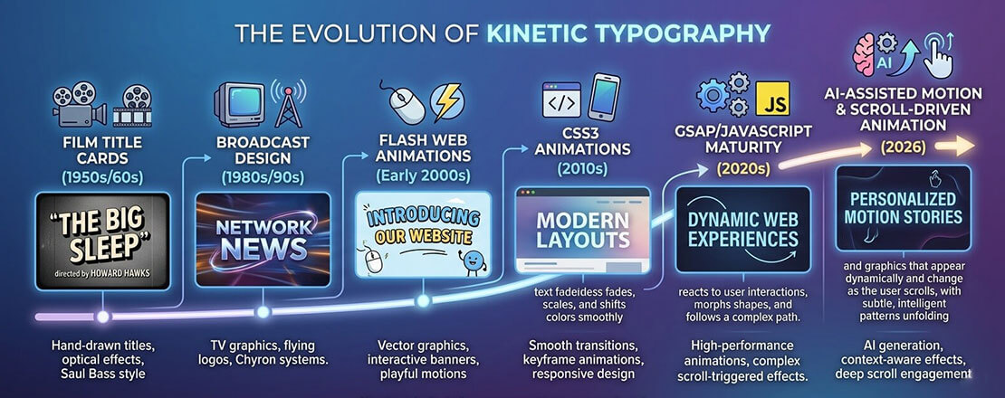
Kinetic typography has moved from a film and broadcast specialist technique through decades of technological evolution to become a practical, accessible web design tool in 2026 — enabled by better animation libraries, improved browser support, and no-code tools.
Why Motion Text Works: The Psychology and UX Evidence
Kinetic typography’s effectiveness is not a matter of taste — it is grounded in well-documented perceptual psychology and measurable UX outcomes.
The Orienting Response and Motion Salience
Human visual attention is hardwired to respond to motion. The brain’s superior colliculus — one of the oldest structures in the vertebrate brain — prioritises moving objects in the visual field, directing attention to them before conscious processing. This orienting response evolved to detect predators and prey. In a web context, it means animated text commands attention from the peripheral visual field in a way that static text cannot, regardless of how large or bold that static text is.
For website heroes, this means a kinetic headline captures attention approximately 2 to 3 seconds faster than an equivalent static headline — a significant advantage on pages where user attention is scarce and the decision to stay or leave is made almost instantly.
Emotion Encoding Through Motion Characteristics
Research in animation psychology, pioneered by Heider and Simmel in 1944 and extended by decades of subsequent work, demonstrates that motion characteristics (speed, easing, path, stagger) communicate emotional qualities even when applied to abstract shapes — including letterforms. Slow, smooth motion reads as calm or luxurious. Fast, elastic motion reads as energetic or playful. Sharp, linear motion reads as precise or authoritative.
Kinetic typography exploits this encoding consciously — choosing motion characteristics that reinforce the emotional quality of the text’s meaning rather than merely animating the letters arbitrarily.
Sequential Attention Guidance
Static text delivers all content simultaneously — the viewer’s eye roams freely across the full text block. Animated text that reveals sequentially (words appearing one at a time, phrases building on each other) controls reading order precisely, ensuring the audience encounters content in the intended sequence. For headlines with a specific rhetorical structure — a setup, then a punchline; a problem, then a solution — sequential revelation is more effective than simultaneous display.
The 7 Types of Kinetic Typography Used in Web Design
Text Reveal (Clip Path / Wipe)
Text appears as if being uncovered — a mask moves across the word revealing letters progressively. Feels precise and intentional. Used extensively in luxury brands, editorial design, and technology companies. Creates a sense of unveiling that matches “reveal” messaging.
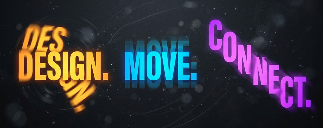
Staggered Character Entry
Individual characters animate into position with slight delay between each — letters drop in, fly in, or fade in sequentially. Extremely common in hero sections. Creates a sense of assembly or construction. Works best with short, punchy headlines where each character is significant.
Typewriter / Text Cycling
One phrase types out character by character, then is deleted and replaced by the next phrase. Used to cycle through multiple value propositions in a single headline slot. Immediately legible to any web user. Risk: overused to the point of feeling clichéd without careful implementation.
Scroll-Driven Text Animation
Text animates as the user scrolls — words appear as they enter the viewport, letters scatter as the section exits, or a sentence “writes itself” as the user scrolls through it. Increasingly supported natively via CSS scroll-driven animations (Scroll Timeline API) in 2026. Creates a sense of narrative pacing that encourages continued scrolling.
Variable Font Animation
Variable fonts — single font files that contain a continuous range of weight, width, and other axes — enable smooth transitions between typographic states that were previously impossible. A headline that breathes between light and bold weights, or a typeface that morphs from condensed to expanded on hover. Highly distinctive and technically elegant.
3D Text and Perspective Animation
Text animated in three-dimensional space — rotating on an axis, receding in perspective, assembling from scattered 3D letterforms. Implemented via CSS 3D transforms, Three.js, or Spline. Creates the most dramatic impact of any kinetic typography technique but requires the most careful performance management.
Morphing and Liquid Text
Text that transforms between words — letters rearranging, shapes morphing, one word liquefying into another. The most technically complex form of kinetic typography, typically requiring GSAP MorphSVG or WebGL. Used by premium creative agencies to demonstrate capability. Maximum impact, maximum implementation complexity.
CSS Implementation — Code for the Most Impactful Text Animations
Several kinetic typography effects are achievable in pure CSS without any JavaScript dependency. Here are production-ready implementations for the most commonly used effects:
Text Reveal with Clip Path (Type 1)
/* Text reveal — clip path wipe from left */
.reveal-text {
  display: inline-block;
  clip-path: inset(0 100% 0 0);
  animation: text-reveal 0.8s cubic-bezier(0.77, 0, 0.175, 1) forwards;
  animation-delay: 0.2s;
}

@keyframes text-reveal {
  to {
    clip-path: inset(0 0% 0 0);
  }
}

/* For multiple lines — stagger with animation-delay */
.reveal-text:nth-child(2) { animation-delay: 0.4s; }
.reveal-text:nth-child(3) { animation-delay: 0.6s; }
Typewriter Effect (Type 3)
/* Typewriter effect — CSS only */
.typewriter {
  overflow: hidden;
  border-right: 3px solid #005182; /* cursor */
  white-space: nowrap;
  width: 0;
  animation:
    typing 2.5s steps(30, end) forwards,
    cursor-blink 0.75s step-end infinite;
}

@keyframes typing {
  from { width: 0; }
  to   { width: 100%; }
}

@keyframes cursor-blink {
  50% { border-color: transparent; }
}
Scroll-Triggered Fade Up (Type 4 — CSS Scroll Timeline)
/* CSS Scroll-driven animation — 2026 native approach */
/* Supported in Chrome 115+, Edge 115+, Safari 18+ */
@keyframes fade-up-in {
  from {
    opacity: 0;
    transform: translateY(30px);
  }
  to {
    opacity: 1;
    transform: translateY(0);
  }
}

.scroll-text {
  animation: fade-up-in linear both;
  animation-timeline: view();
  animation-range: entry 0% entry 30%;
}
Variable Font Breathing Animation (Type 5)
/* Variable font weight animation — requires a variable font */
/* (e.g., Inter Variable, Roboto Flex, etc.) */
@keyframes font-breathe {
  0%, 100% { font-variation-settings: 'wght' 300; }
  50%       { font-variation-settings: 'wght' 800; }
}

.breathing-headline {
  font-family: 'Inter Variable', sans-serif;
  animation: font-breathe 3s ease-in-out infinite;
}

/* Hover-triggered variable font on button */
.variable-btn {
  font-family: 'Inter Variable', sans-serif;
  font-variation-settings: 'wght' 400;
  transition: font-variation-settings 0.3s ease;
}

.variable-btn:hover {
  font-variation-settings: 'wght' 700;
}
GSAP for Advanced Kinetic Typography
CSS animation covers the fundamentals, but for truly sophisticated kinetic typography — character-by-character staggered entry, text morphing, complex timeline-sequenced animations — GSAP (GreenSock Animation Platform) is the industry standard. GSAP’s SplitText plugin (included in Club GreenSock membership) splits text into individual characters, words, or lines and enables frame-accurate animation of each independently.
// GSAP SplitText — staggered character entry
// Requires GSAP + SplitText plugin
gsap.registerPlugin(SplitText);

const headline = document.querySelector('.hero-headline');
const split = new SplitText(headline, { type: 'chars' });

gsap.from(split.chars, {
  opacity:   0,
  y:         60,
  rotateX:   -90,
  stagger:   0.03,
  duration:  0.6,
  ease:      'back.out(1.7)',
  delay:     0.3
});
GSAP’s advantages over CSS alone for kinetic typography:
- Timeline control — sequence multiple text animations precisely, with callbacks and labels
- ScrollTrigger integration — pin sections and animate text as the user scrolls through, with scrubbing (animation tied directly to scroll position)
- Cross-browser consistency — GSAP handles browser rendering differences that can cause CSS animations to behave differently across platforms
- Reverse and restart — animations can be played backwards, restarted on repeat, or triggered by specific events programmatically
No-Code Kinetic Typography in 2026
For designers who want kinetic typography without writing code, 2026’s no-code tools offer significant capability:
| Tool | Kinetic Typography Capability | Best For | Price |
|---|---|---|---|
| Webflow | Scroll-triggered animations, hover interactions, lottie integration, text reveal via clip path | Full websites with sophisticated motion design without code | From $14/month |
| Framer | Variable speed text reveals, staggered entry, scroll-driven, component-level motion | Designer-focused sites with polished motion — best UX of no-code tools | From $5/month |
| Spline | 3D text animation, physics-based text, WebGL text scenes embedded in websites | Hero sections requiring 3D kinetic typography without Three.js coding | Free / from $7/month |
| LottieFiles | Pre-built and custom text animations as Lottie JSON — embeddable anywhere | Adding polished animated text to existing WordPress or custom sites | Free player / from $15/month creator |
| Elementor (Pro) | Text reveal animations, typing effects, scroll motion — within WordPress | WordPress sites needing kinetic typography without custom development | From $59/year |
When to Use Kinetic Typography — and When to Keep Text Still
-
Use kinetic typography on hero headlines where first impression is everything
The homepage hero section has one job: capture attention and communicate value within 5 seconds. A kinetic headline commands attention through motion — triggering the orienting response and giving the visitor a reason to read. For agency portfolios, technology products, creative brands, and any website where the first impression is commercially critical, a hero with kinetic typography consistently outperforms an equivalent static design. -
Use it to communicate brand personality — when motion matches the brand
Kinetic typography is most powerful when the character of the motion reinforces the character of the brand. A luxury brand’s text should move slowly, smoothly, with elegant easing. A gaming company’s text should snap, bounce, and react with energy. A technology company’s text should feel precise and purposeful. When motion and brand personality align, kinetic typography amplifies the brand. When they conflict — a financial services firm with bouncing text, a children’s brand with cold mechanical text reveals — it undermines it. -
Use scroll-driven text animation for narrative content
Long-form pages that tell a story — a brand’s origin, a product’s development journey, a service process — benefit from scroll-driven text animation that controls the narrative pacing. Text that appears as the user scrolls through a story section creates the experience of the narrative unfolding with the reader’s engagement rather than presenting everything simultaneously. This technique encourages continued scrolling and creates a more memorable reading experience. -
Avoid it for body copy, long paragraphs, and reading-heavy content
Kinetic typography serves headlines, heroes, and short impactful phrases. Applied to body copy, it makes reading difficult and frustrating — forcing readers to wait for text to be readable before they can read it. The rule: animate the first impression, not the substance. Once a visitor is engaged and reading, static text is faster, more comfortable, and more functional than animated equivalents. -
Avoid it entirely for accessibility-critical or information-dense contexts
Healthcare, government, financial services, legal, and education websites serve audiences where accessibility is paramount and information clarity is more important than brand impression. Kinetic typography in these contexts risks creating accessibility barriers for users with cognitive disabilities, attention disorders, or motion sensitivities — and the UX cost typically outweighs the brand benefit. Keep text static; let content and information architecture do the work.
Performance and Accessibility: The Rules That Cannot Be Skipped
Two rules are non-negotiable for any kinetic typography implementation:
- Animate only transform and opacity — never animate font-size, width, height, or layout properties that trigger reflow. Text animation that causes layout recalculation on every frame will jank, hurt INP scores, and feel broken on mobile.
- Respect prefers-reduced-motion always — kinetic typography is the most motion-intensive web design technique, which makes reduced-motion compliance the most critical here. Any user who has enabled reduce-motion at the OS level must receive static text, not animated text.
/* Complete reduced-motion handling for kinetic typography */
@media (prefers-reduced-motion: reduce) {

  /* Disable all text animations */
  .reveal-text,
  .typewriter,
  .scroll-text,
  .stagger-char,
  .breathing-headline {
    animation: none !important;
    transition: none !important;

    /* Ensure text is immediately visible (not hidden mid-animation) */
    opacity: 1 !important;
    transform: none !important;
    clip-path: none !important;
    width: auto !important;
  }
}
// GSAP — check reduced motion preference before animating
const prefersReducedMotion = window.matchMedia(
  '(prefers-reduced-motion: reduce)'
).matches;

if (!prefersReducedMotion) {
  // Run kinetic typography animations
  gsap.from(split.chars, {
    opacity: 0, y: 60, stagger: 0.03, duration: 0.6
  });
} else {
  // Make text immediately visible without animation
  gsap.set('.hero-headline', { opacity: 1 });
}
Frequently Asked Questions About Kinetic Typography
| What is kinetic typography in web design? | Kinetic typography in web design is the technique of animating text — making words, letters, or phrases move — to communicate meaning, create emotional impact, and capture attention in ways that static text cannot. It encompasses a wide range of techniques, from simple text reveals where words fade or slide into position, to complex staggered character animations where individual letters arrive sequentially, to scroll-driven animations where text moves in response to the user’s scroll position, to 3D text that rotates and assembles in three-dimensional space. Kinetic typography’s effectiveness comes from motion psychology: humans are hardwired to pay attention to moving objects, and the character of motion (speed, easing, path, stagger) communicates emotional qualities — energy, elegance, precision, playfulness — that complement and amplify the meaning of the words themselves. |
| How does kinetic typography affect website performance? | Kinetic typography’s performance impact depends entirely on the implementation technique used. CSS animations applied to the transform and opacity properties are hardware-accelerated on the GPU compositor thread and have negligible performance impact — they run smoothly at 60fps even on mid-range mobile devices and do not affect Core Web Vitals scores. CSS animations applied to layout-triggering properties (font-size, width, height, margin, padding) cause full page reflows on every animation frame, producing severe jank and directly harming INP (Interaction to Next Paint) scores. JavaScript animation with GSAP is performant when it animates transform and opacity but requires careful management to avoid main-thread blocking. 3D text effects using WebGL or Three.js are GPU-intensive and require explicit performance testing on target devices — they can produce beautiful results on high-end hardware and unacceptable jank on mid-range Android devices. The universal rule: always test kinetic typography performance on real mid-range devices using Chrome DevTools CPU throttling before deployment. |
| Can I add kinetic typography to a WordPress website? | Yes — kinetic typography can be added to WordPress websites through several approaches with varying levels of technical complexity. The simplest approach is CSS animations added through WordPress Admin → Appearance → Customize → Additional CSS or via the Simple Custom CSS and JS plugin — covering text reveals, fade animations, and typewriter effects without JavaScript. For scroll-triggered text animations, the Intersection Observer API implemented in custom JavaScript (added via Simple Custom CSS and JS or functions.php) provides performant scroll-driven text reveals. For advanced staggered character animations, GSAP can be enqueued through WordPress functions.php using wp_enqueue_script. For WordPress page builder users, Elementor Pro includes built-in text animation presets including typing effects and scroll-triggered reveals. For the highest-quality kinetic typography on WordPress without deep coding, Lottie animation files created in After Effects can be embedded using the LottieFiles WordPress plugin — this approach allows sophisticated motion design to be created in professional animation tools and embedded on any WordPress page. |
| What is GSAP and why is it used for text animation? | GSAP (GreenSock Animation Platform) is the industry-standard JavaScript animation library for web development — used by Google, Microsoft, Nike, Amazon, and the majority of professional web animation studios. It is used for text animation because it enables capabilities that CSS alone cannot provide: animating individual characters within a text element independently (via the SplitText plugin), creating complex multi-step animation timelines with precise synchronisation between text and other elements, implementing scroll-scrubbed animations where text movement is tied directly to scroll position (via ScrollTrigger), and achieving cross-browser consistent animation timing that CSS keyframes occasionally fail to deliver. GSAP is consistently benchmarked as faster than equivalent native CSS animations in complex sequences because of how it batches DOM reads and writes to avoid layout thrashing. Its free tier covers the most common text animation use cases; the Club GreenSock membership (approximately $150/year) adds SplitText, MorphSVG, and other premium plugins used in the most sophisticated kinetic typography implementations. |
| Is kinetic typography good for SEO? | Kinetic typography does not directly help or harm SEO — search engines read the text content of animated elements just as they read static text. A headline implemented as kinetic typography with CSS or JavaScript animation contains the same text that Google indexes, whether or not it animates. The indirect SEO effects are mixed: if kinetic typography is implemented correctly (using transform and opacity, not layout-triggering properties), it has no negative impact on Core Web Vitals, which are Google ranking signals. If implemented incorrectly (animating layout properties that cause CLS or frame jank that harms INP), it can negatively affect Core Web Vitals scores and therefore rankings. The positive indirect effect is that engaging kinetic typography on hero sections can reduce bounce rate and increase time on page — user engagement signals that correlate with higher organic rankings. The practical conclusion: kinetic typography is SEO-neutral when implemented correctly and SEO-negative when implemented incorrectly. |
| What industries use kinetic typography most effectively on websites? | Kinetic typography is most effectively used on websites in industries where brand impression and visual storytelling are commercially significant. Creative agencies and design studios use it to demonstrate design capability — the quality of a studio’s own motion design is a portfolio piece in itself. Technology companies and SaaS products use it on marketing sites to communicate innovation and energy that static design cannot. Consumer brands in fashion, beauty, and lifestyle use it to create aspirational, premium first impressions. Gaming and entertainment companies use it to match the energy and dynamism of their product. Luxury and premium brands use slow, elegant text reveals to communicate exclusivity. Industries where kinetic typography is generally inappropriate include healthcare, legal, financial services, and government websites — contexts where the primary audience need is information clarity and trust, and where accessibility requirements typically constrain animation use significantly. |
| What is a variable font and how does it enable kinetic typography? | A variable font is a single font file that contains a continuous range of typographic variations — typically weight (from thin to black), width (from condensed to expanded), and potentially other axes like optical size, slant, or custom properties defined by the type designer. Traditional font families require separate files for each weight and style (Regular.ttf, Bold.ttf, Italic.ttf). A variable font contains all of these in a single file and enables smooth, programmable transitions between any point in the continuous range. This capability enables kinetic typography effects that are impossible with traditional fonts: a headline that breathes between light and heavy weight, text that dynamically adjusts weight based on scroll position, characters that morph between widths on hover, or words that pulse between typographic extremes as an animation loop. Variable font animations are implemented in CSS using the font-variation-settings property in CSS keyframes or transitions — smooth, hardware-accelerated, and requiring no JavaScript. Major variable fonts available free in 2026 include Inter Variable, Roboto Flex, and many Google Fonts variable options. |
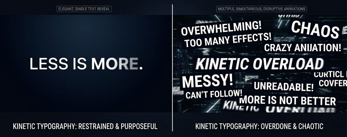
The difference between kinetic typography that elevates a design and kinetic typography that clutters it is restraint — one carefully crafted text animation commands attention; multiple simultaneous animations compete with each other and create visual noise that undermines the message they are meant to deliver.
At its best, kinetic typography elevates a website from a page of content to an experience — words arriving with the weight and intention of their meaning, motion and message working together rather than separately.
Want kinetic typography implemented professionally on your website?
Neel Networks designs and builds websites where motion design is purposeful, performant, and accessibility-compliant — including kinetic typography for hero sections, scroll-driven text reveals, and scroll-triggered narrative design. Talk to our team about your next project.