Dark Mode Websites: Design Best Practices and Implementation Guide
Dark mode has moved from a developer preference to a mainstream user expectation. Apple introduced system-wide dark mode in macOS Mojave in 2018. Google followed with Android 10 in 2019. Today, studies consistently show that between 55% and 82% of users have dark mode enabled on at least one of their devices — and a significant proportion of those users actively prefer websites that respect their system preference.
For businesses, dark mode is no longer optional on serious digital products. It is a design expectation that affects user satisfaction, time on site, accessibility, and increasingly, conversion rate. But dark mode done poorly — flat black backgrounds, unreadable text, broken contrast, ignored interactive states — creates a worse experience than no dark mode at all.
This guide covers everything you need to implement dark mode correctly: the design principles, the CSS implementation, the accessibility requirements, the common mistakes that break dark mode experiences, and the specific scenarios where dark mode is — and is not — the right design choice for a business website.
Why Dark Mode Matters for Business Websites in 2026
The business case for dark mode has three distinct dimensions — user experience, health and accessibility, and brand perception — and all three have strengthened significantly in recent years.
User Preference Is Now Mainstream
Dark mode adoption has crossed from early adopter behaviour into mainstream preference. Android’s Material Design team reported that more than 70% of Android users have enabled dark mode on their devices. Apple’s iOS usage data shows similar numbers. When a majority of your potential website visitors have dark mode enabled at the OS level, a website that ignores that preference is actively working against their preferred experience.
For websites that respect the prefers-color-scheme media query — automatically switching to dark mode for users who have set that preference — the user experience benefit is immediate: the site feels considered, modern, and tailored. For sites that force light mode on dark mode users, the contrast between their dark-mode OS and a bright white website is jarring and uncomfortable, particularly in low-light environments.
Reduced Eye Strain and Battery Benefits
Dark mode on OLED and AMOLED screens — which include most premium smartphones — delivers measurable battery life improvements because dark pixels require significantly less power than bright pixels. Studies from Google’s Android team found up to 63% power saving at full brightness on OLED displays when using dark mode. Beyond battery, dark mode reduces eye strain in low-light environments — a meaningful benefit for users reading long-form content in the evening.
Brand Perception and Premium Positioning
A well-executed dark mode communicates premium quality. The association of dark interfaces with sophistication is well-established — Apple’s own premium product pages, high-end automotive brands, luxury consumer goods, SaaS dashboards, and creative agencies consistently use dark aesthetics to signal quality. For businesses where premium positioning is a commercial strategy, a thoughtfully designed dark mode option reinforces that positioning at every interaction.
Dark mode done well communicates premium quality across every industry — from luxury consumer brands to enterprise SaaS products. The common thread is intentional colour choice, careful contrast management, and consistent application across all interface elements.
The Four Dark Mode Design Principles
Most dark mode implementations fail because designers approach them the same way they approach light mode — choosing colours that look good in isolation rather than colours that work systematically across an entire interface under varying conditions. These four principles separate genuinely excellent dark mode design from dark mode that merely exists.
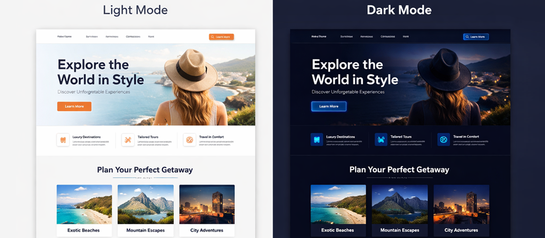
Principle 1: Dark Does Not Mean Black
The most common dark mode mistake is using pure black (#000000) as the background colour. Pure black against white text creates extreme contrast — far beyond WCAG requirements — that produces visual vibration and eye strain, particularly on high-refresh-rate displays. It also makes the interface look flat and cheap rather than sophisticated.
Material Design’s dark mode specification uses #121212 as its baseline surface colour. Apple’s macOS dark mode uses a family of dark greys ranging from approximately #1c1c1e to #2c2c2e. High-quality SaaS products typically use deep navy blues (#0d1117, #0f172a, #1b2b5e) or warm dark greys (#1a1a2e) that provide visual warmth without sacrificing readability.
The design principle: dark mode backgrounds should have a subtle tonal quality — slightly blue, slightly warm, or slightly purple — rather than being neutral black. This quality is what makes dark interfaces feel premium rather than simply inverted.
Principle 2: Elevation Through Lightness, Not Shadows
In light mode design, cards, modals, and elevated surfaces use shadows to communicate depth. In dark mode, shadows become nearly invisible against dark backgrounds — a dark shadow on a dark background is imperceptible.
Dark mode communicates elevation differently: through lightness. Surfaces that are higher in elevation — closer to the user in the visual hierarchy — are slightly lighter than the base background. A card sitting above a page background is not shadowed; it is a slightly lighter dark. A modal sitting above a card is slightly lighter still.
Material Design’s elevation system expresses this as a percentage white overlay: a 1dp elevation surface has 5% white overlay, 2dp has 8%, 8dp has 12%, 24dp has 16%. This systematic approach produces consistent, predictable hierarchy across an entire interface.
Principle 3: Desaturate Your Colours for Dark Backgrounds
Colours that look perfect on light backgrounds often feel aggressive, vibrant, or even painful when placed on dark backgrounds. A vivid blue (#1976D2) that is perfectly readable on white becomes uncomfortably intense on dark backgrounds at the same saturation level.
Dark mode colour palettes use desaturated, lighter versions of the same hues — moving away from saturated, dark-facing colours toward pastel-adjacent tones. A primary blue for light mode might be #1976D2; the dark mode equivalent might be #90CAF9 — the same hue family but significantly lighter and less saturated. This lightened version maintains the colour meaning while being gentle on the eyes against a dark background.
Principle 4: Fewer Accent Colours, More Intentional Application
Dark interfaces showcase accent colours more prominently than light interfaces — a coloured button or link on a dark background commands significantly more visual attention than the same element on white. This amplified effect means dark mode interfaces should use fewer accent colours, applied more deliberately.
Where a light mode interface might use three or four accent colours across its palette, a well-designed dark mode interface uses one or two — applied to the most important interactive elements and calls to action. Every colour decision in dark mode carries more visual weight, and that weight must be managed.
Dark Mode Colour System — What Actually Works
Here is a practical dark mode colour system for professional business websites, with specific hex values:
| Role | Light Mode | Dark Mode | Notes |
|---|---|---|---|
| Page background | #FFFFFF or #F5F7FA | #0F172A or #121212 | Never pure black — use deep navy or dark grey |
| Card / surface | #FFFFFF with shadow | #1E293B or #1C1C1E | Slightly lighter than page bg — elevation via lightness |
| Elevated card (modal) | #FFFFFF deeper shadow | #334155 or #2C2C2E | Even lighter still — maintains elevation hierarchy |
| Primary text | #1D1729 or #111827 | #F1F5F9 or #E2E8F0 | Not pure white — slightly warm off-white reduces glare |
| Secondary text | #6B7280 | #94A3B8 | Must maintain 4.5:1 contrast ratio against bg |
| Primary accent | #005182 (NN Blue) | #60A5FA or #93C5FD | Lightened, desaturated version of brand blue |
| CTA button | #005182 bg + white text | #1D4ED8 bg + white text | Slightly lighter than pure brand colour |
| Borders / dividers | #E5E7EB | #1E293B or rgba(255,255,255,0.1) | Subtle — borders should whisper, not shout |
| Input fields | #FFFFFF with grey border | #1E293B with lighter border | Must be clearly distinguishable from page background |
CSS Implementation: prefers-color-scheme Explained
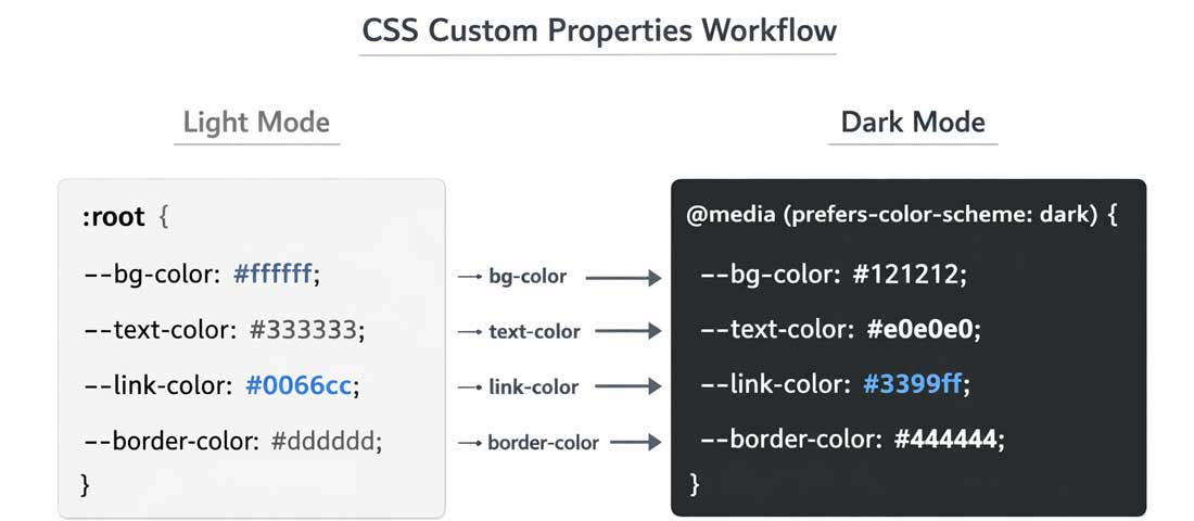
The CSS media query prefers-color-scheme detects the user’s OS-level dark mode preference and applies appropriate styles automatically — no JavaScript required, no toggle button needed. This is the cleanest, most performant approach to dark mode and the one recommended for most business websites.
The Basic Implementation Pattern
/* ─── Define all colours as CSS Custom Properties ─── */
:root {
  --colour-bg:        #ffffff;
  --colour-surface:   #f5f7fa;
  --colour-text:      #1d1729;
  --colour-text-muted:#6b7280;
  --colour-accent:    #005182;
  --colour-border:    #e5e7eb;
  --colour-cta:       #005182;
  --colour-cta-text:  #ffffff;
}

/* ─── Dark mode overrides ─── */
@media (prefers-color-scheme: dark) {
  :root {
    --colour-bg:        #0f172a;
    --colour-surface:   #1e293b;
    --colour-text:      #f1f5f9;
    --colour-text-muted:#94a3b8;
    --colour-accent:    #60a5fa;
    --colour-border:    rgba(255,255,255,0.1);
    --colour-cta:       #1d4ed8;
    --colour-cta-text:  #ffffff;
  }
}

/* ─── Use custom properties everywhere ─── */
body {
  background-color: var(--colour-bg);
  color:            var(--colour-text);
}

.card {
  background-color: var(--colour-surface);
  border:           1px solid var(--colour-border);
}

a { color: var(--colour-accent); }

.btn-primary {
  background-color: var(--colour-cta);
  color:            var(--colour-cta-text);
}
The key architectural decision is defining all colours as CSS Custom Properties (CSS variables) on :root in light mode, then overriding only those variables inside the prefers-color-scheme: dark media query. Every element automatically updates — no element-by-element dark mode styling required.
Adding a Manual Toggle (User Choice)
For websites where some users may want to override their OS preference, a manual dark/light toggle is valuable. The cleanest approach uses a data-theme attribute on the <html> element, toggled by JavaScript, with CSS Custom Properties defined for each state:
/* Light mode default */
:root,
[data-theme="light"] {
  --colour-bg:   #ffffff;
  --colour-text: #1d1729;
  /* ... all light values */
}

/* Dark mode via OS preference */
@media (prefers-color-scheme: dark) {
  :root:not([data-theme="light"]) {
    --colour-bg:   #0f172a;
    --colour-text: #f1f5f9;
    /* ... all dark values */
  }
}

/* Dark mode via manual toggle */
[data-theme="dark"] {
  --colour-bg:   #0f172a;
  --colour-text: #f1f5f9;
  /* ... all dark values */
}
// JavaScript toggle — saves preference to localStorage
const toggle = document.getElementById('theme-toggle');
const root   = document.documentElement;

// Load saved preference on page load
const saved = localStorage.getItem('theme');
if (saved) root.setAttribute('data-theme', saved);

toggle.addEventListener('click', () => {
  const current = root.getAttribute('data-theme');
  const next    = current === 'dark' ? 'light' : 'dark';
  root.setAttribute('data-theme', next);
  localStorage.setItem('theme', next);
});
Dark Mode for WordPress — The Right Approach
WordPress dark mode implementation depends on whether you are using a classic theme or block-based theme, and whether you want automatic OS-based switching or manual toggle capability.
Approach 1: Pure CSS in style.css (Simplest)
For WordPress themes where you control the CSS, add the prefers-color-scheme media query directly to your theme’s style.css using CSS Custom Properties as described above. This provides automatic dark mode for users with the OS preference set, with zero JavaScript overhead.
Approach 2: Simple Custom CSS and JS Plugin (Your Current Setup)
Since you already use the Simple Custom CSS and JS plugin, this is your fastest route to dark mode. Add the CSS Custom Properties approach to the Custom CSS section — it applies sitewide immediately without touching theme files.
Approach 3: WordPress Plugin (Non-Technical)
For WordPress sites where editing CSS directly is not feasible, the WP Dark Mode plugin provides automatic and manual dark mode switching with a visual customiser. It handles the complexity of dark mode across themes, page builders, and plugins — though it adds plugin overhead and the automated colour conversion is less refined than a custom implementation.
Typography in Dark Mode — The Rules Most Designers Miss
Typography behaviour changes significantly in dark mode — and many designers do not realise it until they see their carefully designed light mode typography looking wrong in dark mode. Here are the specific rules:
Reduce Font Weight in Dark Mode
Light text on a dark background has a slightly blooming quality on most screens — the light pixels spread slightly, making text appear bolder and heavier than the same weight text on a light background. A font at font-weight: 400 in light mode may look like font-weight: 500 in dark mode. Compensate by reducing font weight by one step in dark mode:
body { font-weight: 400; }

@media (prefers-color-scheme: dark) {
  body          { font-weight: 300; }
  h2, h3        { font-weight: 600; } /* was 700 in light mode */
  strong, b     { font-weight: 500; } /* was 600 in light mode */
}
Do Not Use Pure White for Body Text
Pure white (#FFFFFF) body text on a dark background creates extreme contrast — harsh and tiring to read at length. Use an off-white or light grey (#F1F5F9, #E2E8F0, #D1D5DB) that maintains excellent readability without the harshness of maximum contrast.
Increase Line Height Slightly
Reading light text on dark backgrounds is slightly more demanding for the visual system than the reverse. A marginally increased line height — from 1.7 to 1.8 in body text — improves readability in dark mode without being noticeable as a design change.
Images, Icons, and Media in Dark Mode
Images and icons present specific challenges in dark mode that pure CSS colour overrides cannot solve.
Photography and Illustrations
Photographs generally look fine in dark mode — most images are self-contained and do not depend on the surrounding background colour. The exception is images with white or light backgrounds (product photos, screenshots, diagrams) that appear as bright white boxes in dark mode, creating jarring contrast.
Solutions:
- CSS filter:
img { filter: brightness(0.85) contrast(1.1); }applied in dark mode slightly dims all images — reducing the jarring brightness of light-background images while keeping photographs looking natural - Dark mode specific images: Provide separate dark mode versions of key images (logos on white backgrounds, diagrams with white backgrounds) using the
<picture>element withmedia="(prefers-color-scheme: dark)"
SVG Icons
SVGs with hardcoded dark fill colours (fill="#1D1729") become invisible on dark backgrounds. Use fill="currentColor" on SVGs and let CSS colour inheritance handle the dark mode switch automatically — the icon colour will follow the text colour.
Your Logo in Dark Mode
If your logo is dark text on a transparent background (common for SVG logos), it will become invisible in dark mode. Solutions:
- Provide a light/white version of the logo specifically for dark mode
- Use a CSS filter:
filter: invert(1)inverts the colours (works for simple logos but can distort coloured logos) - Use the
<picture>element to serve different logo versions based onprefers-color-scheme
The CSS Custom Properties approach: define all colours as variables in light mode, override only those variables in the dark mode media query. Every element updates automatically — no element-by-element dark mode styling needed.
Dark Mode Accessibility — Contrast, Readability, and WCAG
Dark mode creates specific accessibility challenges that are distinct from light mode accessibility. The WCAG 2.1 contrast requirements (4.5:1 for body text, 3:1 for large text and UI components) apply equally in dark mode — but achieving them requires different techniques.
The WCAG Contrast Trap in Dark Mode
The most common accessibility failure in dark mode is secondary text — descriptions, captions, metadata, labels — that does not maintain sufficient contrast against dark backgrounds. Designers often use colours that look comfortable in dark mode without checking contrast ratios. Grey text that reads clearly on a white background can fail WCAG contrast requirements when lightened for dark mode contexts.
Test every text colour in your dark mode implementation with a contrast checker. The free WebAIM Contrast Checker (webaim.org) is the standard tool. Aim for 4.5:1 minimum for all body text — not just headlines.
Interactive State Visibility
Focus outlines — the visible indicator that appears when a user navigates with a keyboard — must be clearly visible in dark mode. The default browser focus outline (typically blue or black) often disappears against dark backgrounds. Define explicit focus styles for dark mode:
@media (prefers-color-scheme: dark) {
  :focus-visible {
    outline: 2px solid #60a5fa;      /* bright blue, visible on dark */
    outline-offset: 3px;
  }
}
Prefers-Reduced-Motion Interaction
Dark mode transitions — the animation that switches between light and dark — should respect the prefers-reduced-motion media query. Users who have set this preference have vestibular or sensitivity conditions that can be triggered by animations:
/* Smooth transition for users without motion sensitivity */
* { transition: background-color 0.3s ease, color 0.3s ease; }

/* No transition for users who prefer reduced motion */
@media (prefers-reduced-motion: reduce) {
  * { transition: none; }
}
Common Dark Mode Mistakes — and Exactly How to Fix Them
Pure black background (#000000)
Problem: Looks cheap, creates harsh contrast, causes eye strain on OLED.
Fix: Use #0F172A, #121212, or #1C1C1E. Never pure black.
Pure white text on dark background
Problem: Maximum contrast causes visual vibration and eye strain at length.
Fix: Use #F1F5F9 or #E2E8F0 — maintains readability without harshness.
Same saturated brand colours in dark mode
Problem: Vivid colours feel aggressive and painful on dark backgrounds.
Fix: Desaturate and lighten. #005182 → #60A5FA for dark mode.
Shadows for elevation in dark mode
Problem: Dark shadows on dark backgrounds are invisible — no depth signal.
Fix: Use lighter surface colours for elevated elements instead of shadows.
Hardcoded dark colours in SVG icons
Problem: fill=”#000000″ icons disappear on dark backgrounds.
Fix: Use fill=”currentColor” and let CSS colour cascade handle dark mode.
No testing on actual dark mode devices
Problem: Dark mode looks different on OLED vs LCD vs desktop monitors.
Fix: Test on an iPhone, an Android OLED, and a desktop monitor separately.
When Dark Mode Helps — and When It Does Not
| Business Type | Dark Mode Recommendation | Reason |
|---|---|---|
| Technology / SaaS products | ✅ Strongly recommended | Tech users expect it; dashboard data reads better on dark backgrounds |
| Creative agencies / design studios | ✅ Strongly recommended | Premium aesthetic signal; portfolio work showcases beautifully on dark |
| Web design agencies (like Neel Networks) | ✅ Recommended | Demonstrates design expertise; signals technical capability |
| eCommerce / product stores | ⚠️ Cautious approach | Product photography often designed for white backgrounds; conversion impact uncertain |
| Healthcare / medical | ❌ Generally avoid | Light mode signals clinical clarity, trust, and hygiene — dark mode conflicts with these associations |
| Legal / accounting / financial | ❌ Generally avoid | Trust and professionalism associations lean strongly toward light, clean interfaces |
| News / editorial / long-form blogs | ✅ Offer as an option | Readers value dark mode for evening reading; user-toggleable is ideal |
| Local services (restaurants, salons) | ⚠️ Industry dependent | Hospitality can work beautifully in dark; services generally better in light |
-
Audit your current colour system
Before starting implementation, document every colour used across your website — backgrounds, text, borders, buttons, icons, shadows. Map each to its function (primary text, secondary text, CTA, etc.). This audit is the foundation for a systematic dark mode palette. -
Convert to CSS Custom Properties
Replace all hardcoded colour values in your CSS with CSS Custom Properties defined on:root. This is the single most important implementation step — everything else depends on having a variable-based colour system in place. -
Design the dark mode palette
Create your dark mode colour set following the principles above: dark-but-not-black background, off-white text, desaturated accent colours, lighter surface colours for elevation. Check every colour pair against WCAG contrast requirements before proceeding. -
Add the media query override
Add the@media (prefers-color-scheme: dark)block with your dark mode Custom Property overrides. Test immediately in a browser with OS dark mode enabled. -
Address images and icons
Audit every image and icon for dark mode compatibility. Applyfill="currentColor"to SVGs, prepare dark mode logo variants, and consider thefilter: brightness(0.85)approach for images with light backgrounds. -
Test across devices and conditions
Test on: an iPhone with dark mode enabled, an Android device with OLED display, a desktop monitor, and a laptop screen. Test in genuinely dark conditions, not just at a bright desk. The dark mode experience that looks good in daylight often looks different at night. -
Consider adding a manual toggle
Once the automatic OS-based dark mode is working correctly, evaluate whether a manual toggle adds value for your audience. For tech-forward, design-conscious, or content-heavy sites — yes. For simple business brochure sites — probably unnecessary additional complexity.
Frequently Asked Questions About Dark Mode Website Design
| What is dark mode and how does it work on websites? | Dark mode is a colour scheme where the interface uses dark backgrounds (typically deep navy, dark grey, or near-black) with light-coloured text, instead of the traditional light background with dark text. On websites, dark mode is implemented using the CSS media query prefers-color-scheme: dark, which detects whether the user has enabled dark mode in their operating system settings and applies a dark colour scheme automatically. When a user has dark mode enabled on their iPhone, Android device, or desktop OS, websites that support this media query switch to their dark colour scheme automatically — no user action required on the website itself. Websites can also offer a manual toggle button that allows users to override their OS preference independently. |
| Does dark mode help or hurt website SEO? | Dark mode implemented correctly has no negative impact on SEO and can indirectly benefit it through user experience improvements. The prefers-color-scheme CSS media query is a purely client-side visual change — search engine crawlers see and index the same content regardless of which colour scheme is active. The indirect SEO benefits come through improved user experience metrics: users with dark mode preference who encounter a website that respects that preference tend to have lower bounce rates and longer session times — both signals that Google associates with quality content. Core Web Vitals are unaffected by dark mode implementation when done correctly with CSS Custom Properties, as there is no additional JavaScript or layout shift involved. |
| What colours should I use for a dark mode website background? | Never use pure black (#000000) as a dark mode background — it creates extreme contrast and makes interfaces look cheap rather than premium. The most widely used and well-regarded dark mode background colours are: #121212 (Material Design’s standard dark surface), #0F172A (Tailwind’s slate-900, used by many premium SaaS products), #1C1C1E (Apple’s iOS dark mode background), and deep navy variants like #0D1117 (GitHub’s dark mode) or #0F0F0F (near-black with a slight warmth). The common thread is that all of these have a subtle tonal quality — slightly blue, slightly warm, or slightly grey — rather than being neutral black. For elevated surfaces like cards and modals, use progressively lighter versions of the base background colour rather than shadows. |
| How do I add dark mode to a WordPress website? | There are three main approaches for adding dark mode to a WordPress website. The simplest is to define all colours as CSS Custom Properties in your theme’s style.css and add a @media (prefers-color-scheme: dark) block that overrides those variables — this requires CSS editing capability but produces the cleanest result with no plugins. The second approach is to use the Simple Custom CSS and JS plugin (if already installed) to add the CSS Custom Properties and media query without touching theme files. The third approach is to install the WP Dark Mode plugin, which provides a visual settings interface and handles the implementation automatically — though the automated colour conversion is less refined than a custom implementation. For WordPress block themes in 2026, the theme.json file includes native dark mode colour scheme support that can be configured without any CSS. |
| Is dark mode better for your eyes than light mode? | The answer depends significantly on the environment and the individual. In low-light conditions — reading at night or in a dimly lit room — dark mode produces considerably less eye strain than a bright white interface, because the screen emits less overall light and the contrast between the screen and the surrounding environment is lower. On OLED and AMOLED screens, dark pixels emit no light at all, further reducing the light output. In well-lit environments — working in natural daylight or a brightly lit office — light mode is often easier to read because the light background contrast is more similar to reading physical paper, and the higher ambient light means the screen brightness is less dramatic relative to its surroundings. Studies from the British Journal of Ophthalmology have found that both modes have merits in different conditions, and the best solution for eye health is offering users the choice of both. |
| Why do some images look bad in dark mode? | Images look bad in dark mode for two common reasons. First, images with white or light backgrounds — product photos on white, screenshots, diagrams, infographics — appear as bright white rectangles on dark backgrounds, creating jarring contrast that interrupts the dark mode experience. Second, images that are inherently dark (low-contrast photography, dark illustrations) can lose visual detail on dark backgrounds because the image and background blend together. The most effective solutions are: applying a CSS filter of `filter: brightness(0.85) contrast(1.05)` to all images in dark mode, which slightly dims light-background images while maintaining photograph quality; providing separate dark mode image versions using the HTML picture element with the `media=”(prefers-color-scheme: dark)”` attribute for your most prominent images; and designing new images with dark mode compatibility in mind — using transparent backgrounds rather than white for product images and diagrams. |
| Should every business website have dark mode in 2026? | Not every business website needs dark mode in 2026, but the case for offering it has strengthened significantly as OS-level dark mode adoption has crossed 50 to 70% of users on mobile devices. Technology companies, creative agencies, SaaS products, and design-forward brands should implement dark mode — it is a user expectation in these sectors and its absence is now noticed. Long-form content websites and blogs should strongly consider it given the reading environment benefits. Healthcare, legal, financial, and government websites generally benefit from staying with light interfaces where clinical clarity and trust signals are paramount design requirements. eCommerce sites should evaluate carefully — product photography is typically designed for white backgrounds, and the conversion rate impact of dark mode on purchasing decisions is not yet well-established. The optimal approach for any business is to implement automatic dark mode via the prefers-color-scheme media query — it costs minimal additional development effort and delivers meaningful experience improvement for the majority of users who already have dark mode enabled. |

A well-implemented dark mode website looks consistently excellent across every device — because it is built on a systematic colour architecture, not a collection of individual overrides.
Want Dark Mode Implemented Correctly on Your Business Website?
Neel Networks designs and develops websites that implement dark mode systematically — with proper CSS architecture, WCAG-compliant contrast, and a colour system built to work beautifully in both modes from the ground up. Talk to our design team about your next project.
Custom Web Design Services UI/UX Design Services WhatsApp Us