Dopamine Design: Why Bright, Bold Websites Are Converting Better in 2026
The grey-on-white minimalism that defined business websites for the last decade is finally losing its grip. The sites that are converting in 2026 look almost nothing like the cautious, restrained templates that ruled 2018 to 2023. They are loud, colourful, character-driven, opinionated about their typography, and unafraid to take up space. The category has a name now — dopamine design — and it is producing measurably better conversion numbers than the muted aesthetic it is replacing, in the right kinds of businesses.
We have redesigned and rebuilt enough websites in the last twelve years to know which design trends actually shift conversion and which ones only photograph well in case studies. Dopamine design is one of the rare ones that does both. This article walks through what it actually is, why the shift happened, where it works and where it backfires, and how to evaluate whether your business can pull it off without breaking the trust signals your buyers already rely on. If you are starting from the foundations of how brand and visual identity interact, our complete brand identity guide is the right place to begin before diving into surface treatment decisions.
What dopamine design actually is, beyond the buzzword
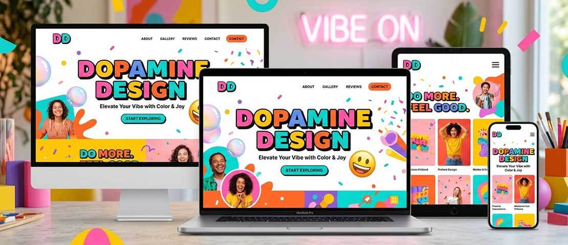
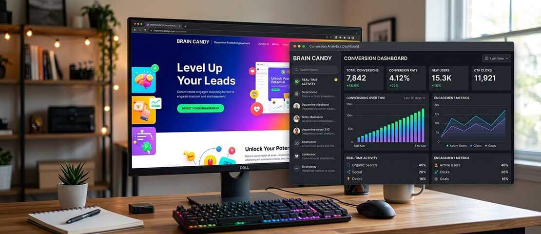
Strip away the social-media framing and dopamine design is a fairly specific set of choices. Saturated, often unblended colour as the dominant visual element. Oversized display typography that takes up half the screen at the hero. Custom character illustration replacing stock photography. Generous use of warm hues — orange, hot pink, lime, electric purple — where the previous generation of websites would have used a careful blue or a safe grey. Friendly geometry: rounded corners, soft shadows, expressive shapes. And almost always, motion that responds to the user — micro-animations, hover states, scroll-linked effects — calibrated to feel alive without overwhelming the page.
The point of all this is emotional. Dopamine design tries to trigger a feeling in the first second the page loads, before the visitor has read a single word. Interest, recognition, sometimes amusement, occasionally surprise. That feeling is what makes someone keep scrolling instead of bouncing, click a second link instead of leaving, remember the brand a week later when they need what the brand sells. The visual treatment is the delivery mechanism. The conversion outcome is the actual product.
What dopamine design is not is chaos. The good versions still respect visual hierarchy, conversion logic, accessibility standards and brand consistency. The difference between a dopamine site that converts and a dopamine site that just looks busy is almost entirely about restraint applied in the right places. Five competing colours is chaos. One dominant colour with two accent hues is dopamine design. Three different display fonts is amateur. One oversized headline font paired with a clean body face is intentional. The line between effective and exhausting is thinner than it looks.
Why the shift happened: five forces behind the change
Dopamine design did not emerge from a single designer or a single product. Five separate shifts in how people use the web, how buying decisions get made, and how brands compete for attention have converged over the last 24 months. Each one is real, each one is measurable, and each one explains why the muted aesthetic that worked in 2020 is failing in 2026.
1. Minimalism reached its breaking point
For roughly a decade, every well-funded software company shipped a website that looked broadly the same. White background. Grey-on-charcoal serif logo. Sans-serif body text. A single muted blue accent for buttons. A subtle gradient somewhere. The aesthetic was meant to signal seriousness, trust, and product-led credibility — and for the first few years it did. By 2023 it had reached saturation. Every fintech, every SaaS tool, every digital-first agency was running variations of the same template. The look that was meant to signal sophistication had become indistinguishable from the look of every direct competitor. At that point, restraint stopped being a differentiator and started being a liability.
2. Mobile attention spans have collapsed further
The window you have to capture a visitor on mobile has shrunk again. Industry-wide bounce rates on mobile have ticked up across most verticals over the last two years, and the average visit length on a mobile landing page is now well under 30 seconds for first-time visitors. A subtle, restrained design loses that 30-second window. A site that punches you in the eye with one bold colour and one oversized headline at least earns the next ten seconds. Dopamine design is in large part a mobile-first response to a problem that minimalist desktop design was never built for.
3. Gen Z is reading websites differently
The buying cohort that is now entering its peak earning years was raised on TikTok, Instagram and Discord. Their visual literacy is significantly higher than the cohort that grew up on text-heavy web pages, and their tolerance for muted corporate design is significantly lower. They scan first, read second. They expect personality. They actively prefer brands that feel human and a little weird over brands that feel polished and corporate. In categories where Gen Z controls the purchase decision — direct-to-consumer goods, creator tools, consumer fintech, food and beverage — dopamine design is no longer optional. It is the price of admission.
4. AI-generated design made everything look the same
The flood of AI-generated mockups, AI-generated marketing copy and AI-generated illustration that hit the web in 2024 and 2025 produced a side effect nobody fully predicted. Because all the models were trained on broadly similar data, the outputs converged toward the same visual centre. Pastel gradients. Generic abstract shapes. Vaguely friendly stock illustration. The result was a strange new homogeneity — sites that looked AI-generated were everywhere, and they all looked vaguely like each other. Dopamine design, with its custom illustration, bespoke colour palettes and personality-driven detail, is now one of the clearest signals that a brand has actually been thought about by humans rather than generated wholesale.
5. The conversion data started catching up
Designers had been arguing for bolder, more expressive interfaces for a few years before the buyer side started agreeing. What changed is that the conversion data finally caught up. Brands that ran proper A/B tests between their muted previous-generation websites and dopamine-aesthetic replacements started reporting consistent uplifts — usually in the 15 to 40 percent range — on conversion-relevant metrics like scroll depth, second-page click-through and email signup rate. Not every test was positive, and the wins were concentrated in specific industries. But the pattern was clear enough that the design conversation stopped being theoretical. The bold sites were demonstrably outperforming the safe ones, in the right contexts.
The five major design approaches in 2026, compared
Dopamine design did not arrive alone. It is one of five distinct design approaches competing for mindshare in 2026, and the right answer for your business depends on where your buyer sits, what category you compete in, and what emotional outcome you actually need at the moment of conversion. The table below maps the five approaches against the kinds of businesses where each one tends to work.
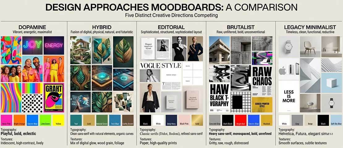
| Design approach | Visual signature | Best fit | Conversion strength |
|---|---|---|---|
| Dopamine design | Saturated colour, oversized typography, character illustration, expressive motion | DTC, creator tools, consumer fintech, mid-market SaaS, food, fitness | High recall, strong scroll depth, fast initial engagement |
| Modern hybrid | Restrained base with dopamine accents — one bold colour, one personality element | Most growing businesses, B2B SaaS that wants to stand out without losing trust | Most reliable broad-audience conversion in our recent client data |
| Editorial minimalist | Black, white, serifs, careful spacing, premium photography | Luxury, premium B2B, high-end services, wealth management | Trust-led, slow but high-value conversion |
| Brutalist / anti-design | Stark, raw, deliberately rough, system-font heavy, unstyled forms | Niche creative, art, music, deliberately countercultural brands | Polarising — strong recall in target, low mainstream conversion |
| Legacy minimalist SaaS | Grey, blue, lots of whitespace, subtle gradients, stock illustration | Enterprise B2B selling to procurement, healthcare, regulated finance | Trust signal preserved but declining differentiation in most categories |
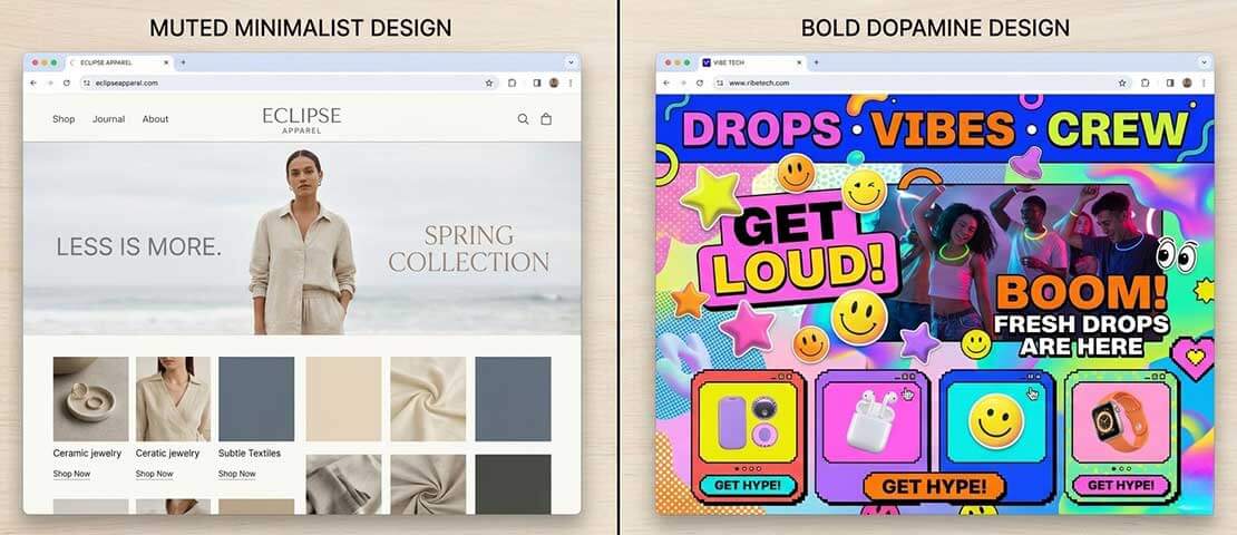
The mistake businesses make at this decision point is treating the choice as a question of taste. It is not. It is a question of what emotional state your buyer needs to be in at the moment they convert, and which visual treatment puts them there fastest. A wealth management firm needs trust. Dopamine design fights against trust. A direct-to-consumer skincare brand needs desire and personality. Legacy minimalism fights against both. The right answer is the one that supports your conversion goal, not the one that looks best in a design portfolio.
Where dopamine design works, and where it backfires
The strongest pattern across our client work and across the broader market in 2026 is that dopamine design is not universally applicable. It is highly effective in some categories, neutral in others, and actively counterproductive in a third group. Knowing which group your business falls into is the difference between a redesign that lifts conversion and one that quietly damages it.
Works strongly: Direct-to-consumer product brands. Creator-economy tools and platforms. Consumer fintech aimed at users under 40. Mid-market SaaS that competes against generic-looking incumbents. Fitness, wellness and lifestyle brands. Food and beverage. Mobile-first products where the first impression is captured on a 6-inch screen. Categories where your buyer is making a fast, partly emotional purchase decision and where standing out from competitor sameness is the primary battle.
Works in a hybrid form: B2B SaaS selling to modern teams rather than enterprise procurement. Marketing agencies, design studios, creative service businesses. Education platforms. Mid-market professional services where the buyer is younger or where the firm wants to signal that it is the modern alternative to its incumbent competitors. In these categories, the full dopamine treatment is often too loud, but a restrained base with a single bold accent — a strong colour, a confident headline typography, a memorable illustration system — outperforms either extreme.
Backfires: Premium luxury, where restraint is the signal of quality. Wealth management, private banking, anything where you are selling financial trust. Legal, accounting, regulated professional services. Healthcare, particularly anything involving regulated patient data. Funeral services, life insurance, anything where the buyer needs to feel that the brand takes their concern seriously. Enterprise B2B selling to procurement committees where playfulness reads as immaturity. In these categories, dopamine design works against the emotional outcome you need, and the conversion impact is consistently negative.
Wondering if your business is the right fit for a bolder design direction?
If you are weighing a redesign and not sure whether your brand can carry a more expressive visual treatment, we are happy to look at your existing site and your competitive set and give you a straight answer. No pressure, no pitch — just an honest read on whether the conversion case is there.
The six elements of a converting dopamine site
The dopamine sites that actually convert — as opposed to the ones that just photograph well — share a fairly tight set of structural choices. None of these are particularly difficult to implement, but the discipline of holding the line on all six at once is what separates a strong site from a chaotic one. The framework below is what we build against when we are commissioned to deliver a dopamine-aesthetic site for a client whose brand can carry it.
-
Lead with one dominant colour, not five
The strongest dopamine sites pick a single saturated hero colour and let it own the entire visual identity. One supporting accent and a neutral base is the maximum. Five competing colours read as chaos and weaken every part of the layout. The discipline of restraint at the palette level is what makes the bold treatment work. -
Oversize the typography deliberately
Hero text at 80 to 120 pixels on desktop is normal in dopamine design, and the bigger the type, the more aggressively it needs to be hinted and balanced against everything else on the page. Body type still has to be readable at 16 to 18 pixels — the dopamine treatment is in the display layer, not the prose layer. Type choice matters more than ever, and the trade-offs are covered in our font pairing and type selection guide. -
Use custom illustration to add personality
Stock illustration is the death of dopamine design. The look depends on character — a recognisable visual personality that signals the brand was actually thought about. Custom character illustration, custom iconography or a distinctive shape system is what carries the difference. A bespoke illustration set costs more than stock, but it is the single highest-return investment in the entire visual identity. -
Use friendly geometry, not corporate angles
Generous border-radius on buttons, cards and containers. Soft drop shadows. Curved section dividers. Rounded image masks. The geometry of dopamine design signals approachability without crossing into infantilisation. The line is real and it matters — squishy enough to feel friendly, sharp enough to feel adult. -
Apply motion with restraint
Subtle scroll-linked animations. Micro-interactions on hover. Gentle reveal animations as sections enter the viewport. Never auto-playing hero video. Never aggressive parallax. Never motion that hijacks the scroll. The motion in a good dopamine site is calibrated to feel alive, not to demand attention away from the conversion path. -
Keep the conversion structure underneath
A clear primary call to action in the navigation. One conversion goal per page. Trust signals — testimonials, client logos, security badges, statistics — visible above the fold and reinforced through the page. Forms that work. Buttons that are obvious. The dopamine layer sits on top of this structure. It does not replace it. The brands that confuse the layers are the ones that ship beautiful sites with broken conversion paths.
How to test whether your brand can carry it
Before commissioning the work, it is worth running your business through a short honest test. The four questions below are what we ask in our own discovery calls when a client comes in asking for a more expressive design direction, and the answers usually decide the brief.
First, look at your buyer persona. If your primary buyer is under 45 and your purchase decision is partly emotional, dopamine design is almost certainly a fit. If your primary buyer is over 50 or sits inside a procurement function, a hybrid approach is usually safer than the full dopamine treatment.
Second, audit your competitive set. Open the websites of your top five direct competitors in a single browser session and look at them as a buyer would. If they all look broadly the same — same colour palette, same typography choices, same illustration style — then the dopamine treatment is a structural differentiator. If they already vary widely, the visual treatment will not be the lever that wins the category.
Third, check your existing brand equity. Do you own a single bold colour that customers already associate with your brand? If yes, dopamine design lets you scale that recognition. If you have spent five years building equity in a particular muted blue, throwing that out for a hot pink is more disruptive than it is differentiating, and the right move is often a gradual evolution rather than a full rebrand.
Fourth, think honestly about your team’s ability to maintain the standard. Dopamine design is hard to keep clean. Custom illustration needs ongoing production. Motion needs developer attention. Type and colour discipline needs a design lead who will say no to bad applications. If you do not have the internal capacity or an external partner committed to upholding the standard, a more restrained design system is easier to live with long term. The deeper logic of how visual systems support brand growth is covered well in our piece on brand building through graphic design.
The common mistakes that wreck dopamine sites
Almost every dopamine site that fails to convert fails for the same handful of reasons. None of these is technically complex to avoid, but they require design discipline that gets stripped out when timelines compress or when the team building the site is not the team that will live with it.
- Too many competing colours. Three or more saturated hues fighting for attention is the single most common failure. The eye cannot decide where to land, and the bounce rate rises instead of falling.
- Illustration that does not match the brand voice. Whimsical character illustration on a financial services site reads as unserious. Corporate iconography on a consumer skincare site reads as cold. The illustration system has to track the brand personality, not the design trend.
- Forgetting accessibility. Hot pink on lime green looks great in the design file and fails WCAG contrast standards on the live site. Roughly one in twelve men has some form of colour blindness. A loud site that excludes a measurable portion of your audience is not a high-converting site.
- Animation that hijacks the user. Scroll-jacking, autoplay video with sound, mandatory intro animations, motion that you cannot dismiss. Each of these has a measurable bounce impact, and on mobile the impact is larger.
- Performance budgets blown. Custom illustration, motion, and bold typography all add weight. A dopamine site that takes 6 seconds to load on a mobile network loses every conversion benefit it gained from the visual treatment. The performance work has to be done from day one.
- Treating the redesign as a one-off. A dopamine site needs ongoing creative input. The brands that ship one beautiful site and then bolt on new pages over the next two years end up with a Frankenstein. The visual standard has to be enforced every time something new is added.
- Losing the conversion path entirely. A page that is fun to look at but where the primary call to action is not obvious within three seconds has solved the wrong problem. The visual experience is the wrapper, not the substitute, for the conversion goal.
What you should actually measure
The conversion case for dopamine design is real, but it shows up in specific metrics rather than in raw conversion rate alone. Brands that measure only the headline conversion number often miss the lift, because the strongest signals appear earlier in the funnel and over a longer time horizon.
Bounce rate is usually the first thing that moves. A well-executed dopamine redesign typically reduces mobile bounce by 10 to 25 percent within the first month, simply because more first-time visitors decide the page is worth a second look. This is the entry-point metric and it is the cleanest to attribute.
Scroll depth follows bounce rate. The percentage of visitors who reach the bottom of the page tends to climb meaningfully — often by half — because the visual rhythm of a dopamine site is built to keep the eye moving downward. This matters because every section below the fold is a chance to address an objection, build trust or reinforce the offer.
Click-through to a second page is the metric that correlates most cleanly with eventual conversion. A visitor who clicks past the landing page is roughly five times more likely to convert than one who does not. Dopamine design tends to lift this metric by 20 to 40 percent in the categories where it fits, and that single number does more for the eventual revenue line than almost anything else you can change about the site. For deeper coverage of how page-level design directly drives conversion, our guide to high-converting landing page design goes further into the patterns that work.
Brand recall is the long tail. In post-purchase customer surveys, brands that ran a dopamine redesign consistently see higher unaided brand recall scores six to twelve months later. This compounds. The visitor who remembers your brand a week after they first saw it is the visitor who comes back without you having to pay for the second visit.
A note on the design treatment versus the design system
One distinction worth being clear about. Dopamine design is a surface treatment. It is what shows on the screen. A design system is the rules and tokens that govern the surface — colour values, type scales, spacing units, component definitions, illustration guidelines. A site can have a strong dopamine treatment on top of a thoughtful design system, in which case it remains consistent as the team adds pages and features. A site can also have a dopamine treatment with no underlying system, in which case it falls apart within a quarter as different contributors apply the surface in inconsistent ways.
If you are commissioning a redesign in 2026 and you are taking it in a dopamine direction, insist on the design system as a deliverable alongside the visible pages. The design tokens — colours, type, spacing, components — should be documented, named, and handed over in a way your future team can pick up. Without that, every new page is a fresh design exercise and the visual standard erodes. With it, the brand stays sharp even as the surface evolves. This is also where surface treatment intersects with the broader brand decisions covered in our glassmorphism design treatment guide — different surface looks, same underlying need for a system that holds them together.
So is dopamine design right for your business?
The honest answer is that it depends on three things: who your buyer is, what category you compete in, and what you can credibly maintain over time. For consumer brands selling to under-40 buyers in homogenised categories, dopamine design is one of the strongest design moves available in 2026 and the conversion case is well-supported by recent data. For B2B SaaS selling to modern teams, a hybrid treatment is usually the right answer — restrained base with one or two bold elements that signal the brand has thought about its identity. For institutional buyers, regulated industries and premium-trust categories, dopamine design works against the conversion goal and a more restrained editorial approach is the better fit.
Whichever direction your business takes, the larger lesson of the last two years is that visual passivity has stopped being a safe option. The default minimalist template that worked from 2018 to 2023 no longer signals trust or sophistication — it signals that the brand has not made a decision. In 2026, every credible website expresses an opinion about itself, whether that opinion is bold, restrained, editorial or hybrid. The brands that win in their category are the ones that pick an opinion, hold it consistently, and back it up with the substance behind it. Dopamine design is one of those opinions. It is not the only one. But it is the one most aggressively rewriting conversion expectations in mainstream consumer-facing categories right now, and any business in those categories needs to have a clear position on whether to adopt it, adapt it, or actively resist it.
Frequently asked questions
| What is dopamine design? | Dopamine design is a website design approach that uses saturated colour, oversized typography, custom character illustration, friendly geometry and expressive motion to trigger an emotional response in the first second the page loads. The aim is to break through the visual sameness of the minimalist aesthetic that dominated business websites from roughly 2018 to 2023 and to win attention in a mobile-first, attention-starved buying environment. The good versions still respect visual hierarchy and conversion logic — the surface treatment sits on top of a disciplined design system, not in place of one. |
| Does dopamine design work for B2B websites? | It depends on which kind of B2B. Modern B2B SaaS selling to younger teams — design tools, productivity software, mid-market vertical SaaS — can carry a hybrid form of dopamine design and often benefits from it because the visual signal helps the brand stand out from generic-looking incumbents. Enterprise B2B selling to procurement committees, regulated industries and risk-averse buying functions usually does not. In those categories, the playfulness of dopamine design works against the trust signal the buyer needs, and a more restrained editorial approach typically converts better. The rule of thumb is that the younger and less institutional the buyer, the more dopamine treatment the brand can carry. |
| How is dopamine design different from maximalism? | Maximalism is the broader design movement of reacting against minimalism — using more colour, more pattern, more visual density, more decoration. Dopamine design is a specific, more disciplined branch of maximalism focused on emotional response and conversion outcome. A maximalist site can be ornate, decorative or visually busy in ways that have nothing to do with conversion. A dopamine design site is structured around triggering a fast emotional read while keeping the conversion path clean. They overlap, but they are not the same thing. Dopamine design is closer to a conversion strategy expressed visually than to a pure aesthetic movement. |
| Will dopamine design hurt my SEO? | Not inherently. The risks are technical rather than aesthetic. Heavy custom illustration, animation and motion can blow your performance budget if they are not optimised properly, and slow pages do hurt SEO. Oversized headline typography can also cause layout shift issues if it is not implemented carefully. The fix is straightforward — proper image and SVG optimisation, careful animation choices, attention to Core Web Vitals, and a development team that treats performance as a design constraint rather than an afterthought. A well-built dopamine site can hit the same Core Web Vitals scores as a minimalist one. A poorly built one will drag those scores down regardless of the visual style. |
| How expensive is it to build a dopamine design website? | A proper dopamine design site costs meaningfully more than a template-based minimalist build, mostly because of the custom illustration and motion work. The visual identity layer — custom illustration system, distinctive type treatment, motion library, design tokens — typically adds 30 to 60 percent to the cost of the equivalent restrained build, depending on the depth of the system you commission. The trade-off is that the resulting site is genuinely differentiated and the visual standard scales as the business grows. Cheaper template-based attempts at the look almost always end up reading as derivative, and the conversion lift evaporates when the site does not feel custom. |
| Can dopamine design be made accessible? | Yes, but it has to be a design constraint from day one rather than a fix bolted on at the end. The accessibility risks specific to dopamine design are colour contrast (bright saturated colours often fail WCAG standards when used together), motion sensitivity (some users are physically affected by aggressive animation), and colour-only information (relying on colour alone to convey meaning excludes colour-blind users). All three are solvable. Pick a dominant colour and a neutral that hits WCAG AA contrast for body text. Honour the user’s reduced-motion preference at the system level. Pair colour with shape, label or pattern so that information is never carried by colour alone. A dopamine site can fully meet accessibility standards. It just has to be built that way deliberately. |
| Is dopamine design just a passing trend? | The specific surface treatment will evolve — the hot pink and lime green of 2026 will not be the hot pink and lime green of 2029. The underlying shift is more durable. The reasons dopamine design emerged — mobile attention compression, the homogeneity of AI-generated and template-driven design, the buying power of a younger cohort with different visual expectations, the saturation of minimalist SaaS aesthetics — are structural forces rather than fashion choices. The aesthetic will move, but the principle that websites need to express a distinctive visual opinion to compete for attention is not going away. Brands that invest in a strong design system now will be able to evolve the surface treatment as the trend shifts, without having to rebuild from scratch every few years. |
Considering a bolder design direction for your next site?
We design and build websites across the full spectrum from restrained editorial through to expressive dopamine — and we are happy to help you work out which direction your brand can credibly carry. Send us your current site and we will come back with an honest read on the design and conversion case within one business day.