The Ultimate Website Redesign Guide: Signs, Mistakes & SEO-Safe Strategies (2026)

Your website is not a one-time project — it is a living business asset that needs to evolve as your business grows, as technology changes, and as user expectations shift. A website that was well-built five years ago may be actively working against your business today: losing search rankings because of poor Core Web Vitals, failing to convert mobile visitors, and presenting a visual impression that no longer matches the quality of what you actually deliver.
What this guide covers
- 1. 10 Clear Signs Your Website Needs a Redesign in 2026
- 2. 10 Design Mistakes That Quietly Kill Conversions
- 3. 7 Costly Web Development Mistakes to Avoid
- 4. Website Redesign Secrets Most Businesses Overlook
- 5. How to Redesign Without Losing Your SEO Rankings
- 6. When Is the Right Time to Redesign — And When Should You Wait?
- 7. Frequently Asked Questions About Website Redesign
- 8. Conclusion: A Great Redesign Is an Investment, Not an Expense
But redesigning a website is not something to do impulsively, and it is certainly not something to do without a clear strategy. Done well, a website redesign can dramatically improve your search rankings, your conversion rates, and your overall business credibility. Done poorly — without protecting your existing SEO, without addressing the underlying problems, or while repeating the same design mistakes — it can cost you rankings you spent years building and leave you with a new website that performs worse than the old one.
This guide brings together everything you need to know about website redesign in 2026: how to know when your site genuinely needs a redesign, the design mistakes that quietly kill conversions, the web development mistakes that undermine performance, the secrets most businesses overlook, and — critically — how to redesign without losing your hard-earned SEO rankings.
10 Clear Signs Your Website Needs a Redesign in 2026
The decision to redesign a website should be driven by evidence, not by aesthetic restlessness. Here are the 10 most reliable indicators that your current website has reached the point where a redesign is a business necessity rather than a luxury.

Sign 1: Your Website Fails Google’s Core Web Vitals
Core Web Vitals — Largest Contentful Paint (LCP), Interaction to Next Paint (INP), and Cumulative Layout Shift (CLS) — are direct Google ranking factors. If your website is failing these benchmarks, it is losing search visibility against competitors whose sites pass them. You can check your Core Web Vitals scores for free using Google Search Console (under “Experience”) or PageSpeed Insights. Failing scores on an existing website are often better addressed through a redesign than through patch-fixes, particularly if the underlying theme or codebase is bloated or poorly structured.
Sign 2: Your Website Looks Noticeably Older Than Your Competitors
Visual dating is real and it matters commercially. When a potential customer visits three websites in your industry and two look modern and one looks like it was built in 2016, the modern ones start with a credibility advantage before a single word is read. This is not about chasing every design trend — it is about the fact that user expectations are set by the best digital experiences they encounter every day, and a website that looks significantly behind the times raises questions about whether the business behind it is keeping up too.
Sign 3: Mobile Experience Is Poor
If your website was not built with genuine mobile-first thinking — if it has tiny text that requires pinching to read, navigation that is difficult to use with a thumb, buttons that are too small to tap accurately, or a layout that simply shrinks without restructuring — it is failing the majority of your visitors and being penalised by Google. A poor mobile experience is one of the most commercially damaging problems a website can have in 2026, and it typically requires a redesign to fix properly rather than incremental patches.
Sign 4: Your Bounce Rate Is High and Conversions Are Low
If Google Analytics shows that visitors are landing on your website and leaving quickly without engaging — and particularly if they are leaving without making contact or submitting an enquiry — your website is not doing its job. High bounce rates combined with low conversion rates typically indicate one or more of the following: the value proposition is unclear, the design does not build trust, the content does not answer the visitor’s questions, or the calls to action are weak or missing. These are structural problems that a redesign addresses at the root.
Sign 5: Your Business Has Changed But Your Website Has Not
Businesses evolve. New services are added, old ones are discontinued, target markets shift, brand positioning changes. If your website still reflects what your business was three or four years ago rather than what it is today — if there are services listed that you no longer offer, if the positioning language no longer matches your current market positioning, if the visual brand has evolved but the website has not caught up — it is creating a disconnect that potential customers will notice.
Sign 6: You Are Embarrassed to Share Your Website URL
This is one of the most honest and reliable indicators. When a potential client asks for your website address and you feel a slight hesitation — a quiet wish that the site was better before they see it — that feeling is important data. Your website is your business’s most visible representation. If you are not proud to share it, it is not working for you.
Sign 7: Your Website Is Not Appearing in AI-Powered Search Results
Google AI Overviews, Perplexity, and ChatGPT are increasingly where potential customers first encounter businesses. If your website lacks structured data, FAQ content, clear entity signals, and well-organised, question-answering content, it will not be cited by these AI platforms. A modern redesign in 2026 should include AI-search-readiness as a core deliverable — which older websites built before 2023 almost certainly lack.
Sign 8: Your Website Does Not Integrate With Your Current Business Tools
Modern business websites are not isolated digital brochures — they connect to CRM systems, email marketing platforms, booking tools, live chat systems, and analytics platforms. If your current website was built on outdated technology that makes these integrations difficult, clunky, or impossible, it is limiting your ability to capture and manage leads effectively.
Sign 9: The Content Management System Is Painful to Use
If updating your website content — adding a new blog post, changing a phone number, updating a service description — requires either technical expertise you do not have or waiting for a developer, your CMS is the wrong tool for your needs. A redesign is an opportunity to move to a more accessible, user-friendly content management system that allows your team to keep the website current without technical barriers.
Sign 10: Your Hosting and Security Infrastructure Is Outdated
Websites running on old PHP versions, outdated WordPress installations, expired SSL certificates, or hosting environments with poor performance are security risks and performance liabilities. If your website’s underlying infrastructure has not been meaningfully updated in several years, a redesign combined with a hosting upgrade is often the most efficient way to address both the visible and invisible problems simultaneously.
10 Design Mistakes That Quietly Kill Conversions
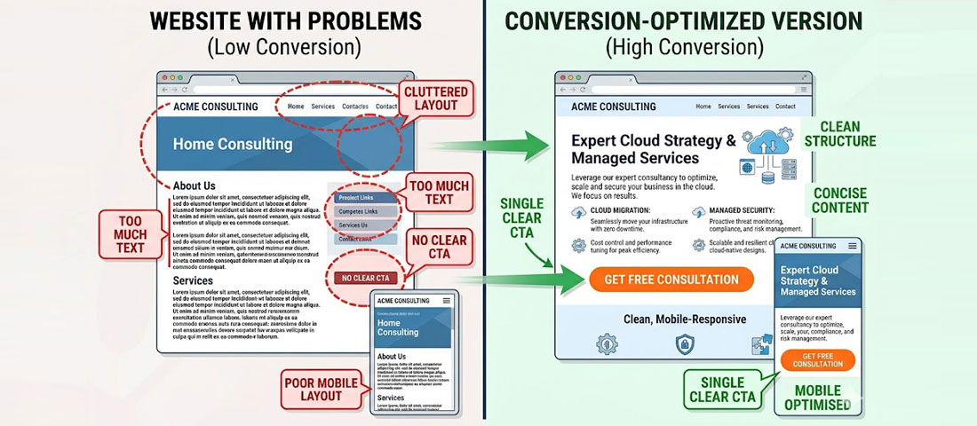
The difference between a website that converts and one that does not is often not dramatic — it is the accumulated effect of several small but significant design decisions.
Mistake 1: No Clear Value Proposition Above the Fold
The “fold” — the area of a webpage visible without scrolling — is the most valuable real estate on your entire website. If a visitor cannot understand what your business does, who it serves, and why they should care within the first five seconds, most will leave. The most common version of this mistake is a homepage that opens with a beautiful image and a tagline so abstract it communicates nothing specific: “Empowering businesses to achieve their potential.” That tells a visitor nothing. A clear, specific value proposition tells them exactly what you do and why they should keep reading.
Mistake 2: Too Many Calls to Action — or None At All
Both extremes kill conversions. A webpage with no clear CTA leaves visitors without a next step — they read, they feel positive, and then they close the tab. A webpage with eight different CTAs competing for attention creates decision paralysis. Every key page should have one primary CTA (the action you most want visitors to take) and optionally one secondary CTA (a lower-commitment alternative for visitors who are not yet ready for the primary action). On a service page, that might be “Get a Free Quote” as the primary and “View Our Portfolio” as the secondary.
Mistake 3: Walls of Text Without Visual Hierarchy
Online reading behaviour is fundamentally different from print reading. Web users scan before they read — they look for headings, bullet points, bold text, and visual breaks that tell them whether a section is relevant to them before committing to reading it. A webpage that presents information as continuous, unbroken paragraphs creates a scanning dead-end. Visitors do not read more carefully — they leave. Effective web content uses headings, subheadings, short paragraphs, bullet lists, and highlighted key statements to make scanning easy and to reward visitors who do read in depth.
Mistake 4: Stock Photography That Signals Inauthenticity
Generic stock photography — particularly the ubiquitous images of diverse groups of people in business attire looking extremely happy about a laptop — is one of the fastest credibility-killers on a business website. Visitors recognise stock photos immediately, even if they cannot articulate why, and they create an impression of a business that cannot or will not show its real people and real work. Custom photography of your team, your workspace, and your actual work is dramatically more effective at building trust, even if the production quality is modest.
Mistake 5: Slow Loading — Especially on Mobile
Every additional second of load time costs you conversions. Research consistently shows approximately 7% conversion loss per extra second of load time beyond the first two seconds. On mobile, where connections are slower and patience is shorter, the impact is even more significant. Page speed is both a user experience issue and a direct Google ranking factor, which means a slow website costs you twice: fewer visitors find it, and fewer of the visitors who do find it stay long enough to convert.
Mistake 6: Navigation That Requires Thought
Good navigation is invisible — visitors move through your website without thinking about the navigation because it is obvious and logical. Poor navigation forces visitors to think about how to find what they need, creating friction that many will not bother to overcome. Common navigation mistakes include: too many menu items (more than 7 top-level items), vague or clever labels that are not self-explanatory, no clear “Contact” or “Get a Quote” link always visible, and nested dropdown menus that are difficult to use on mobile.
Mistake 7: No Social Proof Visible Without Scrolling
Trust signals — testimonials, review scores, client logos, case study statistics — are some of the most conversion-influential elements on a business website. Yet many businesses bury them below the fold or on a separate testimonials page that most visitors never reach. Your strongest trust signal should be visible above or near the fold on your homepage and service pages. Even a single specific, attributed testimonial visible without scrolling increases conversion rates meaningfully.
Mistake 8: Forms That Ask for Too Much
Every additional field in a contact form reduces the completion rate. Asking for name, email, phone, company name, company size, industry, budget range, timeline, how they heard about you, and a detailed description of their needs in a single form will dramatically reduce enquiries — even from visitors who genuinely want to get in touch. The optimal contact form for most service businesses asks for three to five fields: name, email, phone (optional), and a brief message. Additional qualification information can be gathered in the follow-up conversation.
Mistake 9: No Mobile-Specific Design Thinking
A website can be technically “responsive” — meaning it resizes to fit different screen sizes — without being genuinely designed for mobile use. Responsive without mobile-first thinking produces layouts where desktop-designed elements simply shrink, rather than being reconsidered for the small-screen context. Hamburger menus that hide all navigation, multi-column layouts that stack awkwardly, small tap targets, and text that becomes unreadably small are all symptoms of responsive-but-not-mobile-first design.
Mistake 10: Ignoring Page Speed for “Fancy” Elements
Full-screen video backgrounds. Heavy JavaScript animation frameworks. Dozens of third-party scripts loading on every page. These elements have a real cost — in page load time, in Core Web Vitals scores, and in the user experience of visitors on slower connections or older devices. The most effective websites in 2026 achieve visual impact within tight performance constraints. If your website scores poorly on Google PageSpeed Insights, the “fancy” elements are almost certainly part of the reason.
7 Costly Web Development Mistakes to Avoid
Beyond design mistakes, there are development-level decisions that can undermine a website’s performance, security, and longevity — and that are much more expensive to fix after the fact than to get right initially.
Development Mistake 1: Not Building Accessibility In From the Start
Adding accessibility features (proper ARIA attributes, keyboard navigation, sufficient colour contrast, screen reader compatibility) after a website is built is far more expensive than building them in from the beginning. In addition to the ethical argument for accessibility, the legal argument is growing stronger: ADA and WCAG compliance is increasingly required for businesses serving customers in the USA, UK, and EU, and accessibility lawsuits against non-compliant websites have increased significantly.
Development Mistake 2: No Schema Markup
Schema markup (structured data) is one of the most consistently overlooked elements in web development, and its absence is increasingly costly in the AI-search era. Without schema markup — Organisation, Service, FAQPage, and LocalBusiness schemas at minimum — search engines and AI systems have to infer your business information from unstructured content. With schema markup, you communicate it directly and precisely. This affects featured snippet eligibility, AI Overview citations, knowledge graph accuracy, and local search visibility.
Development Mistake 3: Choosing the Wrong Platform or Technology Stack
Building on a platform that cannot grow with your business, that limits your ability to integrate with other tools, or that creates ongoing maintenance headaches is a costly long-term mistake. The right platform depends on your specific requirements — but the decision should be made based on your business needs, not on what the developer is most comfortable building with or what was cheapest to set up. A WordPress website built on a quality, performance-optimised theme with a well-selected plugin set is the right choice for most service businesses. An overcomplicated custom-built solution often creates maintenance problems and vendor lock-in.
Development Mistake 4: No Backup and Recovery System
A website without regular, automated, off-site backups is a business risk. Hosting providers fail. Hackers succeed. Updates break things. Without a reliable backup system, any of these events can result in significant data loss and extended downtime. Automated daily backups stored off-site (separate from your hosting provider) are a standard requirement for any professional website, not an optional add-on.
Development Mistake 5: Ignoring Image Optimisation
Images are typically the largest contributor to page load time on a poorly optimised website. Images that have been uploaded at full resolution from a camera, that have not been compressed, or that are served in outdated formats (JPG, PNG) rather than modern alternatives (WebP, AVIF) add seconds to load times. A professional website in 2026 serves appropriately sized, modern-format, compressed images — ideally with lazy loading so images below the fold only load when they are about to come into view.
Development Mistake 6: Hard-Coding Content That Should Be Dynamic
Hard-coding content — embedding text, phone numbers, addresses, team names, or service descriptions directly into page templates rather than into a CMS — makes websites inflexible and expensive to update. Every time a phone number changes or a team member leaves, a developer has to manually update every page where that information appears. A properly built website stores all regularly updated content in the CMS and pulls it dynamically into templates.
Development Mistake 7: No Staging Environment for Testing Changes
Making changes — plugin updates, design adjustments, new feature additions — directly on a live website is a risky practice that can break functionality in front of real visitors. A staging environment (a private copy of the website where changes can be tested before being pushed to the live site) is a professional development standard that prevents update-related breakages from ever reaching your visitors.
Website Redesign Secrets Most Businesses Overlook
Beyond avoiding mistakes, there are positive strategies that most businesses do not think about when planning a redesign — and that can significantly amplify the return on their investment.
Secret 1: Analyse Your Current Data Before You Design Anything
Your existing website — even if it is underperforming — contains valuable data about what is and is not working. Before a redesign begins, thoroughly analyse your Google Analytics data: which pages get the most traffic, which have the lowest bounce rates, which are generating conversions, and which are losing visitors quickly. This data should directly inform the redesign — keeping what works, fixing what does not, and ensuring that high-performing content is prioritised in the new architecture.
Secret 2: Map Your Customer Journey Before You Map Your Sitemap
Most websites are structured around what the business wants to say about itself, rather than around how a customer actually moves through a decision process. The most effective websites are structured around the customer journey: from awareness (“I have a problem”) to consideration (“what are my options”) to decision (“why should I choose this provider?”). Mapping this journey before designing your sitemap produces a website structure that matches how your potential customers actually think and move.
Secret 3: Redesign Content and Design Together, Not Separately
One of the most common and expensive website redesign mistakes is designing the website first (often using “lorem ipsum” placeholder text) and then filling in the content afterward. This produces a disconnect between how the design is intended to work and what the actual content needs to communicate. The most effective redesign processes develop content strategy and design simultaneously — so the design is shaped by real content requirements, and the content is written to fit the visual hierarchy and page structures being designed.
Secret 4: Plan for Conversion Optimisation From Day One
Most websites launch with a design and then, months later, begin thinking about conversion rate optimisation as a separate exercise. The most effective approach integrates conversion thinking into the design from the very beginning: ensuring heatmap and scroll tracking are set up at launch, planning A/B tests for key elements before the site goes live, and building a roadmap for post-launch optimisation that begins as soon as there is real user data to work with.
Secret 5: Your Competitors Are Your Most Useful Research
Before briefing a design agency, spend time on your main competitors’ websites. Note what they do well, what they do poorly, and what gaps exist that you could fill. Look at their messaging, their trust signals, their CTAs, their content depth. This research should directly inform your redesign brief — helping you to identify both opportunities to differentiate and baseline standards you must meet or exceed.
How to Redesign Without Losing Your SEO Rankings
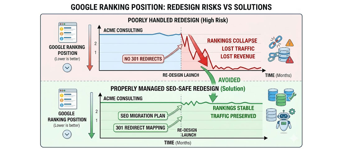
Without a proper SEO migration strategy, a website redesign can cause dramatic and long-lasting ranking drops — even if the new website is technically superior.
One of the most common and most damaging website redesign mistakes is launching a new website without protecting the SEO equity of the old one. This happens when URLs change without proper 301 redirects in place, when pages that were ranking well are removed without equivalent replacement content, or when the new site has technical issues (canonicalisation errors, broken internal links, missing meta data) that were not caught before launch.
The result: rankings that took years to build can drop dramatically within days of a new website going live — even if the new website is visually and functionally superior. Recovering from a post-redesign ranking drop is slow, expensive, and frustrating. Preventing it is straightforward if you follow the right process.
The SEO-Safe Redesign Framework
-
Audit and document everything before you start
Before any design or development work begins, document your existing website comprehensively: all URLs (use Screaming Frog or a similar crawler), all page titles and meta descriptions, all pages that currently rank in Google Search Console, all backlinks pointing to your domain (use Ahrefs or SEMrush), and all pages that generate traffic or conversions. This is your baseline and your migration map. -
Map every old URL to its new equivalent
Create a complete redirect map: for every URL on the old website, identify the corresponding URL on the new website. If the new website has the same URL structure, no redirects are needed for most pages. If the URL structure is changing — which it often is in a redesign — every old URL must be mapped to its new equivalent, or to the most relevant page if no direct equivalent exists. No URL should be left unredirected. -
Implement 301 redirects before the new site goes live
301 redirects tell Google that a page has permanently moved to a new URL and that the SEO equity (ranking power) from the old URL should be transferred to the new one. These must be set up and tested before the new website launches — not added afterward when rankings have already dropped. For WordPress websites, the Redirection plugin handles 301 redirects effectively without requiring server-level access. -
Preserve (or improve) all existing meta data
Every page on the new website should have a title tag and meta description that are at least as good as the old page’s — ideally better, based on your current keyword research. Do not launch a new website with blank meta data, default theme titles, or pages missing their meta descriptions. Export all existing meta data before the redesign and use it as the starting point for the new site. -
Keep all high-performing content
If a page on your old website is generating significant organic traffic or generating leads, that page should exist on the new website in an improved form — not be removed. Removing high-performing content without replacement is one of the fastest ways to lose rankings. If the new site architecture does not have a natural place for certain high-performing pages, create one. -
Test on a staging environment before going live
Before the new website goes live, verify every redirect is working correctly (no redirect chains, no 404 errors), that all pages have proper meta data, that the sitemap is correctly generated and submitted, and that there are no critical technical SEO issues (crawlability problems, canonicalisation errors, noindex tags left on from development). A pre-launch technical SEO audit is not optional — it is essential. -
Monitor Search Console closely for 30 days after launch
In the days and weeks after a website redesign, monitor Google Search Console daily: watch for a spike in 404 errors (indicating broken URLs that were not redirected), coverage issues, and ranking changes. Address any problems as quickly as possible — the sooner they are fixed, the less impact they have on long-term rankings.
Important: Neel Networks handles all SEO migration work as part of every website redesign project — including pre-redesign URL auditing, redirect mapping, meta data migration, and post-launch Search Console monitoring. This is not an optional extra; it is a standard component of our redesign process, because a redesign that damages your SEO is not a successful redesign.
When Is the Right Time to Redesign — And When Should You Wait?
Not every website that is less than perfect needs a full redesign. Sometimes targeted improvements — a homepage refresh, a new mobile navigation approach, updated content, improved page speed — can address the most critical issues at lower cost and disruption than a complete redesign.
A full redesign makes the most sense when:
- The visual design is significantly outdated relative to your competitors and industry standards
- The underlying technology or platform is limiting what you can do (integrations, speed, CMS usability)
- The current sitemap and information architecture do not match your current business and service offering
- Core Web Vitals failures are structural (embedded in the theme or codebase) rather than fixable through optimisation
- The brand positioning or target audience has changed significantly
- Multiple serious issues exist simultaneously and would require as much work to patch as to rebuild
Incremental improvements make more sense when:
- The overall structure and technology are sound but specific elements need updating
- The website was well-built recently and primarily needs content updates or performance tuning
- Budget constraints mean a full redesign is not currently possible — in which case, prioritise the highest-impact improvements
Frequently Asked Questions About Website Redesign
| How often should a business website be redesigned? | There is no fixed rule, but most professional websites begin to show their age and underperform against modern standards after three to five years. Technology changes, user expectations evolve, and your own business and brand will develop over that time. Rather than setting a calendar-based redesign schedule, monitor the 10 signs outlined in this guide: when two or more of them apply to your current website, it is time to seriously evaluate whether a redesign is the right investment. A website that was well-built in 2021 may still be performing strongly in 2026 with maintenance and content updates; one built in 2019 with outdated technology may need a full rebuild. |
| Will a website redesign hurt my Google rankings? | A website redesign will not hurt your Google rankings if it is executed correctly — but it absolutely can if it is done without a proper SEO migration strategy. The key risks are: URLs changing without 301 redirects in place (causing Google to treat new pages as new, losing all ranking equity from old pages); high-performing content being removed; technical errors (noindex tags, canonicalisation issues) being introduced; and meta data being lost or degraded. All of these risks are fully preventable with proper pre-launch planning, a comprehensive redirect map, and post-launch Search Console monitoring. At Neel Networks, SEO migration is a standard component of every redesign project. |
| How long does a website redesign take? | The timeline for a website redesign depends on the scope of the project and how ready the client is with content and feedback. A focused business website redesign (10 to 20 pages) typically takes 8 to 12 weeks from project kickoff to launch — including discovery and strategy, design, client review and revision, development, content integration, testing, SEO migration setup, and launch. More complex redesigns — larger sites, eCommerce, custom features, multiple languages — typically take 12 to 20 weeks. Delays most commonly arise from slow content delivery or feedback from the client side, which is why having your content strategy and key assets ready before the project begins helps significantly. |
| What should I look for when choosing a website redesign agency? | When choosing a website redesign agency, look for: a portfolio of redesign work that demonstrates both design quality and measurable results (not just visual before-and-afters); a structured process that explicitly includes SEO migration planning; clear communication about what is and is not included in the quoted price; named team members who will work on your project (not vague references to “our team”); a realistic timeline with clear milestones; post-launch support and warranty period; and references or case studies from clients in similar industries or of similar size to your business. |
| What is the biggest mistake businesses make when redesigning a website? | The biggest single mistake businesses make when redesigning a website is redesigning for aesthetic reasons without addressing the underlying performance, content, and conversion problems that were causing the website to underperform. A new design on top of thin content, missing calls to action, poor SEO foundations, and slow load times produces a website that looks better but performs similarly to the old one. A successful redesign starts with a clear diagnosis of why the current website is underperforming, and addresses those root causes — not just the visual surface. |
| How much does a website redesign cost in India vs USA or UK? | A professional website redesign from a quality Indian agency like Neel Networks typically costs 50 to 70% less than an equivalent redesign from a comparable agency in the USA or UK. This cost advantage reflects the efficiency of India’s skilled technology workforce rather than any difference in quality, process, or deliverables. Neel Networks delivers the same scope — full mobile-first redesign, SEO migration, schema markup, Core Web Vitals optimisation, CMS setup, and post-launch support — as Western agencies, with the additional advantage of 12+ years of experience working specifically with international clients in the USA, UK, Canada, and Australia. |
| What is a 301 redirect and why is it important in a website redesign? | A 301 redirect is an instruction that tells search engines (and browsers) that a page has permanently moved from one URL to another. When you redesign a website, URLs often change — either because the site structure is reorganised or because the URL format changes. Without 301 redirects from old URLs to new ones, Google treats the new pages as entirely new content, and all the ranking equity built up by the old pages is lost. With proper 301 redirects in place, Google transfers approximately 90 to 99% of the ranking power from the old URL to the new one, preserving your hard-earned search positions. Every URL that changes in a redesign must have a 301 redirect — no exceptions. |
Conclusion: A Great Redesign Is an Investment, Not an Expense

A website redesign done right is not a cost — it is one of the highest-ROI investments a growing business can make. A website that converts 50% better than its predecessor, that ranks higher in search, that projects credibility to every visitor, and that works seamlessly for the majority of your audience who visit on mobile devices will generate additional revenue that compounds year after year.
The businesses that treat their website as a living, evolving asset — investing in it strategically, measuring its performance, and improving it continuously — consistently outperform those that treat it as a one-time project to be done and forgotten.
At Neel Networks, we have been redesigning business websites for over a decade. We have learned what works, what does not, and what separates a redesign that delivers lasting business results from one that simply produces a more attractive version of a website with the same underlying problems. If you are thinking about a redesign — or wondering whether you need one — we are happy to give you an honest assessment.
Ready to redesign your website the right way?
Talk to Neel Networks about a redesign that improves performance, protects your SEO, and delivers a website you are proud to share with every potential client.
Website Redesign Services Get a Free Consultation WhatsApp Us