UI vs UX: Key Differences & How Great Design Increases Website Revenue (2026)

If you have ever been involved in a website project — either as a business owner briefing an agency, or as someone inside a business responsible for the digital presence — you have almost certainly heard the terms UI and UX used interchangeably, semi-interchangeably, or with a vague sense that they mean something similar but not exactly the same. You are not alone in this confusion, and it is worth resolving it clearly — because understanding the difference between UI and UX is not just an academic exercise. It has direct, measurable implications for your website’s revenue performance.
What this guide covers
- 1. UI vs UX — What Is the Actual Difference?
- 2. Why UI and UX Directly Impact Your Website Revenue
- 3. 7 UX Principles That Turn Website Visitors Into Paying Customers
- 4. Essential Web Design Elements for Better User Engagement
- 5. 5 UX Mistakes That Are Killing Your Conversions in 2026
- 6. How to Audit Your Own Website’s UX Without a Specialist
- 7. UI vs UX in Practice: What This Means for Your Next Website Project
- 8. Frequently Asked Questions About UI and UX Design
- 9. Conclusion: The Website That Earns Revenue Is the One That Respects the User
This guide explains precisely what UI and UX mean, how they differ, and how they interact. It then goes further — covering the core UX principles that drive visitor engagement and conversion, the most common UX mistakes that are killing conversions on business websites today, and the practical strategies for improving both the user experience and the visual interface of your site to generate better business results.
UI vs UX — What Is the Actual Difference?
The definitions of UI and UX are frequently muddled, even by people in the industry. Here is the clearest way to think about the distinction:
UI (User Interface) is what users see and interact with. It is the visual layer of a website or application — every button, icon, colour choice, typography decision, layout, image, form field, and interactive element. Good UI design makes an interface look appealing, feel polished, and communicate brand identity clearly. A beautifully designed homepage with carefully chosen colours, well-selected typography, and visually compelling imagery is an example of good UI.
UX (User Experience) is how users feel when they use it. It is the holistic experience of using a website — how easy it is to find what you are looking for, how logical the flow from arrival to action feels, how quickly questions get answered, how much effort it takes to complete a task (filling in a form, finding a phone number, understanding a service offer), and whether the overall interaction leaves the user feeling satisfied and confident or confused and frustrated. Good UX is largely invisible — users are not aware of good UX because everything simply works smoothly.
The relationship between UI and UX is not hierarchical — neither is more important than the other. They are complementary disciplines that need to work in concert. A website can have beautiful UI (visually stunning) with terrible UX (impossible to navigate, confusing, slow to answer questions). And it can have excellent UX (logical, clear, easy to use) with poor UI (visually dated or unappealing). Both failures cost you customers.
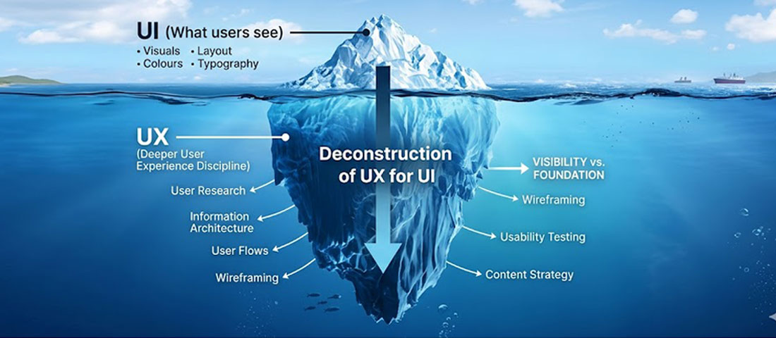
UI is the visible tip of the iceberg. UX is the much larger, deeper foundation that determines whether the interface actually works for users.
Why UI and UX Directly Impact Your Website Revenue
This is not a theoretical point — the relationship between UI/UX quality and business revenue is well-documented and commercially significant.
On the UX side: research published by Forrester found that every £1 invested in UX returns £100 in value — a 9,900% ROI. Studies consistently show that improving the UX of a website’s conversion path can increase conversion rates by 200 to 400%. The specific reason is intuitive — when it is easy and enjoyable to move from “interested” to “contacting you,” more people complete that journey.
On the UI side: research from Stanford found that 75% of consumers judge the credibility of a business based on their website’s visual design alone. First impressions happen in 50 milliseconds — faster than conscious thought. A visually substandard website creates a negative credibility signal before a single word is read. In competitive markets where multiple providers offer comparable services, UI quality can be the deciding factor in whether a visitor chooses to engage.
Together, the argument is compelling: businesses that invest in both excellent UI (creating a strong first impression and professional visual identity) and excellent UX (making it easy for visitors to find what they need and take action) consistently outperform those that neglect either dimension.
7 UX Principles That Turn Website Visitors Into Paying Customers
Every visitor follows a journey from arrival to action. Good UX removes friction from every step of that journey.
Principle 1: Clarity Over Cleverness
The most consistent UX lesson from a decade of conversion research is that clarity outperforms cleverness every time. When businesses try to be creative with their navigation labels, their CTAs, or their value proposition — using clever phrases instead of plain descriptions — they create cognitive load. Visitors have to think about what things mean rather than simply recognising them. Every moment of cognitive friction reduces the probability of conversion.
In practice, this means: your navigation should use the most obvious, descriptive labels possible. “Services” is better than “What We Do.” “Contact Us” is better than “Let’s Talk” — for the navigation label, at least. Your CTA should tell visitors exactly what happens when they click: “Get a Free Quote” rather than “Take the Next Step.” Your headline should describe what you actually do, not what you aspire to be.
Principle 2: Reduce Every Form of Friction
Friction in UX terms means anything that creates effort, hesitation, or difficulty in the path between a visitor’s intention and the action they intend to take. Friction takes many forms: a long contact form that asks for too much information; a checkout process with too many steps; navigation that requires multiple clicks to reach a key page; content that buries the answer to an obvious question inside three paragraphs of background context; a phone number that is not clickable on mobile.
The UX discipline of friction reduction is about systematically identifying every point where effort is required and asking: can this be eliminated, simplified, or accelerated? Each friction point you reduce increases the proportion of visitors who complete the intended action.
Principle 3: Design for the Scanning User, Not the Reading User
Eye-tracking research consistently shows that web users do not read pages linearly — they scan. They look for visual anchors: headings, bold text, bullet points, images, and white space that help them decide whether a section is relevant to their needs before committing to reading it. Content that is not designed for scanning — continuous, unbroken paragraphs without visual hierarchy — fails the majority of its visitors before they have read a single word.
Designing for scanning means: use descriptive headings that summarise the content below them; bold the most important phrases within paragraphs; use bullet lists for information that is genuinely list-like; keep paragraphs short (3 to 4 sentences maximum); and use white space generously to prevent the visual density that causes users to skim and leave.
Principle 4: Match User Expectations at Every Stage
Users arrive at your website with mental models — expectations about how websites in your category look and behave, where things will be found, and what will happen when they interact with elements. When your website violates these expectations — when the menu is in an unexpected location, when clicking a button does something unexpected, when a page layout does not follow the conventions of your industry — users experience disorientation that reduces trust and increases bounce rates.
This does not mean websites should be identical — there is significant room for distinctive design within established patterns. It means that deviating from conventions requires a strong reason and a clear benefit, because the default cost of violating user expectations is negative.
Principle 5: Build Trust at Every Touchpoint
Trust is not built in a single moment on a website — it accumulates (or erodes) across every element a visitor encounters. Every design decision either adds to or subtracts from the visitor’s sense that your business is credible, competent, and worth engaging with. The trust-building elements of good UX include: professional, consistent visual design; specific, attributed testimonials; clear information about who you are and how you work; transparent pricing or pricing guidance; easy-to-find contact information; and technical signals of credibility like HTTPS, fast load times, and a website that works correctly on mobile.
Principle 6: Optimise for the Critical Path
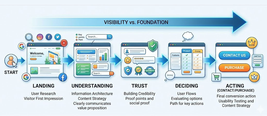
Every website has a “critical path” — the sequence of interactions that, when completed, delivers the most valuable outcome for the business. For a service business, this is typically: arrive → understand the service → feel trust → make contact. UX optimisation should focus first and most intensely on removing every friction point from this critical path. Pages outside the critical path — blog posts, about the team pages, portfolio details — still matter, but they are secondary to ensuring the core conversion journey is as frictionless as possible.
Principle 7: Test, Measure, and Improve Continuously
Good UX is not a one-time achievement — it is a continuous process. User behaviour changes. Competitive context changes. Business objectives change. A website that was well-optimised for UX in 2023 may have UX problems in 2026 that did not exist before. Regular user testing (even informal testing with five people thinking aloud as they try to complete tasks on your website) surfaces problems that analytics data alone misses. Heatmaps, session recordings, and A/B testing tools allow you to measure the impact of UX changes and build a growing evidence base for what works.
Essential Web Design Elements for Better User Engagement
Beyond the broader UX principles above, there are specific web design elements whose presence or absence has a consistently measurable impact on user engagement. These are the building blocks of a website that holds visitors’ attention and converts them into enquiries.
Above-the-Fold Content That Immediately Answers “Am I in the Right Place?”
The first screenful of content that a visitor sees — without scrolling — needs to immediately confirm that they have found what they were looking for. This means your primary headline should be specific and descriptive, not abstract and aspirational. Your subheadline should expand on the headline with one or two more specific details. And there should be a visible CTA that offers a clear next step for visitors who are immediately convinced.
Consistent Visual Hierarchy
Visual hierarchy is the organisation of design elements to guide the eye in a specific sequence — from most important to least important. A well-designed page has a clear visual hierarchy: the headline is the most dominant element, followed by supporting imagery or content, followed by body text, followed by CTAs. When everything on a page is the same visual weight — same font size, same colour treatment, same prominence — nothing stands out and the eye does not know where to focus.
Strategic Use of White Space
White space (also called negative space) is the empty area between design elements. Counterintuitively, more white space almost always improves comprehension and conversion — it reduces cognitive load by preventing visual clutter, it gives important elements room to breathe and attract attention, and it signals confidence and quality. Websites that are heavily cluttered with competing elements feel untrustworthy and chaotic. Websites with generous white space feel considered and professional.
Sticky Navigation for Long-Format Pages
On pages with significant content — service pages, about pages, long-form blog posts — keeping the navigation and primary CTA visible as users scroll is a meaningful UX improvement. When visitors have scrolled 80% down a long service page and are now convinced and ready to make contact, requiring them to scroll back to the top to find the contact link is an unnecessary friction point. Sticky headers that remain visible as users scroll eliminate this friction.
Interactive Elements That Respond Immediately
Micro-interactions — the small visual responses that occur when users hover over buttons, click elements, or scroll past sections — are not decoration. They are feedback signals that tell users their interaction has been registered and help them understand what is interactive and what is not. A button that changes colour slightly when hovered, a form field that highlights when active, a menu item that underlines when focused — these are UX signals that make the interface feel responsive and alive.
Accessible Colour Contrast and Typography
Colour contrast between text and background is both an accessibility requirement and a readability issue that affects all users. WCAG 2.1 AA guidelines require a minimum contrast ratio of 4.5:1 for normal text and 3:1 for large text. Websites that fail this standard are not just inaccessible to users with visual impairments — they are harder for everyone to read, particularly in bright outdoor conditions on a mobile screen. Typography size (minimum 16px for body text on web), line spacing (1.5 to 1.8em), and line length (50 to 75 characters per line) all affect reading comfort in ways that directly influence how long visitors engage with your content.
5 UX Mistakes That Are Killing Your Conversions in 2026

Poor UX on mobile is one of the most common and most costly conversion killers for business websites in 2026.
UX Mistake 1: Making Users Hunt for Contact Information
This is so common and so damaging that it deserves to be the first mistake. If a visitor who is ready to make contact has to hunt — through menu items, footer links, or page after page — to find a phone number, email address, or contact form, a significant proportion of them will give up and contact a competitor instead. Your contact information and primary CTA should be immediately visible on every page of your website without any effort from the visitor. On desktop, this typically means in the header. On mobile, it means a visible “Call” or “WhatsApp” button that is always accessible, ideally in a persistent element.
UX Mistake 2: Autoplay Video and Audio
Auto-playing video or audio when a visitor arrives on your website is one of the fastest ways to generate immediate negative emotion — surprise, annoyance, loss of control. If a visitor is browsing at work, in a public space, or simply without headphones and your website suddenly plays a video with sound, their immediate instinct is to close the tab. Even for visitors who do have audio on, unwanted autoplay feels intrusive and removes their sense of agency over the experience. Video is an effective conversion tool on websites — but only when the user chooses to play it.
UX Mistake 3: Forcing Account Creation Before Value Is Delivered
Requiring visitors to create an account, register, or fill in extensive information before they can access the information or experience they came for is a significant conversion barrier. In the context of service business websites, this might manifest as requiring visitors to fill in a long qualification form before seeing any information about pricing or process, or requiring registration before viewing a detailed portfolio. The principle of “value before ask” — giving users something genuinely useful before asking them for information or commitment — is one of the most consistently supported findings in UX research.
UX Mistake 4: Inconsistent Design Language Across Pages
When different pages of a website look like they were designed independently — different typographic styles, different colour treatments, different layout approaches, different CTA styles — visitors experience a subconscious sense of inconsistency that undermines trust. A professional, credible website has a consistent design language: the same typefaces, the same colour system, the same component styles, and the same spatial relationships used coherently across every page. Inconsistency signals either a lack of attention to detail or a website that has been built piecemeal over time without design oversight.
UX Mistake 5: Not Designing for Error States
Error states — what happens when a form submission fails, when a search returns no results, when a page is not found, or when a required field is missed — are one of the most commonly neglected aspects of website UX. A visitor who encounters an unhelpful error message (“Error 500. Please try again.”), a completely blank search results page, or a generic 404 page with no navigation options is likely to leave — often permanently. Well-designed error states acknowledge the problem in plain language, offer an obvious next step, and preserve the user’s progress where possible.
How to Audit Your Own Website’s UX Without a Specialist
You do not need to hire a specialist to begin identifying UX problems on your website. Here is a practical self-audit framework that any business owner or marketing manager can use:
-
The five-second test
Show your homepage to someone who has never seen it before. After exactly five seconds, remove it and ask them: What does this business do? Who does it serve? What should you do next? If they cannot answer these questions accurately, your above-the-fold UX has a clarity problem that is costing you conversions. -
The mobile walk-through
Pick up your phone, open your website in a browser, and try to complete the following tasks: find your phone number, understand what your most important service includes, find a client testimonial, and submit an enquiry. Note every moment of friction or confusion. These are your UX priorities. -
Review your Google Analytics data
Identify: which pages have the highest bounce rates; which pages have the longest average time on page (often indicating engagement, but sometimes indicating confusion); which pages are the most common exit points before conversion; and which pages are in the conversion path but have high drop-off rates. These data points map your UX problems to specific pages. -
Install a heatmap tool
Free or low-cost tools like Hotjar or Microsoft Clarity show you exactly where users click, how far they scroll, and where they stop engaging on your pages. A heatmap showing that the majority of visitors never scroll below the fold on your homepage tells you something critical about whether your above-the-fold content is answering their needs. A click map showing visitors repeatedly clicking on non-interactive elements tells you those elements are being mistaken for links. -
Check your forms
If you have a contact form, review how many fields it asks for and how often it is abandoned versus completed. Form abandonment rate is one of the clearest UX metrics available. If visitors are starting your form and not finishing it, either the form is too long, the fields are confusing, or the form is appearing at a point in the journey when visitors are not yet ready to commit. -
Test your load speed on mobile
Use Google PageSpeed Insights to test your website on mobile. A score below 50 in mobile performance indicates load time problems that are likely causing significant bounce rate and conversion rate losses. Address the top recommendations before investing in any other UX improvements — because no amount of good design compensates for a website that makes users wait.
The most important insight about UX: The best user experience is one that users are completely unaware of — because everything is so clear, logical, and frictionless that they move effortlessly from arrival to action without ever noticing the design. The moment a user notices they are struggling with your website, you have a UX problem. The goal is a website experience so smooth that the only thing users are thinking about is your business — not about how to use your website.
UI vs UX in Practice: What This Means for Your Next Website Project
When briefing a web design agency for a new website or redesign, here is how to ensure that both UI and UX receive proper attention:
- Ask about the UX discovery process. A professional agency should begin with a discovery phase that covers: your target audience and their goals, your competitors and market context, your current website’s performance data, and the user journeys you want to optimise. UX that is not preceded by research is decoration dressed as strategy.
- Ask to see wireframes before visual design. Wireframes — low-fidelity layouts that define the structure and content hierarchy of each page without visual styling — are where UX decisions are made. Reviewing wireframes before the visual design begins ensures that the information architecture, content hierarchy, and conversion flow are correct before significant design investment is made.
- Ask how the design will be tested. Will the design be user-tested before development? Will there be A/B testing planned for key pages post-launch? Professional UX practice does not end at launch — it builds in mechanisms for measurement and improvement.
- Ask about mobile UX specifically. How does the mobile experience differ from the desktop experience? Is mobile being designed first, or adapted from desktop? What special UX considerations have been made for mobile navigation, touch targets, and mobile-specific content hierarchy?
Frequently Asked Questions About UI and UX Design
| What is the difference between UI and UX design? | UI (User Interface) design refers to the visual layer of a website or application — every button, colour, font, icon, layout, and interactive element that users see. UX (User Experience) design refers to the holistic experience of using a website — how easy it is to find information, how logical the flow from arrival to action feels, how much effort is required to complete a task, and whether the overall interaction leaves users satisfied or frustrated. UI is what users see; UX is how they feel when using it. Both disciplines are essential and must work together for a website to be both attractive and effective. |
| Why does UX design matter for business revenue? | UX design matters for business revenue because it directly affects the proportion of website visitors who become enquiries or customers. Research from Forrester found that every pound invested in UX returns approximately one hundred pounds in value. More specifically: reducing friction in the conversion path increases the percentage of visitors who complete a contact or purchase action. Improving content clarity reduces the percentage of visitors who leave without understanding your offering. And building trust through consistent, professional UX increases the percentage of visitors who feel confident enough to reach out. Each of these improvements compounds over the lifetime of the website. |
| What are the most important UX principles for a business website? | The most important UX principles for a business website are: clarity over cleverness (use the most obvious, descriptive language for navigation and CTAs); reducing every form of friction in the path from arrival to contact; designing for scanning users rather than reading users (using clear headings, short paragraphs, and bullet points); matching user expectations rather than deliberately subverting conventions; building trust at every touchpoint through professional design, specific testimonials, and transparent information; optimising the critical conversion path above all other journeys; and continuously testing, measuring, and improving based on real user behaviour data. |
| What are the most common UX mistakes on business websites? | The most common UX mistakes on business websites in 2026 are: making contact information difficult to find; auto-playing video or audio without user consent; requiring account creation or excessive information before delivering value; inconsistent design language across different pages that undermines the sense of a coherent brand; and neglecting error states — what happens when forms fail, searches return nothing, or pages cannot be found. Each of these mistakes creates friction that reduces the proportion of visitors who successfully complete the intended action. |
| How can I test the UX of my website without hiring a specialist? | You can test your website’s UX without a specialist using several practical methods. The five-second test — showing your homepage to someone unfamiliar with it for five seconds and asking what the business does and what they should do next — quickly reveals clarity problems. Doing a mobile walk-through yourself to complete key tasks (find contact info, understand a service, submit an enquiry) reveals mobile UX friction. Installing a free heatmap tool like Microsoft Clarity shows exactly where visitors click and how far they scroll. And reviewing Google Analytics for high bounce rate pages and common exit points before conversion maps UX problems to specific pages. |
| Is UI or UX more important for a business website? | Neither UI nor UX is more important than the other — they are complementary disciplines that must both be executed well for a business website to perform. A website with excellent UI but poor UX will make a strong first impression but fail to convert visitors because the journey from interest to action is confusing or frustrating. A website with excellent UX but poor UI will be logical and easy to use but may fail to establish the credibility and trust that visual quality communicates. The most commercially effective business websites invest seriously in both — beginning with UX discovery and architecture, and executing the visual design to a professional standard. |
| How does UX design differ for mobile vs desktop users? | UX design for mobile differs from desktop in several important ways. Mobile users are typically in more varied contexts — commuting, outdoors, distracted — and have shorter attention spans and less patience for friction. Touch targets (buttons, links) need to be larger than on desktop to accommodate finger interaction rather than precise mouse clicks. Navigation must be accessible without a mouse hover interaction. Forms should be as short as possible, with appropriate mobile keyboard types triggered for different fields (number keyboards for phone numbers, email keyboards for email addresses). Content hierarchy often needs to be restructured for single-column mobile layouts rather than simply stacked from desktop designs. And click-to-call and WhatsApp links should be prominent for mobile users who are ready to contact you immediately. |
Conclusion: The Website That Earns Revenue Is the One That Respects the User

The websites that generate the most business are not necessarily the most visually spectacular. They are the ones that most effectively serve their users — answering questions clearly, building trust consistently, removing every unnecessary obstacle between interest and action, and delivering on the visual and functional expectations of their target audience.
UI and UX are not competing priorities — they are two aspects of the same discipline. The goal is a website that earns the visitor’s trust visually the moment they arrive (UI), and then guides them smoothly and logically through the exact journey that results in them becoming a customer (UX). When both are done well, the result is a website that works hard for your business every hour of every day.
At Neel Networks, our design process begins with UX — understanding your audience, your business objectives, and the user journeys that matter most — and builds toward a visual execution that serves those objectives with skill and intention. If your current website is generating traffic but not converting it into enquiries and customers, the problem is almost certainly in the UI or UX — and it is a solvable problem.
Ready to build a website that is both beautiful and built to convert?
Talk to the Neel Networks design team about what great UI and UX looks like for your specific business and audience.