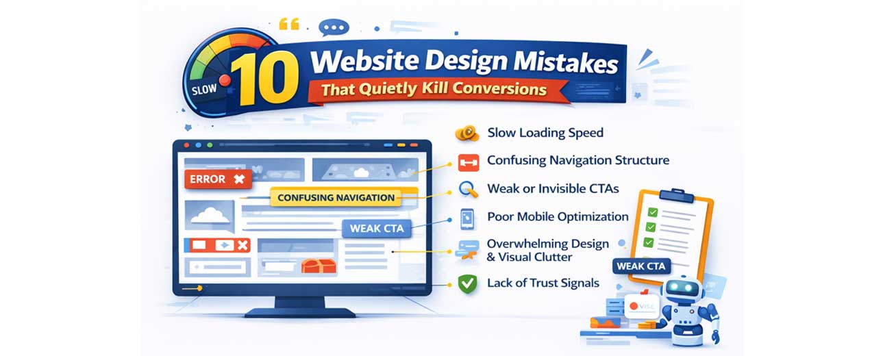
10 Website Design Mistakes That Quietly Kill Conversions (2026 Authority Guide)
In 2026, the website design is no longer just about visual appeal — it is the foundation of digital performance. Businesses invest thousands in ads, SEO, and social campaigns to drive traffic, but if the website design fails to guide, engage, and build trust, those visitors leave without converting. A modern website must do more than look good; it must communicate value instantly, reduce friction, and lead users toward action with clarity and confidence.
Today’s users make decisions within seconds. When someone lands on your homepage, they subconsciously evaluate speed, structure, readability, and professionalism. If the website design feels outdated, cluttered, slow, or confusing, trust drops immediately. In an era where competition is just one click away, even small usability flaws can increase bounce rates and silently reduce conversions.
Another major shift is user expectation. With AI-driven personalization, mobile-first browsing, and seamless app-like experiences becoming the norm, people expect intuitive digital journeys. The website design must now be strategically engineered around user psychology, not just aesthetics. Clear messaging, logical navigation, strong visual hierarchy, and optimized mobile performance all directly influence whether a visitor becomes a customer.
This guide explores the most critical website design mistakes that quietly kill conversions and explains how to fix them using modern UX and CRO principles. Because in today’s digital economy, traffic alone does not grow revenue — effective website design does.
1. Slow Loading Speed
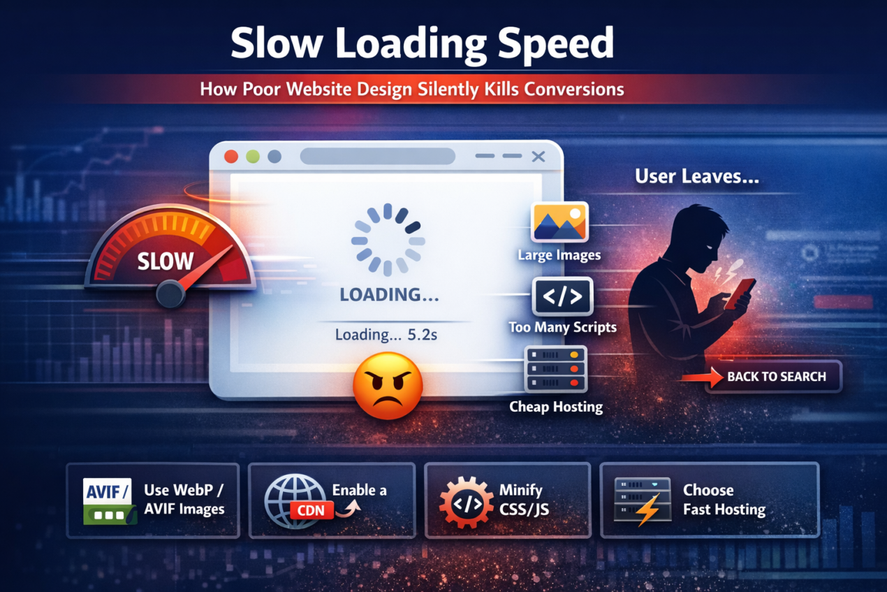
One of the biggest conversion killers in website design is slow loading speed. In 2026, users expect websites to load almost instantly. Attention spans are shorter, competition is stronger, and patience is minimal. If your page takes more than 2–3 seconds to load, a large percentage of visitors will leave before even seeing your offer. That means your headlines, products, testimonials, and CTAs never get the chance to influence them.
Speed issues are often created during the development phase of the website design. Businesses focus heavily on aesthetics — large background videos, high-resolution images, heavy animations, complex sliders — without understanding their performance impact. While these elements may look modern, they increase page weight and delay rendering time, especially on mobile devices. A visually impressive website that loads slowly will always convert worse than a simpler, faster one.
Several hidden factors typically cause performance problems:
- Oversized, uncompressed images
- Too many third-party scripts (chat tools, trackers, widgets)
- Bloated themes and page builders
- Excessive plugins
- Poor-quality hosting servers
- Render-blocking CSS and JavaScript
Mobile speed is even more critical. Most users now browse via smartphones, often on variable network conditions. If the website design is not optimized specifically for mobile performance, users experience lag, layout shifts, and delayed interactivity — all of which reduce trust and increase bounce rates. Google also uses Core Web Vitals as ranking factors, meaning speed impacts both SEO and conversions.
To improve performance strategically, businesses should:
- Use next-gen formats like WebP or AVIF
- Enable server-level caching
- Implement a reliable CDN
- Minify CSS and JavaScript files
- Remove unnecessary plugins
- Choose performance-focused hosting
- Lazy-load images and videos
A fast website creates a perception of professionalism, efficiency, and reliability. When the website design is engineered for speed, users stay longer, explore more pages, and feel more confident taking action. Speed is not just technical optimization — it is conversion psychology in action.
2. Confusing Navigation Structure
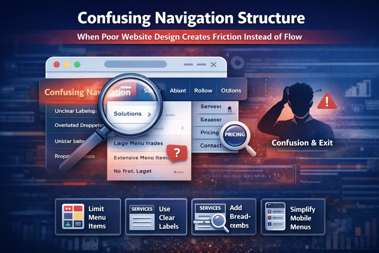
A confusing navigation structure is one of the most overlooked problems in website design, yet it directly impacts user experience and conversion rates. When visitors land on your website, they subconsciously look for direction. If they cannot immediately understand where to click or how to find information, they experience cognitive friction. And in the digital world, confusion almost always leads to exit.
Navigation is not just about menus — it is about structure, hierarchy, and predictability. Many businesses make the mistake of adding too many menu items, complex dropdown layers, creative but unclear labels, or duplicate pages. While internally the structure may make sense, users think differently. They want simplicity, clarity, and logical grouping. When they have to “figure out” your website, you lose momentum and trust.
Common navigation mistakes in the website design include:
- Too many primary menu items (10–15 options in header)
- Vague labels like “Solutions” or “Explore” without context
- Overloaded dropdown menus with multiple sub-levels
- Important pages buried inside secondary menus
- No clear path to pricing or contact pages
- Hidden navigation on mobile devices
In 2026, effective website design follows a user-first structure. The best-performing websites typically limit main menu options to 5–7 core categories. These are labeled clearly — such as Services, Pricing, About, Case Studies, and Contact. Instead of trying to be clever, they focus on being clear. Clear navigation reduces mental effort, and reduced mental effort increases engagement.
Mobile navigation deserves even greater attention. Since most traffic comes from smartphones, menus must be thumb-friendly and intuitive. Large tap areas, simplified structures, and visible CTAs improve usability. If users struggle to open menus, scroll through options, or locate key pages on mobile, they are unlikely to convert.
To improve navigation strategically, consider the following:
- Simplify and reduce menu items
- Group related pages logically
- Use descriptive, benefit-driven labels
- Add breadcrumb navigation for large sites
- Keep a visible CTA button in the header
- Include a search bar for content-heavy websites
Good navigation feels invisible. Users don’t notice it because it works effortlessly. They move naturally from page to page, absorbing information without friction. When the website design creates smooth directional flow, visitors stay longer, trust more, and convert faster.
3. Weak or Invisible Call-to-Action (CTA)
A beautifully structured page means nothing if users don’t know what to do next. One of the most critical mistakes in website design is having a weak, unclear, or barely visible call-to-action (CTA). Your CTA is the turning point where interest becomes action. If it is vague, hidden, or uninspiring, conversions drop — even if traffic and engagement look healthy.
Many businesses assume visitors will automatically understand the next step. They use generic buttons like “Submit,” “Learn More,” or “Click Here” without clearly communicating the benefit. In 2026, users expect clarity and value-driven messaging. A strong CTA doesn’t just tell users what to do — it tells them what they will gain. For example, “Get My Free Website Audit” is far more compelling than “Contact Us” because it highlights a specific outcome.
Common CTA mistakes in the website design include:
- Using vague or passive wording
- Placing the CTA only at the bottom of long pages
- Using colors that blend into the background
- Making buttons too small for mobile tapping
- Including too many competing CTAs in one section
- Not repeating the primary CTA throughout the page
Visual hierarchy plays a major role in CTA effectiveness. If your headline, images, and buttons all compete equally for attention, users become uncertain about what matters most. High-converting website design uses contrast intentionally. The primary CTA should stand out through color, size, spacing, and placement. It should be immediately visible above the fold and repeated after persuasive sections.
Psychology also matters. Users hesitate because of fear — fear of spam, hidden costs, or commitment. Smart website design reduces this anxiety using microcopy below the CTA, such as “No credit card required,” “Free consultation,” or “Cancel anytime.” These small reassurance statements significantly improve click-through rates.
To strengthen CTAs strategically:
- Use action-oriented, benefit-driven language
- Place CTAs in multiple logical positions
- Ensure strong color contrast
- Make buttons large and thumb-friendly
- Add trust signals near the CTA
- Reduce distractions around the action button
A strong CTA provides direction and momentum. When the website design clearly guides visitors toward a single, valuable next step, conversions become intentional rather than accidental.
4. Poor Mobile Optimization
In 2026, mobile traffic dominates nearly every industry. If the website design is not optimized specifically for mobile users, conversion rates will suffer significantly. Designing for desktop first and then “adjusting” for mobile is an outdated approach. Modern users interact primarily through smartphones, and their expectations are shaped by fast, app-like experiences. If your website feels difficult to use on mobile, users will not hesitate to leave.
Mobile friction often appears in subtle ways. Text may look too small to read comfortably. Buttons may be too close together. Forms may require excessive typing. Pop-ups may block content. Images may overflow the screen. Even slight usability frustrations increase bounce rates. Unlike desktop users, mobile visitors are often multitasking or browsing in short time frames. They expect clarity and ease within seconds.
Common mobile mistakes in the website design include:
- Tiny font sizes that require zooming
- Buttons smaller than recommended tap targets
- Sticky popups that block content
- Horizontal scrolling issues
- Overcrowded layouts
- Long, difficult-to-complete forms
Google’s mobile-first indexing makes this even more important. Search engines primarily evaluate the mobile version of your website for ranking. If your mobile performance is poor, both traffic and conversions decline. That means mobile optimization directly impacts revenue.
To improve mobile conversion performance:
- Use responsive, mobile-first frameworks
- Keep font sizes readable (minimum 16px body text)
- Ensure buttons are at least 44px in height
- Simplify layouts with a clear visual hierarchy
- Reduce form fields and enable autofill
- Use sticky bottom CTAs for easy access
A well-optimized mobile website design feels effortless. Users scroll naturally, read comfortably, and take action without frustration. When mobile usability improves, conversion rates increase — often dramatically.
5. Overwhelming Design & Visual Clutter
One of the most common yet underestimated mistakes is visual clutter. Many businesses believe that adding more elements — more banners, more animations, more icons, more colors — will make the website look “rich” or “premium.” In reality, too many visual elements create confusion, reduce clarity, and weaken conversions. When everything is trying to grab attention, nothing truly stands out.
Human attention is limited. Users scan web pages quickly, looking for structure and direction. If your layout is crowded with multiple competing sections, aggressive popups, auto-playing videos, blinking buttons, and inconsistent typography, visitors experience cognitive overload. Cognitive overload leads to hesitation, and hesitation leads to exit. A cluttered interface makes decision-making harder, which directly reduces conversion rates.
Common clutter mistakes in the website design include:
- Too many colors are used inconsistently
- Multiple fonts with no hierarchy
- Overuse of sliders and carousels
- Too many CTAs competing in one section
- Large blocks of unstructured text
- Popups appearing immediately on page load
Modern conversion-focused website design in 2026 prioritizes clarity over decoration. White space (or negative space) is not empty space — it is a strategic breathing room. Proper spacing improves readability and directs user focus. A clean layout allows the eye to move naturally from headline to supporting text to CTA without friction.
Strong visual hierarchy is essential. Headlines should clearly stand out from body text. Primary CTAs should be more visually dominant than secondary links. Important content should appear above the fold, while secondary information can be placed lower on the page. Consistency in typography, spacing, and color usage builds professionalism and trust.
To reduce clutter and improve conversion clarity:
- Limit your color palette to 2–3 primary colors
- Use one or two font families consistently
- Focus on one primary CTA per section
- Remove unnecessary animations
- Break long text into structured sections
- Use spacing intentionally to guide attention
A clean website design feels confident and authoritative. It communicates that the business understands its message clearly. When visitors are not distracted by unnecessary elements, they focus on the value being offered — and that focus leads to higher conversions.
6. Lack of Trust Signals
In 2026, users are more skeptical than ever before. With rising online scams, fake reviews, AI-generated content, and misleading advertisements, people approach new websites with caution. If the website design does not immediately communicate trust and legitimacy, visitors hesitate to take action. And hesitation is the biggest enemy of conversion.
Trust is not built through design alone, but design plays a major role in presenting proof. When users land on a website, they subconsciously look for reassurance. They want to see evidence that the business is real, experienced, and credible. If testimonials are missing, if there are no case studies, no clear contact information, no recognizable logos, or no visible security indicators, users feel uncertain. Even if your service is excellent, lack of visible proof reduces confidence.
Common trust-building elements missing in poor website design include:
- Real testimonials with names and photos
- Detailed case studies with measurable results
- Client or partner logos
- Certifications and industry badges
- Secure payment indicators (SSL, payment icons)
- Clear contact details (phone, address, email)
- Privacy policy and terms pages
Modern users also evaluate authenticity carefully. Generic testimonials without context no longer work. In 2026, trust signals must feel real and specific. A testimonial that says, “Great service!” is weak. A testimonial that says, “They increased our conversion rate by 38% in three months,” is powerful. Specificity builds credibility.
Placement also matters. Trust elements should not be buried on a separate page. Strong website design places social proof near CTAs, pricing sections, and decision-making points. When reassurance appears exactly where users feel doubt, conversions improve significantly.
To strengthen trust in the website design:
- Add real, verifiable testimonials
- Showcase quantifiable results
- Include team photos and the company story
- Display clear refund or guarantee policies
- Add security and compliance badges
- Highlight years of experience or client count
Trust reduces risk perception. When users feel safe, they move forward. A conversion-focused website design does not assume trust — it actively builds it at every stage of the user journey.
7. Long & Complicated Forms
Forms are often the final step between a visitor and a conversion. Whether it’s booking a consultation, requesting a quote, signing up for a trial, or downloading a guide, the form is where intent turns into action. However, many businesses unknowingly damage conversions by making this step more complicated than necessary.
When the website design includes long forms with too many required fields, users begin to hesitate. Every additional question creates friction. Visitors start wondering why so much information is needed. They question privacy. They feel the effort outweighs the benefit. Even highly interested prospects may abandon the process simply because it feels time-consuming.
Common form-related mistakes include:
- Asking for unnecessary information (fax number, full address, company size, etc.)
- Making every field mandatory
- Not showing clear error messages
- Using confusing field labels
- Displaying long single-page forms without progress indicators
- Poor mobile form experience
From a psychological perspective, forms increase perceived commitment. The longer and more complex a form looks, the more serious the commitment feels. If the value offered does not clearly outweigh that commitment, users drop off. This is why simplifying forms often leads to immediate improvement in conversion rates.
Effective website design reduces friction strategically. Instead of collecting all information upfront, businesses can use progressive profiling — gathering essential details first and additional information later. Multi-step forms with progress indicators also perform better because they feel shorter and more manageable.
To optimize forms for higher conversions:
- Only ask for essential information
- Break long forms into multiple steps
- Add inline validation for errors
- Use autofill and dropdown simplification
- Clearly explain why certain information is required
- Reassure users about privacy (“Your information is secure”)
A well-designed form feels quick and effortless. When users can complete it in under a minute without confusion or doubt, conversions increase naturally. The goal is simple: reduce effort, increase clarity, and make taking action feel easy.
8. Ignoring AI & Personalization

Visitors don’t want to feel like just another number. When the website design delivers the exact same message to every single user — regardless of their location, behavior, interests, or stage in the buying journey — it creates a generic experience. And generic experiences rarely convert at high rates.
Users today are used to personalization. Streaming platforms recommend content. E-commerce stores suggest products based on browsing history. Even search engines tailor results to user behavior. When someone lands on a website and sees broad, one-size-fits-all messaging, it feels disconnected. The content may be correct, but it doesn’t feel relevant.
A lack of personalization often shows up in subtle ways:
- Headlines that speak to “everyone” instead of a specific audience
- No location-based messaging
- No recognition of returning visitors
- Static product or service recommendations
- Identical CTAs for all traffic sources
- No segmentation between new and warm leads
Personalization does not mean overcomplicating the website. It means making users feel understood. Even small adjustments — like dynamically changing headlines based on ad campaigns or displaying location-specific trust signals — can significantly improve engagement. When visitors feel that the website speaks directly to their needs, attention increases and resistance decreases.
Modern website design integrates behavioral insights. For example, a returning visitor might see a different CTA than a first-time visitor. Someone who previously viewed pricing may see a limited-time offer. A user arriving from a healthcare-related search query might see tailored messaging specific to healthcare solutions. These subtle adjustments increase perceived relevance.
To strengthen personalization:
- Use dynamic headlines based on traffic source
- Display location-aware messaging
- Recognize returning visitors
- Show behavior-based product or service suggestions
- Segment CTAs based on user intent
- Use smart chat systems that adapt to user queries
Relevance builds connection. Connection builds trust. And trust drives conversion. When the website design adapts intelligently instead of remaining static, users feel understood — and they are far more likely to take action.
9. Inconsistent Branding & Messaging
Consistency builds trust. When users move through different pages and experience different tones, styles, colors, or messaging, it creates subtle confusion. The website design should feel unified and intentional from the homepage to the contact page. If branding shifts unexpectedly, visitors may question professionalism and credibility.
Inconsistent branding often happens when websites grow over time without a structured design system. New pages are added with different fonts. Colors vary slightly between sections. Messaging tone changes from formal to casual. Headlines promise one thing, while subheadings suggest another. These inconsistencies may seem minor internally, but to visitors, they signal disorganization.
Common branding inconsistencies in the website design include:
- Multiple font styles without hierarchy
- Different button styles across pages
- Varying color palettes in different sections
- Mixed tone of voice (corporate on one page, friendly on another)
- Misaligned value propositions
- Outdated content sitting next to updated messaging
Strong branding creates recognition and stability. When a visitor scrolls through your site, everything should feel connected — visually and verbally. The colors should align with your brand identity. The typography should be uniform. The tone of voice should match your target audience. The core promise should remain clear across all pages.
Messaging consistency is equally important. If your homepage emphasizes “premium solutions,” but your pricing page focuses on being “budget-friendly,” it creates confusion about positioning. The website design should reinforce one clear identity. Clarity strengthens authority, and authority improves conversions.
To improve consistency:
- Develop and follow a brand style guide
- Standardize typography and color usage
- Maintain consistent button design
- Align messaging across all pages
- Regularly audit older pages for outdated tone or visuals
- Ensure visuals match your brand personality
When branding feels cohesive, users experience confidence. A consistent website design communicates professionalism, stability, and reliability — qualities that make visitors more comfortable taking the next step.
10. No Clear Value Proposition Above the Fold
The first screen a visitor sees — commonly known as “above the fold” — determines whether they stay or leave. Before scrolling, before reading details, before exploring services, users make a rapid judgment. If the website design does not clearly communicate what you do, who it is for, and why it matters, visitors lose interest almost instantly.
Many websites waste this critical space with vague statements like “We Build Digital Solutions” or “Innovating the Future.” While these phrases may sound impressive, they do not explain anything specific. Users do not want to decode your message. They want clarity. If they cannot quickly understand the benefit, they will move on to a competitor who communicates more directly.
A weak above-the-fold section often includes:
- Generic headlines with no clear outcome
- No defined target audience
- Missing or unclear primary CTA
- Overly large images pushing key content below the fold
- Sliders that dilute the core message
- No supporting proof element (testimonial, stat, or badge)
A strong value proposition answers three essential questions immediately:
- What do you offer?
- Who is it for?
- What result or benefit does it provide?
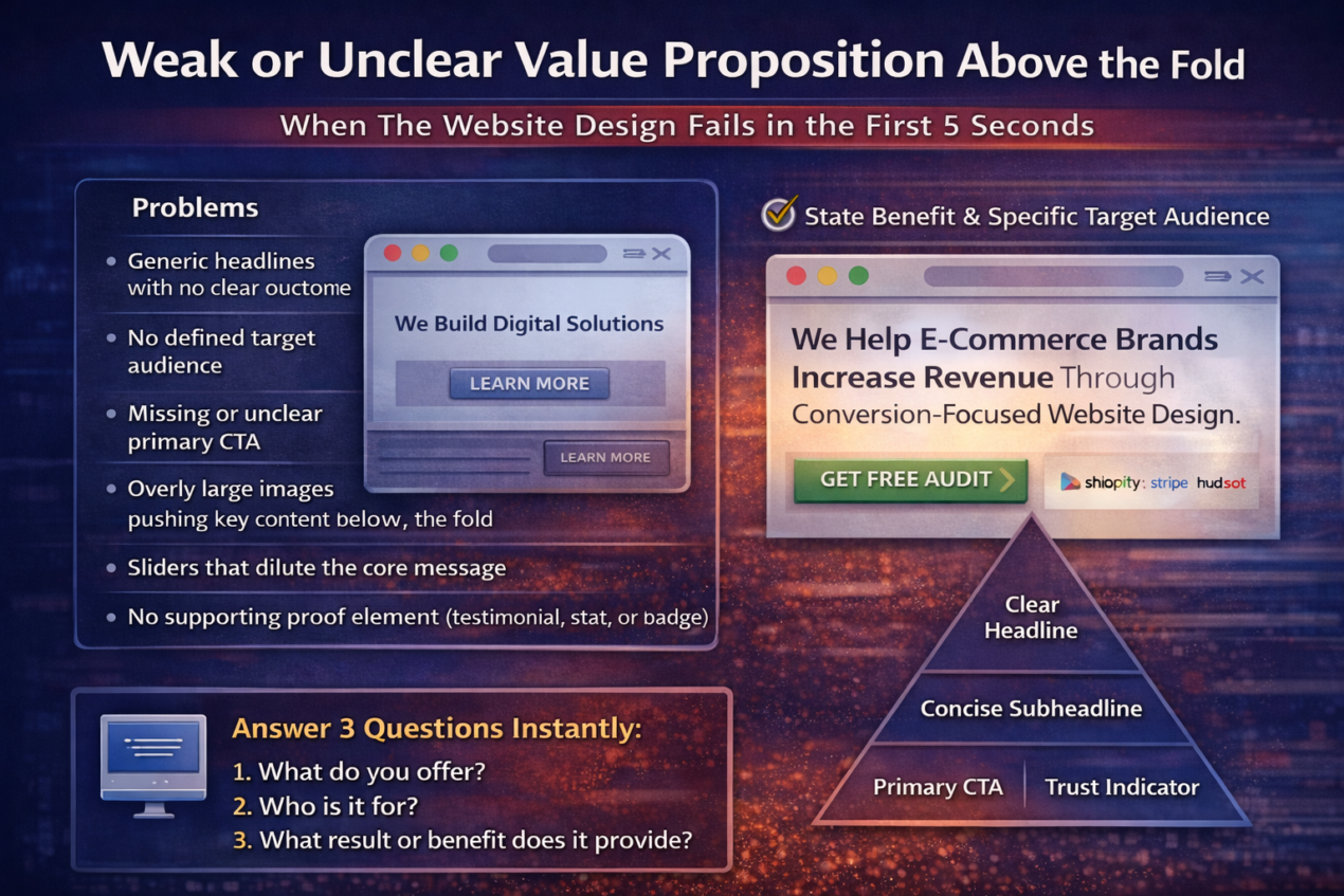
For example, instead of saying,
“We Provide Marketing Services,”
a stronger version would be:
“We Help E-commerce Brands Increase Revenue Through Conversion-Focused Website Design.”
Notice the difference. It is specific, audience-focused, and outcome-driven. That clarity creates interest and encourages scrolling.
The website design should structure the above-the-fold area with intention. A clear headline, a concise supporting subheadline, one primary CTA, and a small trust indicator (like client logos or a key result metric) create immediate confidence. The goal is not to impress — it is to communicate.
When visitors instantly understand your value, they feel oriented and in control. That sense of clarity builds engagement. And engagement is the first step toward conversion.
FAQ
1. Why is website design important for conversions?
The website design directly influences how users interact with your content, navigate your pages, and make decisions. A well-structured design reduces friction, builds trust, and guides visitors toward clear actions. If the design is confusing, slow, or cluttered, users hesitate or leave before converting. Conversions are not just about traffic — they are about experience.
2. How does website speed affect conversion rates?
Speed affects user perception and patience. When a website loads slowly, visitors associate it with inefficiency and low professionalism. Even a delay of a few seconds can significantly increase bounce rates. Faster websites keep users engaged longer, improve SEO rankings, and create a smoother path toward conversion.
3. What is the most common website design mistake?
One of the most common mistakes is having an unclear value proposition above the fold. If visitors cannot immediately understand what you offer and how it benefits them, they will leave. Other frequent mistakes include weak CTAs, poor mobile optimization, and a lack of trust signals.
4. How can I improve my website’s conversion rate?
Improving conversions requires optimizing multiple elements within the website design, such as:
- Clarifying your headline and value proposition
- Strengthening call-to-action buttons
- Simplifying navigation
- Reducing form fields
- Adding real testimonials and proof
- Optimizing mobile usability
- Improving page speed
Small improvements across these areas often produce significant results.
5. Does mobile optimization really impact conversions?
Yes. Since most users browse on smartphones, poor mobile usability leads directly to lost conversions. If buttons are hard to tap, text is difficult to read, or forms are frustrating to complete, users quickly abandon. Mobile-friendly website design is essential for both SEO performance and conversion growth.
6. How often should I audit my website design?
A website should be reviewed and optimized regularly — at least every 6 to 12 months. User behavior changes, technology evolves, and competitors improve their experiences. Continuous testing, analytics review, and design refinement help maintain strong conversion performance.
Conclusion: Why Neel Networks Focuses on Conversion-Driven Website Design
A website rarely fails loudly — it fails quietly. Visitors land on a page, scroll briefly, feel uncertain, and leave without taking action. There are no visible alarms. No technical errors. But beneath the surface, weak messaging, slow loading speed, cluttered layouts, unclear navigation, and missing trust signals steadily reduce conversions.
At Neel Networks, website design is not treated as decoration — it is treated as strategy. Every layout decision, headline structure, CTA placement, and mobile interaction is engineered with one objective in mind: turning visitors into customers. Because traffic alone does not grow a business. Conversions do.
High-performing website design requires clarity, speed, consistency, trust, and a user-focused structure. It requires understanding user psychology, reducing friction at every step, and guiding visitors toward confident decisions. When these elements work together, conversions become predictable — not accidental.
Businesses that consistently grow online are not simply the ones with the most traffic. They are the ones with the most optimized experience. And that is the difference between having a website and having a website that performs.
If your website is attracting visitors but not generating results, it may be time to evaluate whether the design is supporting your business goals or silently holding them back.