Best Typography Tools 2026: Find, Identify & Pair Fonts Like a Pro
Typography is the silent workhorse of design. When it is done well, nobody notices it — they simply find the content easy to read, the brand credible, and the design harmonious. When it is done poorly, something feels off, even if the viewer cannot articulate exactly why. The wrong typeface for a brand communicates the wrong personality. Clashing font combinations create visual tension. Poor type hierarchy makes content harder to scan. Body text set too small or at incorrect line-spacing reduces reading comfort in ways that directly increase bounce rates on web pages.
What this guide covers
- 1. Understanding Typography: The Basics Worth Knowing
- 2. Font Discovery Tools: Finding the Right Typeface
- 3. Font Identification Tools: Name That Typeface
- 4. Font Pairing Tools: Building Effective Type Combinations
- 5. The Principles Behind Effective Font Pairing
- 6. Web Font Performance and Technical Considerations
- 7. Font Licensing: What You Need to Know
- 8. Building and Managing a Font Library
- 9. Frequently Asked Questions About Typography and Font Tools
- 10. Conclusion: Good Typography Is Invisible — Bad Typography Is Not
In 2026, designers, developers, and business owners have access to an extraordinary range of typography tools — for discovering fonts, identifying typefaces from images, pairing fonts effectively, testing fonts in use, and managing font libraries. The challenge is not accessing good typography; it is knowing which tools serve which purpose and how to use them to make decisions that hold up across the full range of digital and print contexts a brand operates in.
This guide covers the best typography tools available in 2026, organised by use case: font discovery, font identification, font pairing, testing and prototyping, and web font management. It also covers the core principles of effective type pairing and the practical decisions every designer and brand manager needs to make around licensing and performance.
Understanding Typography: The Basics Worth Knowing
Before diving into tools, a brief grounding in the concepts those tools are built around makes the tool recommendations more useful and the decisions they support more confident.
Typeface vs. font: A typeface is a family — Helvetica, Garamond, Inter. A font is a specific weight and style within that family — Helvetica Bold, Garamond Italic, Inter Light. The distinction is often collapsed in everyday usage, but it matters when purchasing licenses (you license a typeface family, not individual fonts) and when specifying typography in brand guidelines.
Type classification: The major type classifications — serif, sans-serif, slab serif, display, script, and monospace — carry personality associations and practical characteristics that influence both aesthetic and functional decisions. Serifs (the small strokes at the ends of letterforms) are associated with tradition, authority, and readability in long-form print text. Sans-serifs are associated with modernity, clarity, and screen readability. Display types are designed for large sizes and short text — they often fail at body copy size. Scripts suggest elegance, personality, and informality depending on their design.
Variable fonts: Variable font technology, now well-supported across modern browsers and design tools, encodes the full range of a typeface’s weights, widths, and styles in a single file. This reduces HTTP requests and file size for web typography while enabling more expressive typographic applications. In 2026, variable fonts are the preferred format for any brand investing in a distinctive typographic identity for digital use.
Font Discovery Tools: Finding the Right Typeface
With hundreds of thousands of typefaces available across commercial and open-source libraries, the discovery problem is real. These tools make it manageable.
Google Fonts
Free. fonts.google.com
The largest curated library of open-source fonts available for free commercial use. Over 1,500 families covering Latin and non-Latin scripts. Filterable by category, language support, number of styles, and visual characteristics (thickness, slant, width). Includes a preview tool with custom text and the ability to compare multiple fonts side by side. The default choice for web typography where budget is a constraint — though the library’s ubiquity means some typefaces are heavily overused.
Adobe Fonts
Included with Adobe Creative Cloud. fonts.adobe.com
An extensive library of premium commercial typefaces available to Adobe CC subscribers with no per-font licensing fees. Exceptional quality from major foundries. Deep integration with Photoshop, Illustrator, InDesign, and XD. The best starting point for designers working within the Adobe ecosystem who need professional-quality typefaces beyond the Google Fonts library.
Fonts In Use
Free. fontsinuse.com
A curated archive documenting how specific typefaces are used in real-world design projects — packaging, book covers, wayfinding, websites, brand identities. Invaluable for seeing how a typeface actually performs in context rather than as an abstract specimen. Search by typeface to see examples of its use, or browse by industry and application type to discover typefaces used in contexts similar to your project.
Typewolf
Free / Paid guides. typewolf.com
Curated daily examples of beautiful web typography from live websites, organised by typeface and style. Strong editorial voice and genuinely useful curation make it one of the best sources for discovering typefaces that work well in digital contexts. The site builder also lists the specific typefaces used on featured sites, making it a practical research tool as well as an inspiration source.
MyFonts
Commercial. myfonts.com
One of the largest commercial font marketplaces, aggregating typefaces from hundreds of independent type foundries alongside major publishers. Excellent for discovering typefaces outside the major subscription services. Includes user reviews and “used in” examples. One-time license purchases rather than subscription model — appropriate for projects where a specific typeface is needed that is not available through subscription services.
Fontshare
Free. fontshare.com
A newer free font platform from the Indian Type Foundry (ITF) offering high-quality, professionally designed typefaces free for personal and commercial use. The library is smaller than Google Fonts but the quality is consistently high and the designs are less overused. Particularly strong in contemporary sans-serifs and display types. Worth checking before defaulting to the most popular Google Fonts options.
Font Identification Tools: Name That Typeface
Every designer and brand manager eventually encounters a typeface they want to identify — in a competitor’s logo, a design they admire, a brand asset with no documentation, or a historical identity that needs to be matched. These tools make identification tractable.
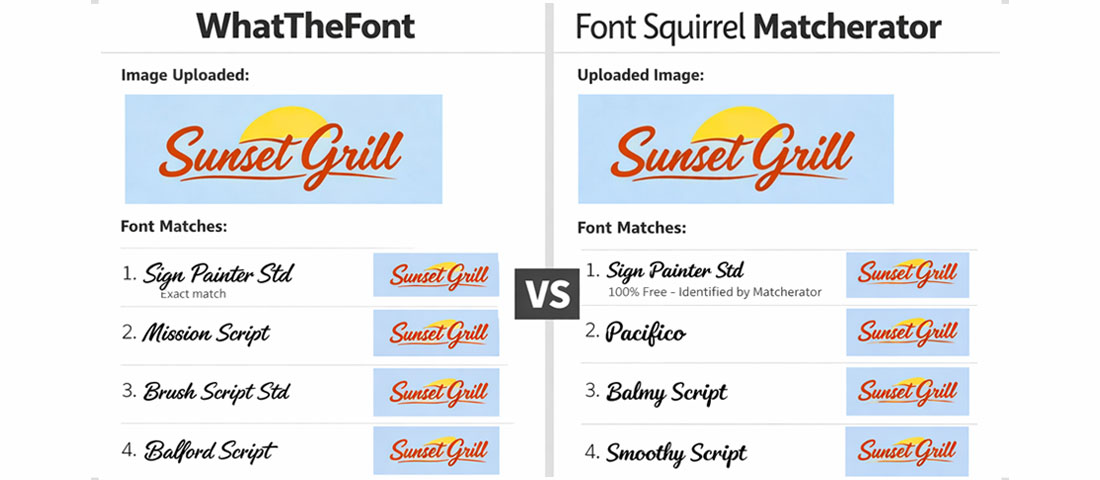
WhatTheFont (MyFonts)
Upload an image containing text and WhatTheFont analyses the letterforms to identify the typeface or suggest the closest matches. Highly accurate for clean images of widely available commercial fonts. Less reliable for custom lettering, heavily modified typefaces, or obscure fonts. Available as a web tool at myfonts.com/pages/whatthefont and as a mobile app.
Font Squirrel Matcherator
Similar to WhatTheFont — upload an image and receive typeface suggestions. Often worth running both tools on the same image, as they use different matching algorithms and occasionally one succeeds where the other returns imprecise results.
Identifont
A systematic identification tool that works by asking a series of questions about specific letterform characteristics — the shape of certain letters, the style of serifs, the presence or absence of specific features. Slower than image-based tools but more reliable for challenging identification tasks where image quality is poor or the typeface is unusual. Operates through a guided question-answer process rather than image analysis.
Google Lens and Image Search
In 2026, Google Lens has become a surprisingly effective font identification tool for type set in recognisable commercial fonts. Photograph or screenshot the text, run it through Lens, and the visual search frequently identifies the typeface directly or surfaces examples of its use that enable identification. A useful first step before more specialised tools for everyday identification tasks.
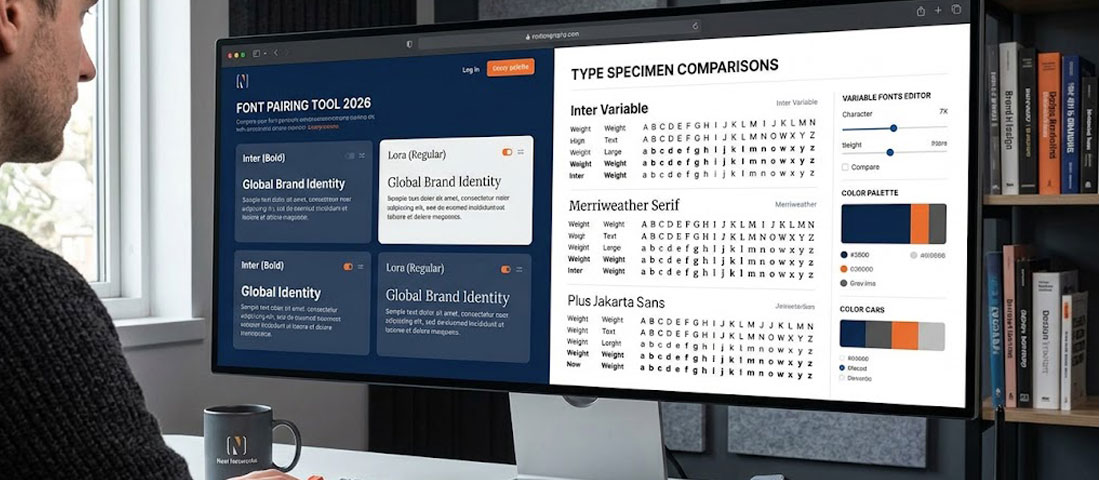
Font Pairing Tools: Building Effective Type Combinations
Font pairing is one of the most frequently challenged aspects of typography for non-specialists. These tools remove much of the trial and error.
Fontpair
Fontpair.co is a curated collection of Google Fonts pairings, selected and presented with sample text showing each combination in heading and body copy applications. Filterable by pairing style (sans-serif with serif, sans with sans, etc.) and visual character. The most efficient starting point for discovering Google Fonts pairings that work — the curation quality is high and the visual presentation makes evaluation straightforward.
Typ.io
Analyses font pairings actually used on websites across the web and presents them with visual examples. Shows the typefaces used on real sites in context, with the specific pairing details. Useful for researching what pairings are working in practice in specific industries or design styles.
Monotype Fonts
The professional platform from Monotype (the foundry behind Helvetica, Times New Roman, and hundreds of other major typefaces) provides pairing recommendations alongside its extensive type library. The pairing suggestions are informed by typographic expertise and are particularly reliable for professional brand identity applications.
Figma Type Scale and Pairing Plugins
Within Figma, plugins including Type Scale, Fontbase, and Font Pairing (various publishers) allow designers to experiment with pairings directly in their working environment rather than switching between browser tools and design software. For designers already working in Figma, testing pairings in context — with real content, at actual usage sizes — produces more confident decisions than testing on abstract specimen pages.
Archetype (by Monotype)
A dedicated font pairing and exploration tool that allows selection of brand fonts and live preview across heading, subheading, and body copy hierarchy. More focused on brand typography decisions than general discovery, making it particularly useful for the specific task of selecting and validating a typographic system for a brand identity project.
The Principles Behind Effective Font Pairing
Tools assist with pairing decisions, but understanding the underlying principles makes those decisions more reliable — especially when the right pre-paired combination does not exist in a curation library and original judgment is required.
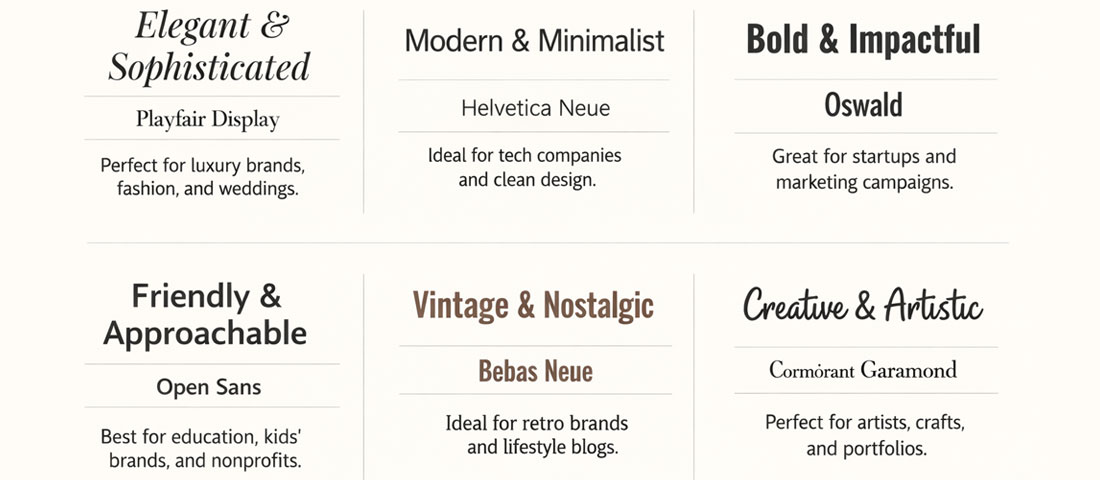
Contrast in classification
The most consistently successful pairings combine typefaces from different classifications: a serif with a sans-serif, a geometric with a humanist, a display type with a utilitarian body face. Classification contrast creates visual distinction that makes the typographic hierarchy immediately legible — the heading clearly reads as different from the body copy not just in size but in character.
Shared personality, different expression
While the typefaces should contrast in classification, they should share an underlying personality. A refined, elegant serif pairs naturally with a refined, elegant sans-serif. A bold, geometric display type pairs well with a bold, clear geometric sans-serif for body text. Pairing a delicate calligraphic serif with an aggressive condensed sans creates tonal dissonance that undermines both typefaces rather than elevating either.
Weight and proportion considerations
The x-height (the height of lowercase letters relative to capitals) and overall proportions of two typefaces influence how comfortably they coexist at similar sizes. Typefaces with similar x-heights tend to pair more harmoniously than those with very different proportions. When in doubt, test the specific weights and sizes you intend to use in your actual layout rather than evaluating the pairing at arbitrary sizes on a specimen page.
The “superfamily” approach
Many type families include both serif and sans-serif variants designed to complement each other — Freight Text and Freight Sans, Merriweather and Merriweather Sans, Source Serif and Source Sans. These “superfamily” pairings are almost always harmonious because they were designed by the same hand with the same structural proportions. For projects where pairing confidence is a priority over typographic distinctiveness, superfamily pairings are the lowest-risk approach.
| Pairing Approach | Example Combination | Character | Typical Use Case |
|---|---|---|---|
| Serif heading + Sans body | Playfair Display + Source Sans | Editorial, premium, authoritative | Publishing, luxury brands, professional services |
| Sans heading + Serif body | Montserrat + Lora | Modern with warmth, contemporary editorial | Lifestyle brands, magazines, thoughtful B2B |
| Geometric + Humanist sans | Futura + Gill Sans | Precise and modern with human touch | Technology, design agencies, architecture |
| Display + Utility sans | Bebas Neue + Inter | High impact, clean, contemporary | Sports, entertainment, digital products |
| Superfamily pairing | Merriweather + Merriweather Sans | Harmonious, reliable, readable | Blogs, content-heavy sites, documentation |
| Single typeface system | Inter (varied weights) | Clean, unified, minimal | SaaS products, dashboards, UI-heavy applications |
Web Font Performance and Technical Considerations
Typography choices have direct performance implications for web projects. Every font family loaded on a website adds HTTP requests and file size — considerations that affect Core Web Vitals scores and therefore both user experience and search rankings.
Font loading best practices in 2026:
Self-host fonts where possible. Serving fonts from your own domain eliminates the DNS lookup and connection overhead of third-party font servers. For Google Fonts, tools like google-webfonts-helper.herokuapp.com allow you to download and self-host any Google Font with the correct WOFF2 format and preload configuration. Self-hosting typically reduces font load time by 200–400ms compared to loading from the Google Fonts CDN.
Use font-display: swap. This CSS property tells the browser to display text in a fallback system font while the custom font loads, then swap to the custom font when it is available. Without this, some browsers show a blank space where text should be during font loading — a significant Cumulative Layout Shift contributor and readability problem.
Preload critical fonts. Using <link rel="preload"> for the WOFF2 files of the fonts used in the largest visible text elements (typically your primary heading font) instructs the browser to download those font files with high priority — reducing the time to first meaningful paint.
Subset fonts for character sets you actually use. A full Latin font file includes characters for dozens of languages most websites never use. Subsetting reduces file size by including only the character ranges your content requires. For English-language sites, a Latin subset is almost always sufficient. For multilingual sites, generate separate subsets for each language rather than loading the full character set for all users.
Use variable fonts for multi-weight typography. If your design system uses more than two weights of a typeface, a variable font file is almost always smaller than loading multiple static weight files. Check whether your chosen typefaces have variable font versions available — the Google Fonts library includes variable versions for many of its most popular families.
Font Licensing: What You Need to Know
Font licensing is the most frequently misunderstood and most frequently ignored aspect of professional typography. Using a font without the appropriate license is copyright infringement, regardless of whether it is detectable. Professional design practice requires licensing every typeface used in commercial work.
The main license types to understand: Desktop license — permits use in print and static digital files (PDFs, presentations) produced on the licensed machine. Web license — permits embedding in websites, typically sold per monthly pageview tier. App license — permits embedding in mobile or desktop applications. Broadcast license — permits use in video content. OFL (Open Font License) — the license used by most Google Fonts and open-source typefaces, permitting free commercial use in all contexts including web embedding and app embedding without per-unit fees.
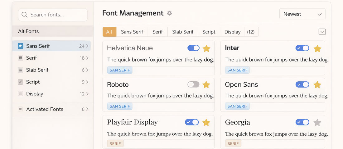
Building and Managing a Font Library
For design teams, agencies, and businesses that work with typography regularly, font library management is a practical workflow concern. These tools help.
Fontbase (free and paid): A desktop application for organising, activating, and previewing local font files. Allows fonts to be organised into collections, activated on demand (reducing system performance impact from large installed font libraries), and previewed with custom sample text before use.
Adobe Fonts (Creative Cloud): For teams on Creative Cloud, Adobe Fonts handles licensing and activation seamlessly — browse and activate fonts directly from Photoshop, Illustrator, or Figma without managing local files. Team libraries ensure all team members have access to the same typefaces.
Google Fonts API: For development teams, the Google Fonts API provides a standardised, easy integration for loading any Google Font on any web project. The API returns optimised, subset font files and handles CDN delivery. For self-hosting preference, the same fonts are available for download and can be served from the project’s own infrastructure.
Frequently Asked Questions About Typography and Font Tools
| What is the best font for a professional website in 2026? | There is no single “best” font for professional websites because the right typeface depends on the brand’s personality, the content type, and the audience’s expectations for that particular industry and context. That said, some typefaces consistently perform well across a range of professional digital contexts: Inter is the most widely used UI typeface for modern web applications and SaaS products, valued for its clarity at all screen sizes and extensive weight range. Satoshi and Plus Jakarta Sans have become popular alternatives for brands wanting a distinctive but professional sans-serif without Inter’s ubiquity. For brands needing a serif component, Lora and Merriweather both perform well at body copy scale on screens. For premium brand applications, the Adobe Fonts library provides access to high-quality commercial typefaces that offer more distinctive character than the most commonly used Google Fonts options. The choice should be made against the specific brand personality and content requirements, not selected from a “best fonts” list. |
| How many fonts should I use on a website or in a brand identity? | Most effective typographic systems use two typefaces: one for headings and brand moments, one for body copy and UI elements. Some systems use three — adding a monospace or accent typeface for specific functional uses like code snippets or pull quotes. Systems with more than three typefaces almost always create visual confusion rather than richness. The perceived complexity and character of a type system comes from the skill with which the chosen typefaces are used — their weights, sizes, spacing, and contextual variation — not from the number of different families deployed. A single typeface used with six weights across a well-considered hierarchy can be more expressive than three typefaces used without intentional weight contrast. When in doubt, fewer fonts used better is always the more professional outcome. |
| Can I use Google Fonts for commercial projects for free? | Yes — all fonts in the Google Fonts library are licensed under the Open Font License (OFL) or Apache License, both of which permit free use in commercial projects including websites, printed materials, mobile applications, and video content. There are no per-use fees, no attribution requirements, and no restrictions on commercial or revenue-generating applications. This makes Google Fonts genuinely free for commercial use in the fullest sense, which is why they are so widely used by both designers and developers. The only limitation is that OFL fonts cannot typically be sold as standalone font files — but this restriction applies to font resellers, not to the businesses and designers using them in their work. The extensive Google Fonts library combined with completely free commercial licensing makes it the default choice for budget-conscious projects and web development work where font licensing overhead is an operational consideration. |
| What is the difference between kerning, tracking, and leading? | These three terms describe different aspects of spacing in typography, each of which significantly affects readability and visual quality. Kerning is the adjustment of space between specific pairs of letters to correct for optical imbalances that arise from the shapes of adjacent letterforms — for example, the space between “A” and “V” is typically tightened because the diagonal shapes leave a visually large gap at their meeting point. Professional typefaces include kerning pairs built in; kerning in a logo or headline context often requires manual refinement for large-scale typesetting. Tracking (also called letter-spacing) is the uniform adjustment of space between all letters in a word, phrase, or block of text. Increasing tracking is commonly used in all-caps short text for readability and elegance; decreasing tracking can create visual density in display applications. Leading (pronounced “ledding”) is the vertical space between lines of text, named after the lead strips historically used to separate lines in letterpress printing. Insufficient leading makes dense text claustrophobic and difficult to read; excessive leading makes text feel disconnected. For body copy, a leading of 1.4–1.6× the font size is generally comfortable for sustained reading. |
| How do I choose fonts that work well in multiple languages? | For brands that communicate in multiple languages, typeface selection must account for the character sets required by each language. Latin script fonts only include characters for Latin-alphabet languages; brands operating in Indian language markets (Hindi, Tamil, Telugu, Marathi, Gujarati, etc.) need typefaces that include the relevant Indic script characters. Google Fonts has made significant progress in Indic script typography and now includes high-quality typefaces for most major Indian scripts. For multilingual brand applications, the most practical approach is to select a primary Latin typeface for English-language communications and pair it with a complementary Indic script typeface — one designed with similar weight and personality characteristics — rather than expecting a single typeface to cover both Latin and non-Latin scripts at the same quality level. Noto, Google’s comprehensive multi-script typeface family, is specifically designed to provide harmonious coverage across all the world’s scripts and is a reliable choice for any project requiring genuine multilingual consistency. |
| How does typography affect SEO and Core Web Vitals? | Typography affects SEO and Core Web Vitals in two distinct ways. The first is direct performance impact: every web font file loaded adds to the page’s total resource weight and the browser’s rendering timeline. Poor font loading implementation — loading multiple large font files without subsetting, failing to preload critical fonts, not using font-display: swap — contributes to poor Largest Contentful Paint (LCP) and can trigger Cumulative Layout Shift (CLS) when text reflows after a web font loads and replaces a differently proportioned fallback font. These are both Core Web Vitals metrics that influence search rankings. The second is indirect readability impact: typography that makes content easier to read — appropriate size (minimum 16px for body copy on mobile), sufficient line-height, adequate contrast ratio, not too-narrow measure (line length) — reduces bounce rate and increases time-on-page, both of which are positive engagement signals. Optimising font loading and ensuring readable typographic settings is a legitimate and often underappreciated component of technical SEO work. |
| What is the best way to test how a font will look on a real website before committing to it? | Several approaches allow realistic testing before final commitment. Google Fonts and Adobe Fonts both offer preview tools where you can type your own text and see it rendered in the typeface at different sizes — useful for a quick quality check but limited because it does not show the font in your actual layout. Fontjoy.com allows you to preview font pairings with your own text in a realistic heading/body hierarchy layout, which is more representative of actual use. For the most realistic testing, the most reliable approach is to load the candidate typeface on a staging version of your actual website or a prototype page — either by temporarily embedding it via the Google Fonts API or by downloading and self-hosting the font file for testing. Seeing the typeface applied to real content, at real sizes, on real devices (particularly mobile) provides a quality of judgement that no specimen page or preview tool can match. Figma prototypes with the actual typeface embedded and previewed on a mobile device are also an effective testing approach for design decisions that will be implemented by a development team. |
Conclusion: Good Typography Is Invisible — Bad Typography Is Not
The goal of typography in functional design is to serve communication so seamlessly that readers never think about it. When the typeface is right, the hierarchy is clear, the spacing is generous, and the pairing is harmonious — people simply read, absorb, and remember. When any of these elements is wrong, even readers who cannot articulate what is bothering them will have a slightly harder time engaging with the content and a slightly lower opinion of the brand.
The tools covered in this guide make good typography accessible to anyone willing to invest a few hours in learning their use. The principles behind effective type pairing — contrast with harmony, shared personality, appropriate classification for the context — are learnable even without formal design training. And the practical considerations of licensing and web font performance are manageable with basic implementation knowledge.
Typography is one of the most high-leverage design investments a brand can make, precisely because its effects are pervasive and largely invisible. Get it right and it makes everything else work better. At Neel Networks, typographic craft is a standard part of every brand identity and website design project we undertake — not an optional upgrade.
Want a Website Where Typography Works as Hard as Your Content?
Neel Networks builds websites and brand identities with considered, strategic typography — optimised for both visual quality and web performance. Serving clients across India, the UK, USA, Canada, and Australia since 2014. Let us show you what purposeful type can do for your brand.