Product Page Optimization: The Elements That Actually Convert
Most product page optimisation content on the internet is recycled listicles saying “high-quality images matter” and “clear CTAs help” — which is technically true and practically useless, because it doesn’t tell you what actually differentiates the product pages converting at 4-6% from the ones stuck at 1-2%. After building and optimising hundreds of product pages across categories from fashion to industrial equipment to Ayurvedic goods, the pattern of what actually moves conversion is meaningfully more specific than the generic advice suggests, and it’s not always what you’d expect from a checklist. Some elements everyone talks about turn out to matter less than you’d think; some elements almost nobody discusses turn out to be the difference between a page that converts and one that doesn’t.
This is the honest version of product page CRO — not the “test everything, follow best practices” version that gives you nothing actionable, but the version that tells you which specific elements to invest in first and which conventional wisdom is misleading. If you want the wider context of how product pages fit into eCommerce strategy including platform choice, our complete eCommerce platform selection guide covers the broader picture. This article focuses tightly on what makes an individual product page convert — the specific elements, the order to prioritise them, and the mistakes that quietly cost you conversions you’d otherwise capture.
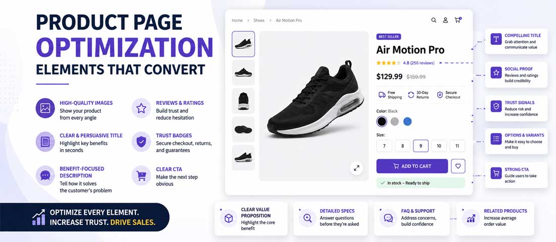
Why most product page optimisation advice is useless
Before dissecting what actually works, being honest about why generic product page advice fails to move conversion is worth the space. The pattern is remarkably consistent across the poor-quality advice out there.
Generic checklists don’t account for buyer type. A luxury handbag buyer, a bulk industrial parts buyer, a fashion-conscious teenager, and a research-heavy B2B procurement manager each need entirely different product page experiences. Advice pretending one checklist applies to all of them produces mediocre pages for everyone rather than excellent pages for anyone.
The gap between “best practices” and “what converts” is bigger than most people realise. Best practices are what most sites do; what converts is what winning sites do differently. Following best practices makes your site average — which is fine if average conversion is your goal but useless if you’re trying to genuinely outperform.
Testing without hypotheses produces bad results. Most “A/B test everything” advice sends businesses into random optimisation cycles that eat time without producing clear winners because they lack the hypothesis discipline needed to learn from tests. Effective testing is hypothesis-driven, not element-driven.
The one-size-fits-all trap catches almost everyone. Advice like “use high-quality images” is true; advice like “your product images specifically need to show the product in use by someone your customer identifies with, from at least three angles, with a scale reference, and zoomable to inspect detail” is useful. The difference between these two statements is what separates advice that moves conversion from advice that fills word counts.
The rest of this article gives you the second kind of advice — specific enough to act on, opinionated enough to have direction, honest enough to acknowledge where the answer depends on context.
The single most impactful element: hero imagery
If you can only invest in improving one thing on your product page, it’s the hero image and image gallery. This is not the most exciting answer but it is the most consistent finding across categories. Product page conversion is fundamentally an image-driven experience for the vast majority of buyers, and the sites that convert best invest in imagery at a level most sites don’t.
Image quality reality versus what most sites deliver. The hero image should be at minimum 1500×1500 pixels, professionally shot or shot to professional standard, colour-corrected, and consistent with other product images on the site. Most product pages online use 800×800 images at moderate quality, shot inconsistently across a catalogue, with lighting and background variations that make products look worse than they are. Simply investing in image quality upgrades — not cleverness, just quality — moves conversion measurably on most sites.
Image count and variety. Single-image product pages convert worse than multi-image product pages, and the drop-off from 5 images to 8-10 images is smaller than the drop from 1 image to 5. Aim for 5-8 images minimum. Include: product-only shots from multiple angles, lifestyle/in-use shots, scale references, detail/close-up shots, and packaging or accessory shots where relevant. The goal is answering every visual question a buyer has before they need to ask.
Context imagery matters more than product-only imagery. Product-only shots on white backgrounds are the eCommerce standard but they answer fewer buyer questions than context shots. A chair on a white background tells you what the chair looks like; a chair in a real living room shows you how it fits with other furniture, its scale relative to a person, and its aesthetic in context. Lifestyle imagery converts better because it answers more implicit questions.
Zoom capability and image gallery UX. Buyers examining products online cannot handle them the way they would in person, and the zoom capability is what compensates for that. Zoom that reveals texture, stitching, material quality, and detail matters for products where these details influence purchase decisions. Poor zoom implementation — pixelated at magnification, small viewport, difficult to navigate — undermines the image quality investment.
The image-heavy sites that convert best. Look at sites like Everlane, Away, Warby Parker, or any of the DTC brands that are known for their product page quality. Notice how much visual real estate the imagery takes, how many images per product, how consistently they’re shot, how the gallery works. This isn’t accidental — these are companies that have tested extensively and concluded imagery is where investment pays back best. If you’re not sure where to invest first, follow their lead.
Product titles: the SEO-vs-conversion tension
Product titles are one of the most consistently mismanaged elements on product pages, and the root cause is the SEO-vs-conversion tension that most sites resolve badly.
The SEO cramming that hurts conversion. Product titles overloaded with keywords (“Premium Quality 100% Organic Cotton Men’s Blue V-Neck T-Shirt Casual Everyday Slim Fit Regular Size Machine Washable”) read like SEO exercises rather than product descriptions. They rank marginally better in some cases but convert worse across the board because they look like spam to human readers. Buyers pattern-match this format to low-quality sellers and unconsciously discount the perceived quality.
Human-first titles that still rank. Modern search engines are sophisticated enough that keyword-stuffed titles aren’t necessary for good rankings — a clean human-readable title with proper structured data and page copy will rank comparably. “Men’s Organic Cotton V-Neck T-Shirt” ranks similarly to the keyword-stuffed version and converts significantly better. The SEO trade-off most people fear from clean titles is smaller than they think.
What buyers actually scan for in titles. The scanning pattern for product titles is: what is it (category), specific type/variant, distinguishing quality signal. “Men’s Organic Cotton V-Neck T-Shirt” hits all three cleanly. Everything beyond this in the title dilutes rather than adds value for the human reader.
Specific patterns that work. [Category] [Distinguishing feature] [Model/name if branded]. “Wireless Noise-Cancelling Headphones — Studio Pro” beats “Studio Pro Bluetooth 5.0 Active Noise Cancellation Over-Ear Headphones with Deep Bass Premium Sound Quality”. The clean version is more memorable, more scannable, and converts better. Leave the technical specifications for the description section where they belong.
For the broader SEO side of product page work — how these titles interact with structured data, category page hierarchy, and technical SEO — our complete guide to eCommerce SEO for product pages is the companion piece to this conversion-focused article. Titles are the specific element where SEO and conversion goals genuinely tension, and the two guides together give the full picture.
Price presentation psychology
How you display price is meaningfully more consequential than most people realise, and there are specific patterns that produce measurable differences.
Charm pricing versus round numbers. $49.99 vs $50.00 is a real conversion difference for lower-priced consumer goods, but the effect diminishes at higher price points and reverses for luxury goods where round numbers signal quality. Under $100, charm pricing generally wins. Over $500, round numbers often outperform. The category matters as much as the price point — utility products benefit from charm pricing, aspirational products benefit from clean numbers.
Strikethrough pricing done right. Showing $49.99 with $79.99 struck through works when the strikethrough price is credible (this product was genuinely sold at that price recently). It backfires when it’s obviously an inflated MSRP nobody paid. Buyers have gotten more sophisticated about this and can tell the difference between real discount signalling and manufactured urgency. The threshold is credibility — real discount claims outperform no-discount displays, but false discount claims damage trust.
Currency and format details. Clear currency indication ($49.99 rather than 49.99), consistent decimal places, no arbitrary rounding, and no hidden fees revealed at checkout. Sites where the product page shows $49 and checkout adds shipping, taxes, and platform fees that push it to $67 destroy the trust the product page built. Better to disclose fees upstream even if it means a higher displayed price.
Bundle and package pricing. When bundle pricing exists (buy 3 get 15% off, buy 2 save $10), display it clearly on the product page rather than burying it. Buyers respond to bundle math when they can see it directly. The effective per-unit price should be calculated visibly rather than requiring buyer math.
Payment plan visibility. BNPL (buy now pay later) options like Afterpay, Klarna, or Affirm displayed on the product page (“or 4 payments of $12.50 with Afterpay”) increase conversion for products over $50 by making the cash outlay feel smaller. This effect is real and significant for discretionary purchases in that price range.
Trust signals near the CTA
Trust signals matter, but where you place them matters more than which specific signals you use. The pattern that works is placing trust signals in the visual proximity of the add-to-cart button so buyers see them at the decision moment rather than needing to scroll to find them.
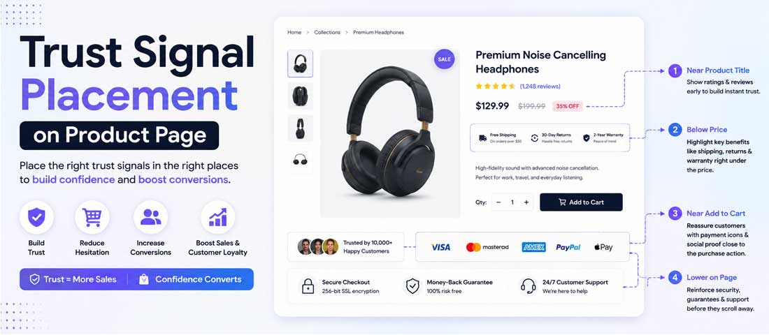
| Trust signal | Impact on conversion | Best placement | Common mistakes |
|---|---|---|---|
| Review count + star rating | High — signals social proof | Adjacent to product title | Buried below the fold or after full description |
| Shipping guarantee | Medium-high — reduces friction | Adjacent to add-to-cart button | Only revealed on checkout page |
| Return/refund policy | High for higher-priced items | Adjacent to add-to-cart | Only in footer or FAQ page |
| Security badges (payment) | Low-medium — expected baseline | Near checkout, not product page | Placed on product page where they add clutter |
| Made-in / material provenance | High for relevant categories | Adjacent to description | Only in secondary tabs |
| Awards, press mentions | Medium for aspirational products | Below or beside imagery | Placed as small footer badges |
| Third-party certifications | Category-specific (organic, fair-trade) | Near product title or description | Buried in fine print |
The pattern to notice is that the highest-impact trust signals are typically underused or misplaced, while lower-impact signals (like payment security badges on product pages) are overused. Reallocating trust signal real estate from low-impact to high-impact signals is often the single change that moves conversion most on a product page that already has “trust signals” in the abstract.
Product description structure that converts
Product descriptions are one of the most consistently underperforming elements on product pages, and the specific pattern that separates good from bad is structure rather than length.
The scannability principle. Buyers don’t read product descriptions linearly — they scan for the specific information they need to make their decision. Descriptions structured as scannable content (bullet points for features, short paragraphs for context, subheadings for major sections) get consumed effectively. Descriptions written as flowing prose paragraphs get skipped entirely for the sections buyers actually care about.
Bullets versus paragraphs. Key features and specifications should be bullets. Context, story, and use-case description should be short paragraphs. Both have places on the product page but confusing them (bullets for storytelling, paragraphs for feature lists) produces content that neither scans nor reads well.
Feature versus benefit framing. “Made with 100% organic cotton” (feature) versus “Soft against your skin, breathable in summer heat, better for the planet” (benefits). Benefits move conversion; features signal accuracy. The pattern that works is benefits first (why this matters to you), features second (proof that these benefits are real). Reversing this order — features first, benefits second — is common and consistently underperforms.
Where descriptions belong on the page. The primary description should be at or near the top of the product information column (right side of the standard product page layout). Full detailed descriptions can live below in dedicated sections or accordion tabs. Making buyers scroll to find any description damages conversion; making them see excessive description before they can decide also damages conversion. The pattern that works is short primary description + expandable detail.
Length considerations. There’s no universal correct length. Short descriptions work for products where the product is largely self-explanatory (basic apparel, common consumer goods). Longer descriptions work for products requiring explanation (technical products, complex items, novel categories). The test is whether the description answers the questions buyers actually have without adding filler that dilutes the essentials.
The seven-element product page conversion framework
For businesses building or auditing product pages, the framework below covers the seven areas that most consistently determine conversion outcomes. Prioritise investment in this order for the highest returns.
-
Above-the-fold decision essentials
Everything a buyer needs to make an initial decision should be visible without scrolling on the primary device (usually mobile). This means product title, price, hero image, review indicator, key variant selectors, and add-to-cart button all visible in the first screen. Anything beyond this — full description, reviews section, related products — supports the decision but shouldn’t be required for it. Product pages that push essential elements below the fold consistently underperform product pages that surface them immediately. -
Hero imagery that answers “will this fit my life?”
Product-only shots tell buyers what the product looks like. Context shots tell them what the product looks like in their life. Both matter, but the context question is what actually drives purchase decisions for most categories. Investment order: shot quality first (professional imagery vs. amateur), then variety (5-8 images minimum), then context (lifestyle shots showing use), then interactivity (zoom, 360 view, video). Sites that get imagery right convert measurably better than sites at every other quality tier below. -
Trust signals adjacent to CTA, not scattered around the page
Buyers make the add-to-cart decision at the moment their eyes are on the add-to-cart button. Trust signals visible in that visual zone influence the decision; trust signals elsewhere on the page are backdrop rather than active persuasion. Review counts, shipping guarantees, return policies, and category-relevant certifications should all cluster in the CTA vicinity rather than spreading across the page. This is one of the easiest layout changes to make and one of the most consistently impactful. -
Scannable product information hierarchy
Above-the-fold: short benefit-led description + key spec bullets. Below the fold: fuller feature-detail description, materials/composition, care instructions, dimensions, technical specifications. The pattern is progressive disclosure — surface what everyone needs to make a decision, hide what only some buyers need. Trying to show everything to everyone produces overwhelming pages that scan poorly. -
Frictionless variant selection
Size, colour, and configuration selection is where a lot of conversions die. Poor variant UX (small unclear swatches, no size guides, out-of-stock handling that hides options rather than showing availability) creates friction at exactly the moment buyers are about to commit. Good variant UX (large visible swatches, clear availability indication, easy size guide access, quick switching between options) removes friction. This is often invisible in analytics — you see cart abandonment but not the variant-selection abandonment upstream of it. -
Reviews positioned where they help the decision
Review count and star rating at the top of the page (near title). Detailed reviews further down the page for buyers who need them. Photo reviews mixed in with product imagery where appropriate. The pattern that works is layered — quick review summary immediately visible, detailed reviews available for buyers researching more deeply. Sites that hide reviews (or only have them in a tab below the fold) underperform sites that surface them prominently, even when the underlying review quality is similar. -
Mobile-first execution, not mobile-responsive execution
Most eCommerce traffic is mobile. Product pages designed on desktop and then made responsive for mobile are meaningfully worse than product pages designed for mobile first and adapted for desktop. Mobile-first design considers thumb zones, sticky CTAs, image gallery navigation on small screens, and load speed on real 4G/5G connections rather than office WiFi. Businesses whose product pages are genuinely mobile-first convert measurably better than those whose mobile experience is a desktop afterthought — which is why proper Shopify development starts with mobile design and works upward.
Want Help Optimising your Product Pages for Conversion?
If you would rather have an experienced team audit your product pages, identify the specific elements underperforming, and rebuild them for measurable conversion improvement, we handle product page optimisation as targeted engagements. Most stores see conversion improvements of 20-40% within weeks of proper product page work — not from testing everything but from fixing the specific elements that are quietly costing you conversions.
Size, colour, variant selection UX: where conversions quietly die
Variant selection is one of the least-discussed conversion elements and one of the most impactful. Buyers who reach your product page interested in your product but who struggle with variant selection often leave without any indication in your analytics that variant UX was the cause.
The friction that kills conversion. Small swatches that are hard to tap on mobile. Unclear which variant is currently selected. Missing size guides. Sizes running out with no clear indication. Colour names without visual swatches. Configuration selectors that require multiple steps. Each of these creates friction at exactly the moment buyers are about to commit, and each individually seems minor while collectively they add up to significant conversion loss.
Out-of-stock handling that preserves conversion. When a size or colour is unavailable, the pattern that works is showing it clearly but not making buyers hunt for what’s available. “Size 8 – Sold Out (notify me)” preserves conversion better than “Size 8” that appears clickable but errors when selected. Better yet is offering related recommendations — “Size 8 is sold out. Size 7 or 9 may fit similarly for this style.” The best sites turn out-of-stock moments into recommendations rather than dead ends.
Size guides that actually help. Generic size charts pulled from templates rarely help buyers. Size guides that include: brand-specific measurements, comparison to common brands the buyer knows, fit descriptions (“runs small, we recommend sizing up”), and photos of models with stated measurements wearing specific sizes are meaningfully more useful. Size guide quality directly affects both conversion and return rates — better guides produce both more purchases and fewer returns from wrong-size buying.
Cross-variant navigation. When buyers land on a specific colour or size variant and want to see another variant, the switching should be instant and preserve their scroll position. Sending buyers back to a category page to pick a different variant, or reloading the entire product page, disrupts the shopping momentum. Modern Shopify themes handle this well; older or heavily-customised themes often don’t.
Real examples of variant UX that works. Look at how Uniqlo handles size selection with clear stock indicators per size, how Warby Parker handles style variant switching without page reload, how Everlane displays colour options with descriptive names alongside swatches. The pattern across sites that do variant UX well is that variant selection feels like part of exploring the product rather than a barrier before purchasing.
The add-to-cart button: copy, colour, placement details
The add-to-cart button gets more optimisation attention than it deserves and less careful design than it needs. Most sites obsess over button colour while ignoring more consequential decisions about copy and placement.
What the button copy should actually say. “Add to Cart” is the default and works fine. “Buy Now” implies immediate purchase and works better for products with short consideration cycles. “Add to Bag” fits certain fashion contexts. “Choose This Design” works for customisable products. The specific verb matters less than that it clearly indicates the action and matches the buyer’s mental model of what they’re doing. Cute variations like “Take Me Home” or “I Want This” occasionally test well but are risky — they can read as unprofessional depending on category.
Colour psychology and reality. The button should contrast strongly with everything around it and match your brand palette. The specific colour matters less than the contrast — a green button on a green background is worse than any high-contrast button in any colour. That said, warm colours (orange, red, yellow) generally produce higher click rates than cool colours (blue, green) for action buttons, but this varies by brand context and audience. Test but don’t obsess.
Sticky versus static. Sticky add-to-cart buttons that follow the buyer as they scroll significantly increase conversion for longer product pages. This is particularly true on mobile where the button might otherwise be off-screen during scrolling. Static buttons work fine for very short product pages but underperform on anything longer than a screen height.
Mobile-specific button design. The button should be large enough to tap without precision (44px minimum height is Apple’s guideline for a reason). It should be positioned in the thumb-reachable zone at the bottom of mobile screens for standing/one-handed use. Sticky bottom placement is standard for mobile eCommerce and consistently outperforms alternatives.
The button no one clicks. Sometimes the problem isn’t the button itself — it’s that buyers aren’t ready to commit when they see it. If your button is beautifully designed but not being clicked, the issue is usually upstream: buyers don’t have the information they need to decide (fix imagery, description, trust signals) or they’re not sure about variant selection (fix variant UX). Optimising the button when the problem is elsewhere produces frustration and no results.
Social proof positioning: reviews are only half of it
Reviews matter, but businesses often stop at “have reviews on our product pages” without thinking through the specific patterns that make reviews actually influence conversion.
Review count and freshness. A product with 4.7 stars from 3 reviews influences purchase decisions less than the same product with 4.4 stars from 800 reviews. Volume signals reliability of the average. Similarly, reviews from within the last 6 months influence more than reviews from 3 years ago even when the ratings are equivalent. Displaying review count prominently and surfacing recent reviews rather than always-oldest-first both matter.
User-generated content (photos, videos). Reviews with customer photos convert better than text-only reviews. Sites that make it easy for reviewers to submit photos and prominently display those photos alongside imagery produce meaningfully better social proof than sites that treat reviews as text-only. This is one of the highest-return investments in the review area.
Trust badges versus actual reviews. Generic trust badges (star ratings without context, “1000+ happy customers” claims without verification) are increasingly ignored by buyers who have learned to discount them. Actual verified reviews from real customer accounts significantly outweigh generic trust claims. The pattern that works is: fewer generic claims, more verified specifics.
Social proof beyond reviews. Press mentions, awards, third-party certifications, and social media follower counts all contribute to social proof beyond just customer reviews. For aspirational products in particular, editorial mentions and awards often influence conversion more than review counts. Placement matters: these signals belong near the top of the product page where they establish credibility, not in the footer where they’re invisible.
Where reviews should appear on the page. Star rating and review count near the top (below or beside title). Detailed reviews in their own section further down. Photo reviews mixed into the image gallery where appropriate. Individual review snippets or quotes surfaced near the CTA for products with strong reviews. The pattern is layered — quick summary immediately, detail available for buyers who want it, highlights emphasised at the decision moment.
Shipping and returns transparency upstream
Checkout abandonment often has its roots on the product page, not the checkout page itself. When shipping costs, delivery times, or return policies are unclear or unfavourable at checkout, buyers abandon. When they’re clear on the product page, buyers who reach checkout have already accepted the terms.
Why checkout anxiety starts on the product page. Buyers evaluating a purchase mentally model the full cost and experience — including shipping and potential returns. Ambiguity about these creates uncertainty that reduces the willingness to commit. Product pages that address shipping and returns transparency upstream reduce checkout abandonment materially.
What to reveal on the product page. Shipping cost or free-shipping threshold, estimated delivery time to the buyer’s location (or “orders ship within 24 hours” if that’s the pattern), return policy summary (“30-day free returns” or “final sale”), and any location-specific restrictions. All of this should be visible without needing to add to cart to discover.
Cost transparency prevents checkout surprises. Sites that show product page prices without disclosing shipping and then add significant shipping at checkout have measurably higher abandonment than sites that either offer free shipping or disclose shipping costs upstream. The specific practice that works is: display “Free shipping over $50” or “From $8 shipping” on the product page so buyers don’t discover it at checkout.
Return policy visibility. “Free 30-day returns” as a visible product page element increases conversion, particularly for higher-priced items and categories where fit uncertainty matters (apparel, footwear, home goods). Businesses that hide their return policy from the product page force buyers to hunt for it, which reduces both the returns policy’s positive effect and the buyer’s confidence.
International shipping. For businesses with international audiences, showing whether you ship to the buyer’s country on the product page prevents wasted effort. Some Shopify and WooCommerce implementations detect location and display shipping options accordingly, which is meaningfully better than displaying generic international shipping info that may not apply.
Free shipping thresholds strategy. “Free shipping over $50” displayed on the product page with the buyer’s current cart total ($37 – $13 to free shipping) creates an incentive to add another item. This is a genuinely effective conversion pattern for stores with variable order values, and the mechanics of implementing it well are covered in our piece on optimising Shopify stores without expensive apps, which touches on the specific integrations that make progressive shipping thresholds work smoothly.
The FAQ section: pre-purchase question elimination
Product page FAQ sections do two things well: they address specific buyer objections without needing the buyer to ask, and they create structured content that helps SEO. Both are valuable but the conversion effect is often underestimated.
The questions actually stopping buyers. The best FAQ content comes from customer service data — what questions do people actually email/chat/call about? Those questions are exactly what other prospective buyers are silently wondering. If your customer service team gets asked “does this fit true to size” fifty times a week, that question needs to be answered on the product page rather than only through email exchange.
Where to place FAQs on the product page. Product-specific FAQs work well as an accordion section below the description. General FAQs (shipping, returns, general policies) work better as separate pages linked from the product page. The specific pattern: 4-8 product-specific questions in an accordion, with an expand-to-view UX that keeps the page scannable while giving detail-seekers the information they need.
How to source FAQ content. Customer service logs (what actually gets asked), review analysis (what do reviewers mention as questions they had), competitor product page FAQs (what are they answering), and direct customer interviews for high-value products. The FAQ that works comes from real questions, not from someone at a whiteboard imagining what might be asked.
Structured data benefits. Product FAQs marked up with FAQ schema can appear in Google search results as expandable FAQ snippets, which increases click-through from search and provides answers to some queries directly in search results. This is a technical SEO benefit that complements the conversion benefit — both matter.
Related products: help or distraction?
Related product recommendations on product pages are one of the most inconsistently helpful elements. Done right they increase average order value; done wrong they distract buyers from the current product and reduce conversion on the item they were about to buy.
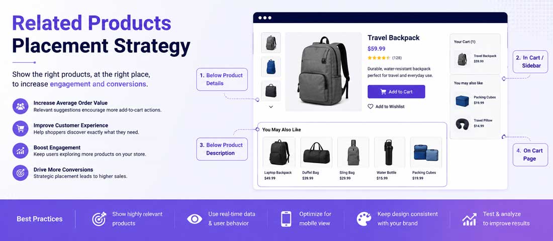
When related products help conversion. Below the fold, after the buyer has had the chance to fully consider the current product. Positioned as “complete the look” or “frequently bought together” with genuine relevance. Contextual rather than random (“customers who bought this shirt often add these pants” rather than “you might also like these unrelated items”). At this positioning, related products increase average order value without cannibalising primary product conversion.
When related products hurt conversion. Above the fold or too close to the primary decision zone. Random or algorithm-driven rather than curated. Prominently displayed as alternatives to the current product (“You might prefer these instead”) rather than complements. In these positions, related products distract from the current decision and produce the “40% who bounce to related products” problem where you lose the current sale trying to promote future sales.
Positioning strategy. The rule that consistently works: related products live below the current product’s decision zone, not around it. Buyers should be able to make the current product decision without being pulled into related product consideration until they’ve committed or clearly rejected the current product.
“Complete the look” done right. Fashion sites often show outfit-completing products near the current product. When done well (curated pairings, styled looks, “here’s the complete outfit”), this genuinely helps AOV and provides value to buyers. When done poorly (algorithm-generated pairings that don’t actually match, “you might also like” with no clear connection), it’s clutter.
The 40% who bounce to related products problem. Analytics on many product pages show that a significant portion of buyers who add to cart came from clicking a related product recommendation on a different product page. This sounds like a win for related products — until you realise those buyers were about to convert on the original product before the related product distracted them. The metric that matters is total conversion rate, not attribution to specific elements.
Mobile-specific optimisations that matter
The mobile eCommerce experience is meaningfully different from desktop and requires specific attention rather than treating mobile as “desktop but responsive”. The elements that matter on mobile aren’t the same elements that matter on desktop.
Mobile isn’t just responsive. Responsive design ensures your desktop layout adapts to mobile screens. Mobile-first design considers how mobile users actually behave (one-handed browsing, thumb reach zones, quick browsing sessions, distraction-prone environments) and designs specifically for those behaviours. The difference is significant — mobile-first product pages convert measurably better than responsive product pages even when both technically “work” on mobile.
Thumb zones on mobile. Primary interactive elements (add-to-cart, variant selectors) should be in the thumb-reachable zone at the bottom of the screen for one-handed use. Elements requiring precision (small close buttons on overlays, small navigation elements) frustrate mobile users and produce accidental interactions. Design mobile layouts assuming one-handed use with thumb interaction.
Bottom sticky CTAs. Add-to-cart buttons stuck to the bottom of the mobile viewport, visible regardless of scroll position, consistently outperform static buttons that scroll with content. The specific pattern: bottom sticky “Add to Cart” or “Buy Now” that’s always accessible, with the main product image and information scrollable above.
Image galleries on mobile. Swipeable image galleries work better than pinch-zoom-on-tap patterns on mobile. Thumbnails visible on desktop should be swipe indicators on mobile. Image counter (“2 of 8”) helps buyers navigate. Pinch-to-zoom should be available but not the primary way to view detail.
Load speed reality on 4G. Testing product page speed on office WiFi doesn’t reflect what your mobile customers actually experience on 4G/5G with variable signal. Real-world mobile speed testing (Chrome DevTools throttling, actual device testing) reveals speed issues that desktop testing hides. Product pages that load in 2 seconds on WiFi but 8 seconds on 4G lose the mobile buyers who represent most of your traffic.
The metrics that actually indicate product page success
What you measure determines what you can improve. Product page metrics beyond just “conversion rate” reveal specific improvement opportunities.
Not just conversion rate. Overall conversion rate is influenced by so many factors (traffic quality, product-market fit, pricing, competition) that using it alone to evaluate product page work is misleading. Isolate the metrics that specifically measure product page effectiveness.
Add-to-cart rate. The percentage of product page visitors who add to cart. This is more directly influenced by product page quality than overall conversion. Improvements in imagery, description, trust signals, and layout should show up here first. A/B testing product page changes with add-to-cart rate as the primary metric produces more actionable learnings than testing with checkout conversion as the primary metric.
Time to add-to-cart. How quickly do buyers who convert reach the add-to-cart action? Faster times often indicate better decision support; slower times can indicate either careful research (positive) or confusion (negative). Combined with add-to-cart rate, this reveals whether your product page is helping decisions or hindering them.
Cart abandonment attributable to product page. Cart abandonment has many sources but some traces back to product page confusion — buyers who added to cart while uncertain about fit, variant, or specifications and then abandoned when they thought about it more. Post-purchase surveys and cart abandonment email response analysis can help isolate this.
Return rate correlation. Product pages that undersell the product’s actual characteristics (better images than the product, misleading descriptions, unclear sizing) produce higher return rates. Product pages that accurately represent the product produce lower return rates. Return rate is a lagging indicator of product page honesty — high returns often indicate product page accuracy problems even when conversion is fine.
Common product page mistakes to avoid
The patterns of underperforming product pages are consistent across categories, and knowing them proactively prevents the specific mistakes rather than learning them through experience.
- Underinvestment in imagery. 2-3 mediocre images when 6-8 professional images would move conversion measurably. This is the single most common expensive mistake in product page work.
- SEO-crammed product titles. Keyword-stuffed titles that hurt conversion more than they help ranking on modern search engines.
- Hiding trust signals in footer or FAQ pages. Trust signals only work when they’re visible at the decision moment. Placing them elsewhere neutralises their effect.
- Long unstructured product descriptions. Wall of text descriptions get scanned past. Structure matters more than length.
- Requiring users to scroll to see essential decision elements. Title, price, hero image, variant selectors, and CTA should all be above the fold on primary devices.
- Poor variant selection UX. Small unclear swatches, missing size guides, dead-end out-of-stock handling all quietly kill conversion.
- Placing related products where they distract. Related products above the fold or too close to the CTA pull buyers away from the current sale.
- Desktop-first design responsive to mobile. Mobile users get a degraded experience that damages conversion for the majority of eCommerce traffic.
- Ambiguous shipping and returns terms. Buyers who have uncertainty about shipping cost or return policy abandon at checkout rather than committing to unknown costs.
- Ignoring how the product page fits into broader marketing funnel design. Product pages are the conversion moment for traffic acquired through marketing efforts. Optimising product pages in isolation from the funnel that brings buyers there is optimising the last mile while ignoring the highway. The full picture of how product pages fit into acquisition and conversion strategy is what our piece on building a marketing funnel covers, and product page optimisation reaches its full potential when it’s integrated with the broader funnel design.
Category-specific considerations
Some product page principles are universal; others depend meaningfully on category. Being aware of category-specific patterns produces better results than treating all eCommerce as identical.
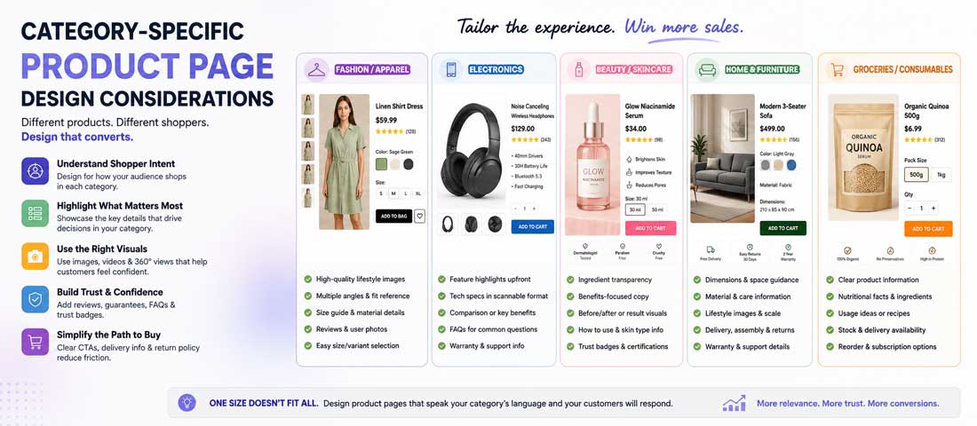
Fashion and apparel. Imagery is disproportionately important. Model shots showing fit on real people (with stated measurements) matter more than product-only shots. Size guides and fit descriptions (“runs small”, “true to size”, “loose fit”) reduce returns. Colour accuracy in imagery matters — customers who receive products in different shades than shown are the ones who leave one-star reviews about “colour was wrong”.
Electronics and tech. Specifications matter more than emotional description. Comparison to alternatives is often useful. Technical details need to be complete and accurate — buyers cross-reference specs against expectations, and missing specs kill conversion. Compatibility information (works with X, requires Y) is essential.
Home goods. Scale reference is critical (a chair looks similar in isolation regardless of size). Lifestyle imagery showing product in real rooms matters. Colour accuracy across screens is a returns issue. Assembly requirements and time should be disclosed.
Food and consumables. Ingredient lists, nutritional information, allergen warnings, and dietary certifications (organic, halal, kosher, vegan) need to be surfaced clearly. Shelf life and storage requirements matter. Subscription and repeat purchase options often outperform one-off purchase framing.
Digital products. “What you actually get” clarity is essential — buyers of digital products often struggle to understand exactly what will be delivered. Demo access, screenshots, or preview versions dramatically improve conversion. Refund policy visibility is especially important because buyers can’t return digital products the way they return physical ones.
B2B products. Quantity discounts, bulk order processes, and volume pricing tables need to be visible. Technical specifications with downloadable data sheets are standard expectation. Contact-for-quote paths for enterprise buyers work alongside self-service purchase for smaller orders. Purchase orders and net-30 payment terms need to be surfaced for buyers who need them. This category benefits from proper WooCommerce customisation more than off-the-shelf themes provide.
Luxury goods. Photography quality is disproportionately important. Round-number pricing rather than charm pricing. Brand story and provenance content matters. Reviews are less influential than editorial mentions and press. Less-crowded pages with more whitespace signal exclusivity better than dense information-heavy pages.
The A/B testing approach that actually reveals winners
A/B testing product pages produces useful learnings when done with discipline and misleading results when done without. The specific patterns that matter for testing are worth being explicit about.
Test hypotheses, not just elements. “Test button colours” produces random results with no learning. “Test the hypothesis that trust signals visible near the CTA increase conversion versus trust signals in the footer” produces a genuine learning about a specific pattern that can inform future decisions. Hypothesis-driven testing accumulates knowledge; element-driven testing accumulates random findings.
Sample size reality. Statistical significance requires meaningful sample sizes. For 5% conversion rate baseline testing 10% relative improvement (moving to 5.5%), you typically need 5,000-15,000 visitors per variant to reach statistical confidence. Sites without significant traffic can’t run meaningful A/B tests on individual product pages and should focus on best practices application rather than testing. This isn’t a criticism of low-traffic sites — it’s honesty about when testing is worth the setup effort.
Test duration matters. Tests need to run for at least full business cycles (typically 2-4 weeks minimum) to account for day-of-week and weekend effects. Tests concluded after 3 days on a Tuesday because “the winner is clear” often report false winners.
What to test first. Priority order for testing: hero imagery quality and count, trust signal placement, add-to-cart button copy and prominence, description structure, then more minor elements. Testing minor elements before major ones is common and produces small improvements while leaving big opportunities on the table.
What not to test. Not everything needs A/B testing. Best practices like mobile-first design, professional imagery, above-the-fold decision elements, and adjacent trust signals are established patterns worth applying without testing. Testing whether these apply to your specific site wastes time on questions that have known answers.
When to bring in professional help
For most eCommerce businesses, applying the principles in this article internally is achievable with focused effort. Specific situations warrant professional help.
Bring in help when your current conversion rate is meaningfully below industry benchmarks and you don’t know why — auditing product pages for the specific issues costing conversion benefits from experienced eyes that have seen the patterns before. Bring in help when you’re redesigning product pages significantly rather than iterating on existing ones — starting fresh with expert input produces better outcomes than DIY redesigns that repeat common mistakes. Bring in help when your site is complex (many products, complex variants, technical categories) and applying general principles requires interpretation for your specific context. And bring in help when the stakes are high enough that professional investment pays back reliably — for stores generating $50,000+ monthly revenue, professional product page optimisation typically pays back within weeks through the conversion improvements.
For ongoing product page optimisation alongside broader eCommerce work, the discipline of continuous improvement produces meaningfully better outcomes than one-time optimisation projects. Product page effectiveness decays as competitor pages improve, buyer expectations shift, and platform capabilities evolve. Ongoing optimisation catches these shifts and adapts. Whether we’re providing this as part of proper UI/UX design work for new stores or auditing existing stores for improvement opportunities, the pattern that produces the best long-term results is treating product page optimisation as ongoing operational discipline rather than a one-time deliverable.
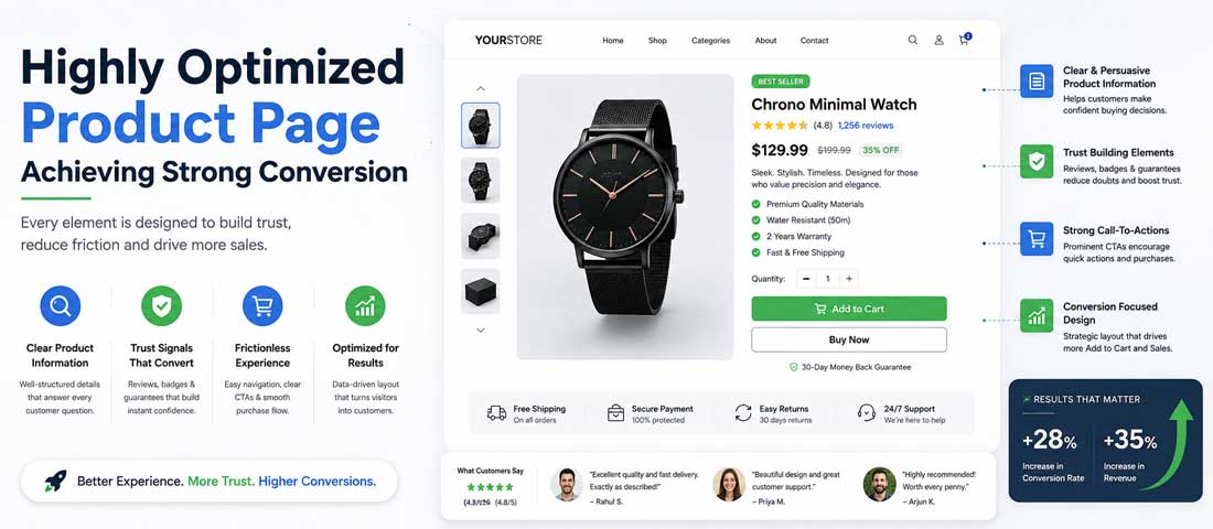
The honest summary of product page optimisation is that the elements that actually move conversion are more specific than generic advice suggests, and prioritising investment where it matters most produces dramatically better results than distributing effort evenly across all “best practices”. Hero imagery is the single highest-impact area for most product pages — professional quality, multiple angles, lifestyle context, working zoom — and businesses that invest here reliably see the biggest conversion gains. Trust signals adjacent to the CTA rather than scattered around the page consistently move conversion. Scannable product descriptions structured for buyer decision-making outperform comprehensive descriptions written for completeness. Frictionless variant selection prevents conversions from dying at the exact moment buyers were about to commit. Mobile-first design (not desktop-first responsive) is now mandatory rather than optional given traffic mix. Category-specific considerations matter — fashion needs different elements than electronics needs different elements than luxury goods. And underneath all of this, the discipline of testing hypotheses rather than random elements, measuring quality alongside conversion rate, and treating optimisation as ongoing work rather than one-time projects is what separates businesses whose product pages keep getting better from businesses whose product pages plateau. The businesses that navigate product page optimisation well are the ones being specific about what they’re improving and why, applying investment where the return justifies it, and iterating based on real data rather than “test everything” bromides. Product page optimisation done right is one of the highest-return investments in eCommerce operations — often producing 20-40% conversion improvements within weeks — but only when the specific elements getting attention are the elements that actually move the needle.
Frequently asked questions
| What’s the single biggest factor affecting product page conversion? | Hero imagery quality and count. This is the least exciting answer and the most consistently accurate one across categories and price points. Product pages with 2-3 mediocre images convert measurably worse than product pages with 6-8 professional images including lifestyle context and functional zoom. Sites that invest in imagery — professional photography, multiple angles, in-context shots, proper gallery UX — reliably see the biggest conversion gains from single-element improvements. This holds across fashion, electronics, home goods, and most other categories where product visualisation influences purchase decisions. If you can only invest in improving one thing about your product pages, invest in imagery. Everything else matters but produces smaller improvements per unit of investment. The good news is that professional product photography costs $500-5,000 per product depending on complexity, which is significant but not prohibitive for stores with meaningful revenue. |
| How many images should a product page have? | Six to eight images minimum for most product categories, with meaningful variety across image types. The specific composition that works: 2-3 product-only shots from primary angles (front, side, three-quarter), 1-2 lifestyle or in-context shots showing the product in real use, 1-2 detail or close-up shots revealing texture, materials, or key features, and 1 scale reference shot (either with a model or with a common object for reference). Beyond 8 images, the returns diminish substantially — additional images add marginal value while adding to page weight and load time. Below 5 images, the drop in conversion is significant relative to properly-imaged pages. For fashion, footwear, and other categories where visualisation is critical, extending to 10-12 images including video can be worthwhile. For simple products (basic consumer goods, standard accessories), 4-6 images can be sufficient. Quality per image matters as much as count — six professional images outperform ten mediocre ones consistently. |
| Should product descriptions be long or short? | Both, structured appropriately. Above the fold: short, benefit-led primary description (2-4 sentences) plus key spec bullets that let buyers make an initial decision without scrolling. Below the fold: longer, detailed description covering full features, materials, care instructions, dimensions, technical specifications, and any category-relevant details buyers might want. The pattern that works is progressive disclosure — surface what everyone needs immediately, hide what only some buyers need behind expandable sections or scrolling. Length itself matters less than structure. Long descriptions that scan well through headings and bullets can outperform short descriptions that don’t answer buyer questions. Short descriptions on complex products underperform because they leave buyers uncertain. Match description depth to product complexity: simple products need less; complex products need more. The universal principle is that description content should be organised for scanning rather than for reading, since buyers rarely read descriptions linearly. |
| Where should reviews appear on a product page? | Layered across the page rather than in one location. Star rating and review count near the top (below or beside product title) so buyers see the summary immediately. A prominent link jumping to the detailed reviews section for buyers who want to research. The full detailed reviews section further down the page, ideally with filtering (by rating, most helpful, most recent, with photos). Photo reviews mixed into the product image gallery where appropriate. Individual review snippets or quotes surfaced near the CTA for particularly strong reviews. The specific mistake to avoid is hiding reviews in a separate tab below the fold where buyers have to know to look for them. Sites that surface reviews prominently outperform sites that hide them even when the underlying review quality is equivalent. The pattern is that reviews influence buyers who see them; reviews that are technically present but not visually accessible influence nobody. |
| What’s the ideal add-to-cart button colour? | The one that contrasts strongly with everything around it and fits your brand palette. The specific colour matters less than the contrast. A high-contrast button in any brand-appropriate colour outperforms a lower-contrast button in a colour that testing suggests is “optimal”. That said, warm colours (orange, red, yellow) generally produce higher click rates than cool colours (blue, green) for action buttons across A/B tests, but this varies enough by brand and context that it’s not worth over-optimising. What matters more than button colour is button size (large enough to tap easily on mobile — 44px minimum height), button copy (clear action-oriented text), button placement (thumb-reachable on mobile, prominent on desktop, sticky when scrolling on long pages), and button visibility (no visual competition from other elements). Businesses obsessing over button colour while ignoring these other factors are optimising the wrong thing. |
| Should I show related products on product pages? | Yes, with careful attention to placement. Below the fold, after buyers have had the chance to fully consider the current product, related products can increase average order value by 10-20% without cannibalising current product conversion. Above the fold or too close to the primary decision zone, related products distract buyers from the current decision and produce measurable conversion loss on the item they were about to buy. The specific rule that works: related products live below the current product’s decision zone, not around it. Curation matters as much as placement — genuinely related products (frequently bought together, completes the outfit, natural add-on) produce better results than algorithm-generated “you might also like” that lacks obvious relevance. For fashion and lifestyle products, “complete the look” curated pairings work particularly well. For utility products, “frequently bought together” often works. For B2B products, “related accessories” is usually more useful than “similar products”. |
| How do I know if my product page is underperforming? | Four indicators reliably signal underperformance. First, add-to-cart rate significantly below industry benchmarks for your category — for fashion, 8-12% add-to-cart rate on product page visits is typical; for consumer electronics, 5-8% is typical; for luxury goods, 3-5% is typical. Well below these ranges suggests specific product page issues. Second, high bounce rate specifically from product pages (not from category pages or homepage) — indicates buyers arriving with intent but not finding what they need to convert. Third, disproportionate return rate for a specific product — suggests the product page is misrepresenting the product (better imagery than reality, inaccurate description, unclear sizing). Fourth, cart abandonment where the specific product added is disproportionately abandoned versus other products — suggests product-page-specific uncertainty carrying through to checkout. Beyond these signals, direct qualitative research (session recordings, user testing, customer service inquiries about specific products) reveals specific improvement opportunities that quantitative metrics don’t surface directly. |
Ready to Optimise your Product Pages for The Conversion Improvements They should be Delivering?
We audit product pages, identify the specific elements underperforming, and rebuild them for measurable conversion improvement as part of our eCommerce services. With 12+ years of experience and over 2,500 websites delivered — including significant Shopify, WooCommerce, and custom eCommerce work — we know what genuinely moves conversion versus what marketing agencies claim moves conversion. Send us your product page URL and we’ll respond within one business day with an honest read on the specific improvements available and expected impact.