Glassmorphism Web Design: How to Use It (and When to Avoid It)
If you have been browsing design inspiration sites, scrolling through Dribbble, or simply paying attention to the websites and apps around you lately, you have almost certainly seen glassmorphism — even if you did not know the name. Those semi-transparent cards with frosted-glass blur effects, soft white borders, and subtly vibrant backgrounds flooding through from behind. The aesthetic that Apple popularised with macOS Big Sur, that Google refined across Material You, and that designers everywhere have been reaching for ever since.
What this guide covers
- 1. What Is Glassmorphism? Origin, Definition, and Core Principles
- 2. The 4 Design Properties That Define True Glassmorphism
- 3. How to Implement Glassmorphism in CSS
- 4. Where Glassmorphism Works Brilliantly — Best Use Cases
- 5. Where Glassmorphism Fails — When to Avoid It Entirely
- 6. Glassmorphism and Accessibility — The Critical Consideration
- 7. Glassmorphism vs Neumorphism vs Flat Design — Which to Choose?
- 8. 2026 Examples: How to Do Glassmorphism Right
- 9. The Glassmorphism Implementation Checklist
- 10. Frequently Asked Questions About Glassmorphism
Glassmorphism is one of the most talked-about and widely adopted web design trends of 2026. Used well, it creates interfaces that feel modern, spacious, premium, and genuinely beautiful. Used poorly — or used in the wrong context entirely — it creates visual noise, accessibility problems, and interfaces that are difficult to read and harder to use.
This guide covers both sides completely: what glassmorphism is, where it came from, how to implement it correctly for web design, the specific contexts where it works brilliantly, and the situations where it will hurt your website more than it helps.
What Is Glassmorphism? Origin, Definition, and Core Principles
Glassmorphism is a UI design style characterised by elements that simulate the appearance of frosted glass — translucent surfaces that allow a blurred, colour-diffused view of whatever lies behind them, creating a layered, depth-rich visual hierarchy. The term was coined and popularised in 2020 by UI designer Michal Malewicz, though the visual concept was already being deployed at scale by Apple in macOS Big Sur, which launched the same year.
The design language taps into something psychologically compelling: glass is a material we associate with quality, sophistication, cleanliness, and modernity. A glass building feels premium. A glass-fronted product feels premium. Glass interfaces carry the same associations into digital design — which is a significant part of why the trend has had such remarkable staying power compared to most design micro-trends, which typically peak and fade within 12 to 18 months.
In 2026, glassmorphism has matured past its initial peak of everywhere-at-once adoption into a more selective, more thoughtfully applied tool in the professional designer’s repertoire. The early adopters who applied it to everything — including contexts where it actively hurt usability — have largely moved on. The designers who are using it well are using it precisely, deliberately, and with a clear understanding of both its visual power and its practical constraints.
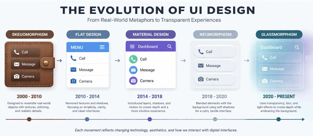
Glassmorphism is the latest evolution in a long lineage of dominant interface design languages — each one a reaction to the limitations of what came before.
The 4 Design Properties That Define True Glassmorphism
Not every blurry, semi-transparent element is glassmorphism. The aesthetic has four defining properties that, when all present together, create the genuine effect. Understanding these properties is the difference between a polished glassmorphism implementation and something that looks like a half-finished attempt.
Property 1: Transparency (Background Opacity)
The defining characteristic of glassmorphism is semi-transparency — the element allows the content behind it to show through, blurred and colour-shifted but visible. In CSS, this is achieved through background: rgba(255, 255, 255, 0.1) to rgba(255, 255, 255, 0.25) for a light glass effect, or equivalent low-opacity dark values for dark glass. The opacity level is critical: too opaque and the glass effect disappears; too transparent and the element loses its visual identity entirely and readability suffers.
Property 2: Backdrop Blur (The Frosted Glass Effect)
The blur is what creates the frosted glass simulation. In CSS, this is backdrop-filter: blur(10px) — or typically 8px to 20px depending on the desired effect strength. The backdrop blur applies a blur to whatever is rendered behind the element, creating the soft, diffused appearance of light passing through frosted glass. Without backdrop blur, you have a transparent element but not glassmorphism. This is the most computationally expensive of the four properties and the one most commonly misused at excessive values.
Property 3: Subtle Border
A thin, semi-transparent white or light-coloured border defines the edges of the glass element — separating it visually from the background without a harsh, opaque line. Typically: border: 1px solid rgba(255, 255, 255, 0.3). This border mimics the way real glass catches light at its edges, giving the element definition and physicality. Without it, glass elements can feel undefined and floating; with a heavy opaque border, the glass illusion breaks.
Property 4: Vivid, Colourful Background
Glassmorphism requires something interesting behind the glass to be effective. A glassmorphism card floating over a plain white background shows nothing through the glass — the transparency is invisible, the blur has nothing to blur, and the effect disappears entirely. The background must be colourful and visually rich — typically a vibrant gradient, colourful photography, an abstract pattern, or other glass elements overlapping — for the frosted glass effect to read correctly. This is one of the most commonly overlooked requirements and the reason many attempted glassmorphism implementations fail to look like the inspiration they were drawn from.
How to Implement Glassmorphism in CSS
Here is the complete CSS implementation of a glassmorphism card — the core pattern from which all variations are built:
/* The container must have a vibrant background */
.glassmorphism-container {
  background: linear-gradient(135deg, #667eea 0%, #764ba2 100%);
  min-height: 100vh;
  display: flex;
  align-items: center;
  justify-content: center;
}

/* The glass card */
.glass-card {
  background: rgba(255, 255, 255, 0.15);
  backdrop-filter: blur(12px);
  -webkit-backdrop-filter: blur(12px); /* Safari support */
  border: 1px solid rgba(255, 255, 255, 0.25);
  border-radius: 16px;
  padding: 32px;
  box-shadow:
    0 8px 32px rgba(0, 0, 0, 0.12),
    inset 0 1px 0 rgba(255, 255, 255, 0.2);
  color: #ffffff;
}

/* Text on glass must maintain contrast */
.glass-card h2 {
  font-weight: 700;
  text-shadow: 0 1px 3px rgba(0, 0, 0, 0.3);
}

.glass-card p {
  opacity: 0.85;
  line-height: 1.7;
}
Browser Support Considerations in 2026
The backdrop-filter property is now supported across all major browsers — Chrome, Firefox (since version 103), Safari, and Edge. The -webkit-backdrop-filter prefix is still needed for older Safari versions. For the small percentage of users on very old browsers, the element will appear with its background colour but without the blur effect — a graceful degradation that leaves the design functional if not visually complete.
Dark Glassmorphism
Glassmorphism is not exclusively a light design treatment. Dark glass — using background: rgba(0, 0, 0, 0.2) or rgba(30, 30, 50, 0.3) — over dark, richly coloured backgrounds creates an equally compelling effect that suits dark-themed interfaces, gaming contexts, fintech dashboards, and premium B2B applications. Dark glass tends to feel more serious and sophisticated; light glass feels more fresh and airy. Both are valid — the choice depends on your brand and audience.
Where Glassmorphism Works Brilliantly — Best Use Cases
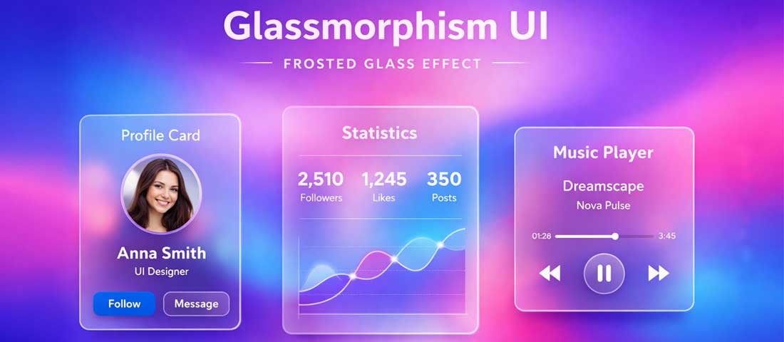
Glassmorphism performs best in contained contexts — pricing cards, modal overlays, dashboard widgets, and hero section CTAs — where the vivid background and limited text keep it readable and visually striking.
1. Hero Section Overlays and CTA Cards
A glassmorphism CTA card floating over a vibrant hero background image or gradient is one of the most effective uses of the aesthetic — it creates immediate visual hierarchy, draws the eye to the conversion element, and communicates premium brand positioning. The glass card says: this is the thing that matters; everything else is context. For Neel Networks clients in creative, premium, or technology-adjacent industries, this pattern consistently generates strong client feedback and conversion performance.
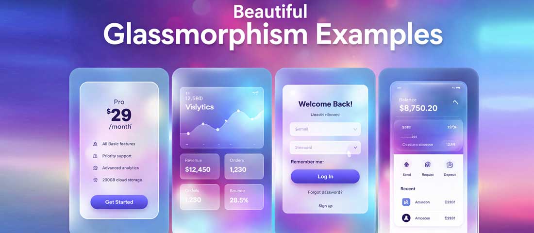
2. Pricing and Feature Cards
Glassmorphism pricing cards over a vibrant background feel premium and contemporary in a way that flat white-box pricing tables simply do not. The visual depth communicates quality before a single word is read. The constraint: pricing cards must remain completely legible, which means testing contrast on every text element against the blurred background and ensuring the white or dark text passes accessibility contrast requirements.
3. Dashboard and Data Widgets
Dark glassmorphism is particularly well-suited to analytics dashboards and admin interfaces — the semi-transparent dark panels create a layered, sophisticated data environment that feels more like a high-end product than a generic data table. Companies in fintech, SaaS, and business intelligence consistently deploy glassmorphism in their dashboards. The dark background makes charts and data visualisations pop while the glass panels organise content into clear visual groups.
4. Modal Dialogs and Popup Overlays
A glassmorphism modal over a blurred, darkened version of the page content it overlays creates a sense of depth and hierarchy that standard white-background modals cannot match. The user clearly understands: this modal is on top of the page; the page is still there behind it. This spatial clarity is genuinely useful from a UX perspective, not just aesthetically — glassmorphism modals communicate their function through their appearance.
5. Mobile App Onboarding and Login Screens
Mobile app designers have embraced glassmorphism enthusiastically for onboarding and authentication screens — the aesthetic creates a memorable first impression that positions the app as premium from the first interaction. Against a vibrant gradient background with carefully composed glassmorphism login form elements, an app’s first screen can feel dramatically more polished than equivalent screens using flat or material design approaches.
6. Navigation Bars and Headers
A glassmorphism navigation bar — a transparent, blurred sticky header that lets page content flow subtly behind it as users scroll — is one of the most elegant uses of the aesthetic in production web design. Apple’s own website uses a variant of this pattern. It solves the practical problem of “how do we keep the navigation visible without covering content aggressively” with a beautiful visual solution.
Where Glassmorphism Fails — When to Avoid It Entirely
The honest warning: Glassmorphism is one of the most abused design trends in recent memory. The gap between “glassmorphism done beautifully by a skilled designer with the right content and context” and “glassmorphism applied carelessly by someone who saw it on Dribbble” is enormous. Before reaching for glassmorphism, read this section carefully.
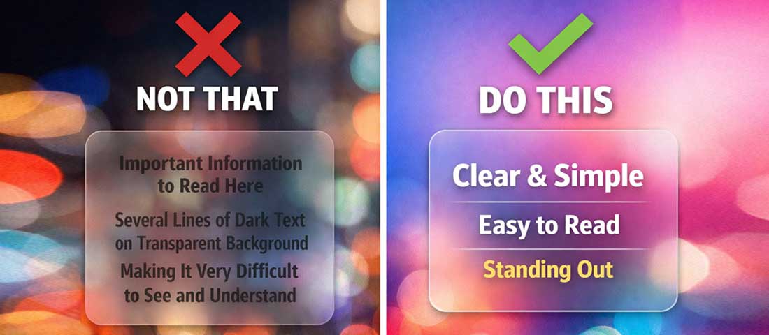
❌ Avoid: Long-Form Text and Reading Content
Glassmorphism and reading do not get along. The visual complexity introduced by a blurred, translucent background behind paragraphs of body text significantly reduces readability — particularly for users with visual impairments, dyslexia, or those reading on lower-quality screens in varying lighting conditions. If your page’s primary purpose is to communicate detailed written information, glassmorphism should not be the background for that text. Reserve it for UI elements, short headings, and data — not paragraphs.
❌ Avoid: Websites With Primarily White or Plain Backgrounds
This is the most common glassmorphism failure in the wild. Applying glassmorphism properties to elements on a website with a plain white or single-colour background produces elements that look washed out, faded, or simply transparent without any of the visual richness that makes glassmorphism work. The entire aesthetic depends on interesting, colourful background content to blur through. Without that, you have a low-contrast element that looks like an unfinished design.
❌ Avoid: eCommerce Product Pages and Conversion-Critical Pages
Conversion rate data is consistent on this point: visual complexity on product pages and checkout pages reduces conversion rates. The glassmorphism aesthetic, with its layered depth, gradient backgrounds, and translucent elements, adds visual complexity that distracts from the product, the price, and the add-to-cart button. For eCommerce contexts, clarity and speed triumph over aesthetic sophistication. A clean, fast-loading product page with a prominent CTA will almost always outconvert a visually complex glassmorphism-heavy one.
❌ Avoid: Professional Services and Trust-Heavy Industries
Legal practices, accounting firms, medical providers, financial advisors, and similar businesses build client relationships on trust, credibility, and professional gravitas. Glassmorphism’s aesthetic associations — youthful, tech-forward, visually playful — are often misaligned with the brand positioning these businesses need. A law firm’s website with glassmorphism pricing cards sends a subtly wrong signal. The aesthetic says “startup” or “creative agency” rather than “established professional practice.”
❌ Avoid: Accessibility-Sensitive Contexts Without Thorough Testing
Glassmorphism creates genuine accessibility challenges. The WCAG 2.1 contrast ratio requirements (4.5:1 for body text, 3:1 for large text) are difficult to meet when text appears over a blurred, constantly changing, semi-transparent background. The background colour bleeding through the glass changes the effective contrast ratio for text — and on small screens or in low-light environments, even text that passes desktop contrast checks can become difficult to read.
If you use glassmorphism in contexts with significant text, you must test: contrast in multiple screen conditions (bright sunlight, dim indoor), on multiple screen types (OLED, LCD, older displays), with accessibility tools, and with real users where possible. This is not a reason to never use glassmorphism — it is a reason to use it carefully and test thoroughly.
❌ Avoid: Performance-Critical Contexts Without Optimisation
backdrop-filter: blur() is one of the most GPU-intensive CSS properties available. On low-end Android devices and older hardware, aggressive backdrop blur can cause visible jank, scroll stuttering, and battery drain. For websites where mobile performance is critical — eCommerce, high-traffic content sites, any site targeting markets with lower-end device penetration — the performance cost of heavy glassmorphism must be carefully evaluated against the visual benefit.
Performance mitigation strategies include: limiting the number of elements with backdrop-filter active simultaneously, reducing blur radius (8px rather than 20px delivers most of the visual effect with significantly less GPU cost), using will-change: backdrop-filter to hint the browser to promote the element to its own compositor layer, and testing explicitly on mid-range Android devices rather than only on the MacBook Pro where you are designing.
Glassmorphism and Accessibility — The Critical Consideration
Accessibility is the dimension of glassmorphism that gets the least attention in design inspiration content and the most attention in production design practice. Here is what you genuinely need to know:
- Always set a fallback background colour. For users who cannot perceive the blurred background content or who are using assistive technologies, the glass element needs a visible, contrasting background colour as a fallback.
background: rgba(255, 255, 255, 0.15)is nearly invisible on its own — addbackground-color: rgba(255, 255, 255, 0.8)as a fallback or use the@supportsquery to apply glassmorphism only whenbackdrop-filteris supported. - Test contrast with the actual background blur, not the element alone. Static contrast checking tools measure text against a solid colour. Glassmorphism text sits on a blurred mixture of the colours behind it — test by taking screenshots at various scroll positions where different background content bleeds through, and checking contrast against the actual rendered output.
- Use text shadows judiciously. A subtle text shadow (
text-shadow: 0 1px 3px rgba(0,0,0,0.3)) on white text over a glassmorphism background significantly improves legibility without visually jarring the design. - Respect
prefers-reduced-motionandprefers-reduced-transparency. Users with vestibular disorders or visual sensitivities can opt into reduced motion and reduced transparency at the OS level. Respecting these preferences is both an accessibility best practice and, in some jurisdictions, a legal requirement.
Glassmorphism vs Neumorphism vs Flat Design — Which to Choose?
| Style | Visual Character | Best For | Avoid When | Accessibility |
|---|---|---|---|---|
| Glassmorphism | Frosted glass, translucency, vibrant background blur | Hero sections, dashboards, premium SaaS, creative agencies, mobile apps | Long text content, plain backgrounds, trust-heavy industries, performance-critical contexts | ⚠️ Requires careful contrast testing |
| Neumorphism | Soft, extruded elements from background — like sculpted plastic | Calculators, music players, specific product UI components | Almost everything else — extremely poor contrast, fails WCAG at scale | ❌ Very difficult to make accessible |
| Flat Design | No depth, no shadows, solid colours, simple shapes | Information-heavy content, long-form reading, corporate, government, healthcare | When visual memorability and premium feel are priorities | ✅ Easiest to make accessible |
| Material Design 3 | Depth through elevation shadows, dynamic colour, rounded shapes | Android apps, Google ecosystem products, structured data applications | Brands that need distinctive visual identity beyond Google’s language | ✅ Accessibility built into the system |
| Hybrid (Glass + Flat) | Flat foundation with glassmorphism accents on specific elements | Most professional business websites in 2026 | When consistency and simplicity are more important than visual flair | ✅ Manageable with careful application |
The “Hybrid” approach — using flat design as the primary interface language with glassmorphism applied selectively to specific high-impact elements — is the dominant production pattern in 2026. It gives you the visual richness of glassmorphism where it matters most without the readability and performance costs of applying it everywhere.
2026 Examples: How to Do Glassmorphism Right
The difference between glassmorphism done well and done poorly is almost always about contrast, restraint, and choosing the right content to put inside the glass element.
Apple — The Originator and the Standard
Apple’s macOS and iOS interfaces remain the definitive reference for glassmorphism in production. The translucent menu bar, the frosted-glass notification centre, the blurred background behind control centre panels — all implement the aesthetic correctly because Apple controls both the content behind the glass (always their own carefully designed backgrounds) and the content inside it (always limited, high-contrast, purpose-specific). The constraint Apple operates within is the key lesson: they only put glassmorphism where they can guarantee the background will produce the right effect.
SaaS Dashboard Applications
Fintech and analytics SaaS products have adopted dark glassmorphism for their dashboards most effectively. The pattern: a deep navy or near-black background with subtle colour gradients, glass-panel data cards with dark semi-transparent backgrounds, vibrant data visualisations inside those panels. The result is a premium, focused environment where the data is the hero and the glass panels organise it with visual sophistication. The key: very limited text in each panel, all in white or near-white with sufficient contrast.
Creative Agency and Portfolio Websites
Creative agencies and design studios have adopted glassmorphism enthusiastically — it is a natural fit for brands positioning themselves as cutting-edge and design-forward. The pattern that works: full-width background imagery or video, glassmorphism overlay cards for project descriptions or service offerings. The text is short and the contrast is carefully managed. The glassmorphism signals aesthetic sophistication; the background content is doing the heavy lifting of communicating the brand’s work.
The Glassmorphism Implementation Checklist
-
Confirm you have a vivid, colourful background
No glassmorphism works on a plain white or single-colour background. Before implementing any glass elements, ensure you have a gradient, image, or other colourful background content for the glass to float over. -
Start with low opacity and low blur
The most common implementation mistake is too much blur and too much transparency. Start atbackdrop-filter: blur(8px)andbackground: rgba(255,255,255,0.1)and increase gradually. Subtlety reads more sophisticated than excess. -
Add the border
border: 1px solid rgba(255, 255, 255, 0.25)is the element that most implementations forget — without it, glass cards look flat and undefined. -
Limit what goes inside the glass
Headings, short descriptive text, icons, data metrics, and CTAs work inside glass. Paragraphs of body copy, complex tables, and form fields with multiple inputs do not. -
Test contrast rigorously
Take screenshots at every scroll position where the background behind the glass changes. Check text contrast against each resulting composite. Fix issues with text shadows or increased opacity before launch. -
Test performance on mid-range Android
Open Chrome DevTools, throttle CPU to 4x slowdown, and test scroll performance. If you see dropped frames, reduce the number of simultaneousbackdrop-filterelements or reduce blur radius. -
Add a
@supportsfallback
Wrap glassmorphism properties in@supports (backdrop-filter: blur(1px))to ensure a solid, readable fallback for non-supporting browsers without the glass CSS making content unreadable.
Frequently Asked Questions About Glassmorphism
| What is glassmorphism in web design? | Glassmorphism is a UI design style that simulates the appearance of frosted glass — semi-transparent surfaces with a backdrop blur effect that lets the blurred, colour-diffused content behind them show through. It is defined by four core properties: background transparency (low-opacity rgba background), backdrop blur (CSS backdrop-filter), a subtle semi-transparent border, and a vivid colourful background for the glass to float over. The style was popularised by Apple in macOS Big Sur and has become one of the most widely adopted design aesthetics of 2025 and 2026 across web design, mobile app design, and SaaS product interfaces. |
| How do you create a glassmorphism effect in CSS? | The core CSS for a glassmorphism card is: background: rgba(255, 255, 255, 0.15) for the semi-transparent background; backdrop-filter: blur(12px) (with -webkit-backdrop-filter: blur(12px) for Safari) for the frosted blur; border: 1px solid rgba(255, 255, 255, 0.25) for the glass edge definition; and border-radius: 16px with a soft box shadow for depth. The container behind the element must have a vivid, colourful background — a gradient, image, or other rich content — for the glass effect to be visible. On a white background, glassmorphism is invisible. |
| When should you avoid glassmorphism in web design? | Glassmorphism should be avoided when: the website has a plain white or single-colour background (the effect cannot work without a colourful background to blur through); the content inside the glass element includes long paragraphs of body text (the visual complexity significantly reduces readability); the website serves trust-heavy industries where a youthful or tech-startup aesthetic is misaligned with the brand (law, medicine, finance, government); the page is conversion-critical (product pages, checkout) where visual simplicity and speed are more valuable than aesthetic sophistication; or when performance testing reveals that backdrop-filter causes scroll jank on target devices. |
| Is glassmorphism good for accessibility? | Glassmorphism creates accessibility challenges that require careful management. The semi-transparent background over a blurred, visually complex background makes achieving WCAG contrast ratio requirements (4.5:1 for body text) significantly more difficult than with solid backgrounds. The effective contrast of text changes as different background content bleeds through the glass at different scroll positions. The mitigation strategies are: always include a solid fallback background colour using @supports; use subtle text shadows on glass element text to improve legibility; rigorously test contrast across all background states; increase element opacity if needed to ensure text is legible; and respect prefers-reduced-transparency media queries for users who have set OS-level transparency preferences. |
| Does glassmorphism affect website performance? | Yes — backdrop-filter: blur() is one of the most GPU-intensive CSS properties available. On high-end devices (current iPhones, MacBooks, flagship Android phones), the performance impact is negligible. On mid-range Android devices and older hardware, multiple glassmorphism elements with heavy blur values can cause scroll jank and battery drain. Performance mitigation strategies include: limiting the number of simultaneous backdrop-filter elements, reducing blur radius (8px rather than 20px achieves most of the visual effect at significantly lower GPU cost), adding will-change: backdrop-filter to compositor-eligible elements, and testing explicitly on lower-end hardware using browser DevTools CPU throttling before launch. |
| What is the difference between glassmorphism and neumorphism? | Glassmorphism and neumorphism are both 2020-era UI design trends but they are visually and technically entirely different. Glassmorphism simulates frosted glass — transparent elements with backdrop blur floating over colourful backgrounds. Neumorphism simulates soft, extruded 3D elements emerging from or pressed into the background — achieved through dual shadow techniques on elements that share their exact background colour. Neumorphism requires very low contrast between elements and their background (because they are the same colour), which makes it nearly impossible to achieve accessibility contrast requirements. Glassmorphism, while accessibility-challenging, can be implemented accessibly with careful attention to contrast. In 2026, glassmorphism remains in widespread professional use; neumorphism has largely retreated from production use due to its accessibility and usability limitations. |
| What websites and industries use glassmorphism most effectively in 2026? | The contexts where glassmorphism is used most effectively in 2026 are: technology and SaaS products, particularly analytics dashboards and fintech interfaces where dark glassmorphism creates premium, data-focused environments; creative agencies and design studios whose brand positioning benefits from visual sophistication; mobile applications, especially onboarding and authentication screens where the aesthetic creates memorable first impressions; premium consumer brand websites for fashion, beauty, and lifestyle where aspirational visual quality is a commercial priority; and website hero sections across many industries where a glassmorphism CTA card over a vibrant background creates strong visual hierarchy and conversion-focused design. |
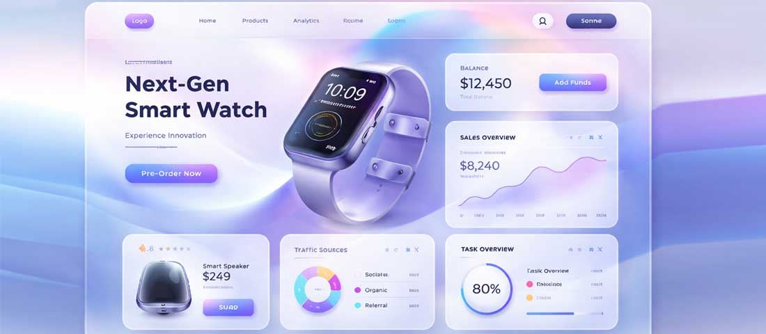
Glassmorphism at its best — subtle, purposeful, with strict contrast discipline and a vivid background doing its job. This is what the trend looks like when used by a team that understands both its possibilities and its limits.
Want glassmorphism implemented beautifully and correctly on your website?
Neel Networks designs and develops websites that use glassmorphism and other 2026 design trends exactly where they work — and avoids them exactly where they would hurt your conversions or readability. Talk to our design team about your next project.
View Our Web Design Services Get a Free Design Consultation WhatsApp Us