Mobile App Analytics 2026: Measuring Engagement, Retention & Conversions
Building a mobile app is the beginning of the journey, not the destination. The businesses that get the strongest long-term results from their apps are not necessarily the ones that built the most sophisticated features at launch — they are the ones that consistently measured how users were actually behaving, identified where value was being created and where it was being lost, and made data-informed decisions to improve the product over time.
What this guide covers
- 1. Why Most App Analytics Implementations Fall Short
- 2. The Metrics That Actually Matter: A Tiered Framework
- 3. Retention Analysis: The Most Important Thing You Can Measure
- 4. Conversion Funnel Analysis: Finding and Fixing Drop-Off Points
- 5. Analytics Tools for Mobile Apps in 2026
- 6. Push Notification Analytics: Measuring What Matters
- 7. A/B Testing in Mobile Apps: Making Data-Informed Product Decisions
- 8. User Segmentation: Analysing the Right Users
- 9. Building a Regular Analytics Review Process
- 10. Frequently Asked Questions About Mobile App Analytics
- 11. Conclusion: Analytics Is the Product Team’s Superpower
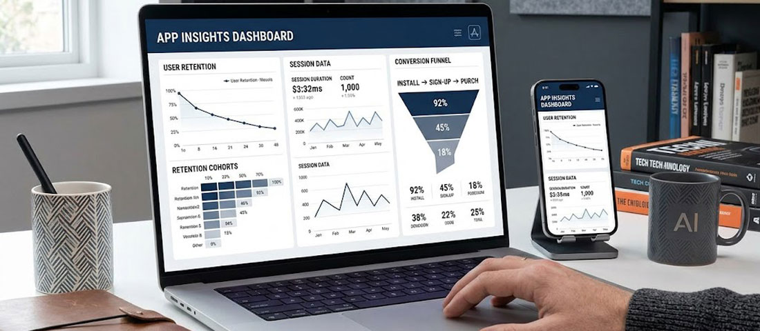
Mobile app analytics is the discipline that makes that improvement process possible. Without it, product decisions are driven by assumptions, executive instincts, and loudest-voice feedback — all of which have a poor track record compared to actual usage data. With it, teams can see exactly where users drop off during onboarding, which features drive the most retention, which user segments are most valuable, and which changes are producing measurable improvements in the metrics that matter for the business.
This guide covers the analytics framework every mobile app product team needs in 2026: which metrics matter and why, how to set up the right tooling, how to analyse retention and engagement in ways that produce actionable insight, and how to connect app performance data to business outcomes rather than stopping at vanity metrics.
Why Most App Analytics Implementations Fall Short
The majority of app teams implement analytics — they add Firebase or Mixpanel, track some events, and generate reports. The minority use analytics effectively. The gap between the two is not about tools; it is about approach. Common failure modes include: tracking everything without deciding what matters; monitoring outputs (downloads, sessions) without tracking outcomes (conversions, revenue, retention); generating reports that describe what happened without producing insight about why; and reviewing analytics periodically rather than building a continuous improvement loop around the data.
Effective app analytics starts with a measurement framework built before implementation — a deliberate decision about what questions you need the data to answer, what user behaviours map to commercial outcomes, and what metrics will actually drive product decisions. Everything else follows from that foundation.
The Metrics That Actually Matter: A Tiered Framework
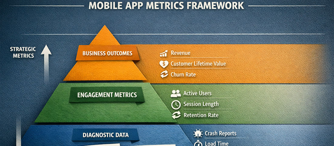
App metrics fall into three tiers: business outcome metrics (the commercial results you are ultimately trying to drive), product engagement metrics (the user behaviours that lead to those outcomes), and diagnostic metrics (the granular data that explains why engagement metrics look the way they do).
Tier 1: Business Outcome Metrics
These are the numbers that appear in board presentations and business reviews. They justify the app investment and tell you whether the product is delivering commercial value.
- Revenue generated through the app: In-app purchases, subscriptions, bookings, or sales directly attributable to app interactions. The foundational commercial metric.
- Customer Lifetime Value (LTV) — app users vs. non-app users: Do customers who use your app have higher lifetime value than those who do not? This comparison quantifies the strategic value of the app as a relationship channel.
- Return on Investment (ROI): Revenue attributable to the app divided by total app investment (development, maintenance, marketing). Track quarterly against the original business case.
- App-influenced conversions: For apps that support rather than replace other sales channels, attributing the app’s role in conversion decisions requires multi-touch attribution modelling.
Tier 2: Product Engagement Metrics
These measure how users are interacting with the app and whether those interactions are building the habits and behaviours that drive business outcomes.
Daily Active Users (DAU) and Monthly Active Users (MAU): The most widely tracked engagement metrics. Measure how many unique users engage with the app each day and each month. Important caveat: an “active user” should be defined by a meaningful interaction (completing a specific action, not just opening the app), not by any session launch.
DAU/MAU ratio (Stickiness): Dividing DAU by MAU produces a stickiness ratio — the percentage of monthly users who engage daily. A stickiness ratio above 20% is generally considered strong for consumer apps; above 50% is exceptional. For utility apps with natural low-frequency use patterns (a booking app used once a week, for example), weekly active users relative to monthly active users is a more meaningful stickiness measure than the daily ratio.
Session length and screens per session: How long do users spend in the app per visit, and how many screens do they navigate? Context matters — a meditation app should see longer sessions than a quick-service restaurant ordering app. Benchmark against your specific use case and track trends over time rather than against generic industry averages.
Feature adoption rate: What percentage of active users are using each significant feature? Low adoption rates for important features indicate either discoverability problems (users do not know the feature exists), UX friction (they find it difficult to use), or relevance gaps (the feature does not solve a genuine user need). Each explanation requires a different response.
Tier 3: Diagnostic Metrics
These explain why engagement metrics look the way they do and identify specific areas for improvement.
Funnel completion rates: For any multi-step process — onboarding, checkout, booking, account setup — what percentage of users who start the funnel complete it? At which step do the most drop-offs occur? Funnel analysis is the most actionable diagnostic metric available because it pinpoints exactly where the UX or messaging is failing.
Crash rate and ANR rate: What percentage of sessions result in a crash or Application Not Responding event? Performance issues directly cause user abandonment and negative reviews. A crash rate above 1% requires immediate attention; below 0.1% is the standard to target.
Load time by screen: How long does each significant screen take to load? Slow screens cause back-navigation and session abandonment. Measure load times across device types and network conditions, not just on fast devices and Wi-Fi.
Retention Analysis: The Most Important Thing You Can Measure
If you could measure only one thing about your mobile app’s health, it should be retention. Retention measures whether users who install the app come back — and if they do not, no amount of new user acquisition will produce a growing, commercially valuable user base. Acquiring new users into a leaky product is an expensive exercise in treading water.
Cohort retention analysis
Standard retention reporting shows you the retention rate for your entire user base at a point in time. Cohort analysis shows you retention for specific groups of users who installed the app during the same period — a much more useful perspective, because it allows you to compare how users who installed in January retained versus those who installed in April, and therefore whether product improvements between those months are producing better retention outcomes.
The standard retention reporting format is an N-day retention table: what percentage of users who installed the app on day 0 were still active on day 1, day 7, day 14, day 30, and day 90? Benchmarks vary significantly by app category, but general consumer app averages in 2026 are approximately: Day 1: 25–35%, Day 7: 10–20%, Day 30: 5–12%. Apps performing above these benchmarks have strong product-market fit; apps performing below them have UX, value proposition, or onboarding problems that acquisition budget cannot solve.
The “aha moment” and time to value
Retention analysis frequently reveals that users who reach a specific milestone in their first session — completing their profile, making their first purchase, booking their first appointment, connecting a specific feature — retain at dramatically higher rates than users who do not. This milestone is often called the “aha moment” — the point at which the user’s experience of value crosses the threshold that makes them likely to return.
Identifying your app’s aha moment and optimising the onboarding flow to get every new user there as quickly as possible is typically the single highest-ROI retention improvement available. It requires no new features — just a better-designed path to existing value.
Conversion Funnel Analysis: Finding and Fixing Drop-Off Points
Every valuable action in your app — completing a purchase, booking an appointment, upgrading a subscription, sharing the app with a friend — is the end of a funnel that starts with a user opening the app or navigating to a specific screen. Funnel analysis tracks what percentage of users complete each step of the path and, critically, where they abandon.
Setting up meaningful funnels requires defining in advance which user journeys are commercially important. For a food ordering app: open app → browse menu → add to cart → reach checkout → complete payment. For a fitness app: open app → start workout → complete workout → log results. For an eCommerce app: open app → search or browse → view product → add to cart → purchase. Each funnel is a conversion optimisation opportunity.
Interpreting funnel data:
High drop-off at an early step (browsing to adding to cart) typically indicates a product presentation or discovery problem — users are not finding or being compelled by what they see. High drop-off at a late step (checkout to payment completion) typically indicates friction, trust, or payment option problems. High drop-off that is consistent across all steps usually indicates a motivation problem — users are not sufficiently convinced of the value to complete any action, which is often an onboarding or messaging issue rather than a specific UX problem.
| Funnel Drop-Off Location | Likely Root Cause | Diagnostic Action | Potential Fix |
|---|---|---|---|
| Onboarding step 1–2 | Poor first impression, too much friction | Session recording, usability testing | Simplify, defer account creation |
| Browse → Add to cart | Poor product presentation, wrong audience | Heatmaps, user interviews | Improve imagery, copy, filtering |
| Cart → Checkout start | Price shock, trust gap | Exit survey, A/B test pricing display | Add social proof, price transparency |
| Checkout → Payment | Friction, limited payment options | Form analytics, device testing | Add Apple/Google Pay, reduce fields |
| Feature discovery | Poor navigation, no awareness | Feature adoption tracking | In-app tooltips, onboarding highlights |
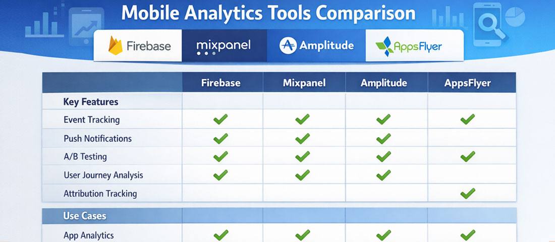
Analytics Tools for Mobile Apps in 2026
The mobile analytics tool landscape has consolidated significantly, and for most app teams, the choice comes down to a small set of well-established platforms rather than an overwhelming field of options.
Firebase Analytics
Google’s free analytics platform is the default choice for most apps in 2026. Deep integration with Android, strong iOS support, cohort analysis, funnel reporting, audience segmentation, and direct integration with Google Ads and BigQuery for advanced analysis. The free tier covers the needs of most small and medium-sized app teams comprehensively.
Mixpanel
Best-in-class for event-based analytics and user behaviour analysis. Exceptional funnel, retention, and flow visualisation. The free tier covers up to 20 million events per month — sufficient for most apps. Preferred by product teams who need deep behavioural analysis beyond what Firebase provides out of the box.
Amplitude
Strong competitor to Mixpanel with particularly strong cohort analysis and product analytics features. Amplitude’s “North Star Metric” framework has influenced how many product teams think about measurement. Well-suited for apps where the product team is large enough to use the full depth of the platform.
AppsFlyer / Adjust
Mobile measurement platforms (MMPs) specialising in attribution — tracking which marketing channels, campaigns, and ad creatives are actually driving installs and post-install events. Essential for apps with paid user acquisition budgets. Both integrate with all major ad platforms and provide fraud detection.
Crashlytics (Firebase)
Crash reporting and error monitoring. Automatically captures crashes, logs affected users, and provides stack traces for debugging. Included in the Firebase suite at no additional cost. Essential from day one — no app should launch without crash monitoring in place.
FullStory / UXCam
Session recording tools for mobile apps. Record anonymised user sessions so product teams can watch how real users interact with the app — where they tap, where they hesitate, where they get confused. Qualitative complement to quantitative analytics. Particularly valuable for diagnosing unexpected funnel drop-off.
Push Notification Analytics: Measuring What Matters
Push notifications are one of the highest-leverage retention tools in mobile — and one of the most frequently measured incorrectly. Teams celebrate high send volumes and open rates without checking whether push notifications are actually improving retention and driving the in-app actions they are designed to encourage.
The metrics that matter for push notification performance: Opt-in rate — what percentage of users grant notification permission? Industry averages sit around 40–60% for iOS (where permission must be explicitly requested) and higher for Android. Low opt-in rates indicate the permission request is poorly timed or the value proposition is unclear. Open rate — what percentage of sent notifications result in the app being opened? Typical ranges are 2–8% for broadcast notifications, 10–25% for personalised, triggered notifications. Conversion rate post-open — of users who open the app from a notification, what percentage complete the intended action? This is the metric that connects notification performance to business outcomes. Churn from notification fatigue — are notification-heavy periods correlated with increased unsubscribes or uninstalls? Track this carefully; over-notification is one of the primary causes of app abandonment.
A/B Testing in Mobile Apps: Making Data-Informed Product Decisions
A/B testing — serving different versions of an app experience to different user segments and measuring which performs better — is the gold standard for evidence-based product improvement. It eliminates the most dangerous category of product decision: assuming you know which version users will prefer based on internal opinion rather than actual behaviour.
Firebase Remote Config is the standard implementation for in-app A/B testing for most app teams — it allows feature flags and configuration values to be changed remotely without a new app release, and integrates directly with Firebase Analytics for results measurement. For more sophisticated experimentation needs, LaunchDarkly and Optimizely support more complex testing scenarios and targeting rules.
Effective A/B test design requires: a clearly defined hypothesis (“we believe users will complete checkout at higher rates if we reduce form fields from 8 to 4”), a single variable changed between variants, a sufficient sample size to reach statistical significance (typically 1,000 users per variant at minimum for 80% statistical power), and a pre-defined success metric against which results will be evaluated. The discipline of testing one variable at a time is frequently abandoned under time pressure — but multi-variable tests make it impossible to know which change drove the result, undermining the entire purpose of the exercise.
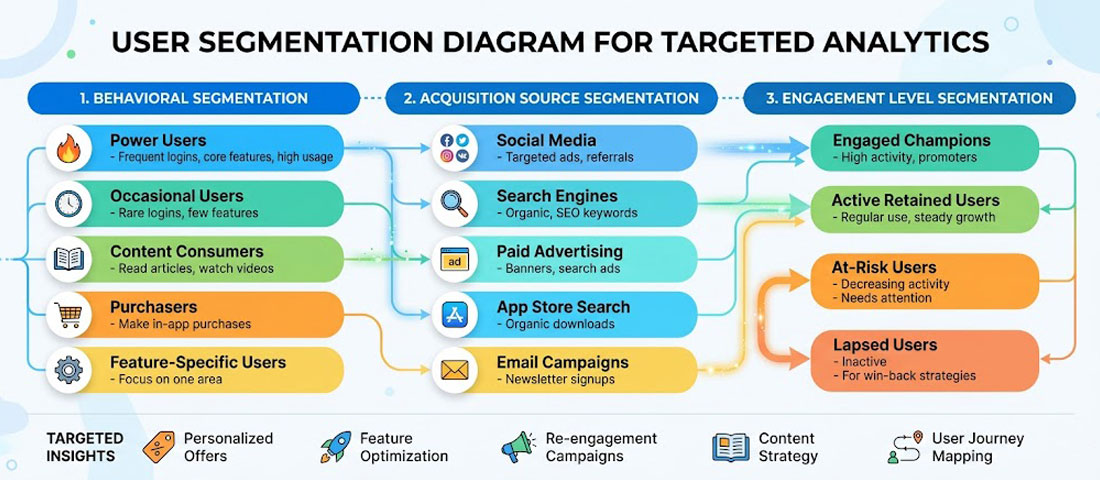
User Segmentation: Analysing the Right Users
Aggregate analytics metrics often obscure more than they reveal. An overall Day 30 retention rate of 15% might be composed of a 45% retention rate among users who completed onboarding and a 3% retention rate among those who did not — a difference that points directly at the product improvement opportunity. User segmentation is the analytical technique that surfaces these distinctions.
The most commercially useful segmentation dimensions for most apps include: acquisition source (do users from different channels retain differently?), device and OS version (are there performance problems on specific device types?), geographic market (do different regional audiences behave differently?), engagement level (power users vs. casual users vs. at-risk churners), and monetisation status (paying vs. free users, for freemium apps).
Behavioural segmentation — grouping users by what they have actually done in the app — is typically the most actionable. Users who completed a specific onboarding step. Users who have used a particular feature. Users who have made more than three purchases. Each segment has different retention characteristics, different feature needs, and may respond differently to push notification campaigns or in-app messaging.
Building a Regular Analytics Review Process
-
Define your North Star Metric
Choose one primary metric that best captures the value your app delivers to users and that correlates with commercial success. For a booking app, it might be “completed bookings per month.” For a fitness app, “completed workouts per active user per week.” This single metric anchors all product decisions and prevents metric fragmentation. -
Build a weekly metrics dashboard
Create a one-page dashboard (in Firebase, Mixpanel, or a tool like Looker Studio) that shows your North Star Metric, DAU/MAU, Day 7 retention for the latest install cohort, and top funnel conversion rates. Review it weekly. Anomalies trigger investigation; trends inform roadmap priorities. -
Run monthly cohort retention reviews
Compare retention curves for each monthly install cohort. Look for improvement over time as a signal that product changes are having their intended effect. Declining cohort retention is an early warning signal that requires investigation before it becomes a significant user base problem. -
Conduct quarterly deep-dive analyses
Once per quarter, go beyond the dashboard metrics into a full funnel analysis, feature adoption review, user segmentation breakdown, and push notification performance audit. These deeper reviews surface opportunities that weekly monitoring misses and should directly inform the next quarter’s product roadmap. -
Close the loop: analytics to action to measurement
Every analytical insight should result in an action: a product change, a new experiment, a marketing initiative, or a decision to deprioritise a feature. Every action should have a measurement plan: which metric should improve, by how much, within what timeframe? Without this loop, analytics becomes a reporting exercise rather than a growth engine.
Frequently Asked Questions About Mobile App Analytics
| What is a good retention rate for a mobile app? | Retention benchmarks vary significantly by app category and use case, so industry averages should be used as directional guidance rather than precise targets. For general consumer apps, Day 1 retention of 25–35%, Day 7 of 10–20%, and Day 30 of 5–12% represents average performance. Apps in the top quartile for their category typically see Day 30 retention above 15–20%. For business and productivity apps, which tend to have more intentional use patterns, Day 30 retention of 20–35% is achievable. For apps with natural infrequent use patterns — a flight booking app or a tax filing app — week-over-week or month-over-month retention is a more meaningful metric than day-over-day. The most useful benchmark is your own app’s historical performance: consistently improving cohort retention over time is a stronger signal of product health than hitting an industry average number. |
| What is the difference between installs and active users, and which should I focus on? | Installs measure how many times the app has been downloaded from the App Store or Google Play. Active users measure how many of those installed users are actually engaging with the app within a defined time period. The gap between these two numbers — which is almost always significant — represents users who downloaded and never meaningfully engaged, or who engaged briefly and churned. Active users are the metric that matters commercially because installs with no engagement generate no revenue, create no customer relationships, and provide no value to the business. Optimising for installs through paid advertising without simultaneously addressing the retention rate of those installs is one of the most common and expensive mobile marketing mistakes. Focus on active users and retention; installs are a precondition, not an outcome. |
| How do I track in-app purchases and revenue accurately? | Revenue tracking for mobile apps requires integrating both the app store’s native purchase APIs and your analytics platform. For iOS, StoreKit handles in-app purchase transactions; for Android, the Google Play Billing Library. These must be correctly implemented to ensure purchases are recorded reliably and verified server-side to prevent fraud. Firebase Analytics automatically tracks in-app purchase events when the native purchase APIs are used correctly, attributing revenue to user cohorts, acquisition sources, and session contexts. For subscription-based apps, RevenueCat has become the industry standard for subscription management and analytics — it handles subscription state management across platforms and provides detailed metrics on monthly recurring revenue (MRR), churn rate, and lifetime value that the native app store dashboards do not provide in a useful form. |
| How should I handle analytics and user privacy in 2026? | Analytics implementation in 2026 must account for a complex and evolving privacy landscape. Apple’s App Tracking Transparency (ATT) framework requires explicit user permission for cross-app tracking on iOS, which has significantly reduced the data available from IDFA-based attribution. Google is phasing in similar restrictions on Android. GDPR in Europe, the DPDP Act in India, and CCPA in California all impose requirements around consent for data collection and processing. Practical implications: use a consent management platform (CMP) to capture and record user consent before collecting personal data; implement server-side analytics where possible to reduce reliance on client-side identifiers subject to platform restrictions; use aggregated and anonymised data for analysis wherever individual-level data is not strictly necessary; and audit your analytics stack annually against current privacy regulations in your target markets. Privacy compliance is not a one-time setup — it requires ongoing monitoring as regulations evolve. |
| What is attribution in mobile app analytics and why does it matter? | Attribution is the process of determining which marketing channel, campaign, or specific ad creative was responsible for a user installing or taking a specific action in your app. Without attribution, you know how many installs you received and how much you spent on marketing, but not which spending drove which installs. This makes budget optimisation impossible. With accurate attribution, you can calculate the cost per install and the lifetime value of users from each channel, identify which campaigns produce users who retain well versus those who install and immediately churn, and allocate budget toward the channels and creatives delivering the strongest return. Mobile measurement platforms (MMPs) like AppsFlyer, Adjust, and Branch specialise in attribution and integrate with all major ad platforms. They are essential for any app with a paid acquisition budget above a few hundred dollars per month. |
| How do I measure the ROI of my mobile app? | Calculating app ROI requires measuring both the revenue generated through and because of the app, and the full cost of building, operating, and marketing it. On the revenue side: direct in-app transactions (purchases, bookings, subscriptions) are straightforward to attribute. Indirect revenue — customers who use the app and subsequently purchase through another channel, or increased retention value for app users compared to non-app users — requires more sophisticated multi-touch measurement and comparison analysis. On the cost side: development cost (amortised over the expected product life, typically 3–5 years), ongoing maintenance and development, server and infrastructure costs, App Store fees, and marketing spend are all attributable costs. A comprehensive ROI calculation might show: if app users retain 40% longer than non-app users and generate 25% higher lifetime value, the incremental lifetime value across your app user base relative to your total app investment over three years produces your ROI figure. This exercise is worth conducting annually, because the ROI picture changes significantly as the user base grows and development costs become proportionally smaller. |
| When should I use qualitative research versus quantitative analytics? | Quantitative analytics tells you what is happening — which screens have high drop-off rates, which features have low adoption, which user segments retain best. It is excellent at identifying that a problem exists and where it is. Qualitative research — user interviews, usability testing, session recordings, in-app surveys — tells you why it is happening. These two approaches are complementary, not competing. The most effective product improvement process uses quantitative data to identify and prioritise problems, then qualitative research to understand root causes, then returns to quantitative measurement to validate that the proposed solution has actually fixed the problem. Teams that rely exclusively on analytics often address the wrong problem with the right solution. Teams that rely exclusively on user feedback often address a vocal minority’s concerns rather than the majority’s actual behaviour. Use both in a structured alternating cycle for best results. |
Conclusion: Analytics Is the Product Team’s Superpower
The difference between a mobile app that plateaus at a modest user base and one that grows into a commercially significant asset is almost always the presence or absence of a disciplined analytics and iteration process. The product does not need to be perfect at launch — no successful app is. It needs to be good enough to retain enough users to generate learning, and it needs a team that turns that learning into consistent improvement.
The analytics framework is not complex: define the metrics that map to business outcomes, implement the right tools from day one, review data on a regular cadence, form hypotheses about what is causing the patterns you see, test those hypotheses with changes, and measure whether the changes produced the expected results. Repeat. The teams that sustain this loop over twelve to twenty-four months produce apps that are dramatically better than their launch versions — and dramatically more commercially valuable.
At Neel Networks, we build mobile apps with analytics instrumentation as a first-class concern, not an afterthought. If you are planning a mobile app project and want to ensure measurement is built in from the architecture stage, we would be glad to discuss the approach.
Build an App With Measurement Built In From Day One
Neel Networks designs and develops mobile apps with proper analytics architecture, event tracking, and reporting dashboards configured before launch — so you have the data you need to improve the product from the moment the first user opens it. Serving businesses across India, the UK, USA, Canada, and Australia.